Wanna learn what warm and cool colors are and how to use/identify them? Then you’re in for a treat as this article explains them in detail and with examples!
Color temperature is an essential part of color theory and application.
Without understanding what warm and cool colors are and how they interact with one another, any project that involves color combinations automatically becomes much more difficult.
But having even an intermediate understanding of cool and warm colors will take your work to the next level.
After reading this article, you’ll walk away with a better understanding of cool vs. warm colors, their strengths, how they affect the eye and the mind, and how to use them effectively in various applications. Let’s get started!

Warm and Cool Colors
Color temperature is an essential part of color theory and effectively using color in a lot of disciplines.
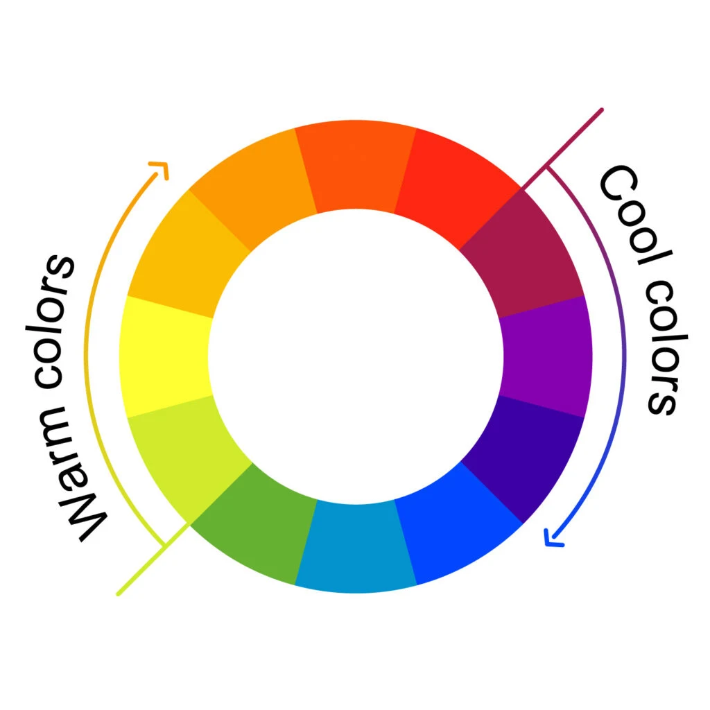
Most people learn about warm and cool colors in elementary school, so we’ll start by reviewing those concepts. The color wheel is split in half between warm and cool colors, which are pairs of complementary colors.
Conventional wisdom groups these into two broad color families. The warm colors are red, orange, and yellow. The cool colors are blue, green, and purple.
In practice, classifying color temperatures is much more complicated, which we’ll get into in the next section. Still, that can be a useful starting point.
The Relativity of Warm and Cool Colors
To thoroughly understand color temperature, we need to talk about undertones and the relationships between colors.
That’s because color temperature isn’t just about assigning temperature to a group of colors as a whole but also describing the relationships between multiple colors.
General wisdom says greens, blues, and purples are cool, and reds, oranges, and yellows are warm, after all, this color family feels…warm.
While this is true if we’re dealing with primary colors, often use far more secondary colors and beyond instead of staying limited to primary colors in the real world. In truth, all colors have cool and warm iterations, depending on their undertones.

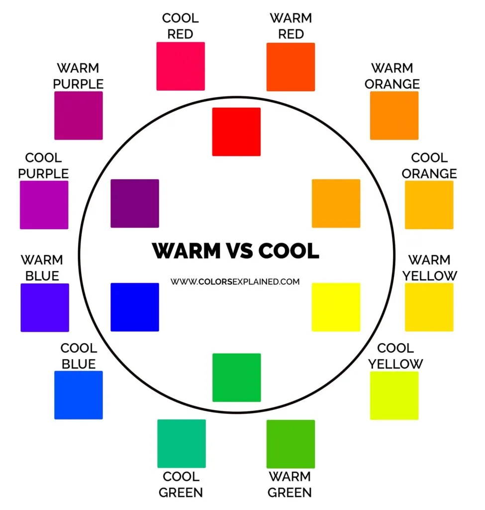
The color chart above shows how every color family has both warm and cool colors.
For instance, cool blues have a greenish bias, while warm blues have a reddish bias. Warm yellows have a reddish bias, while cool yellows have a greenish bias.
Warm reds have a yellowish bias, while cool reds have a bluish bias. Warm greens have a yellowish bias, while cool greens have a bluish bias.
The concept of color bias is essential because there are plenty of situations where you might want to build a color scheme using a color that traditionally would clash.
This problem can be sidestepped by using a cool or warm iteration of that color to achieve harmony in the color scheme, whether you’re working with split-complementary, analogous, triadic, tetradic, square, or complementary color schemes.
Keep in mind color temperature classification isn’t an exact science. If you compare a swatch of blue with a swatch of red, it’s easy to see that the red will almost always be warmer than the color blue. But comparing two similar shades of blue and trying to decide which is warmer can be tricky.
When you’re working with specific shades (such as when creating a color scheme for a website or a palette for an art project), always consider how the colors’ temperatures interact with one another.

How to Identify a Color’s Temperature
Identifying a specific color’s temperature sometimes feels easy. But as we’ve said before, when you’re working with the whole rainbow and a wide range of hues, it can quickly become hard to determine exactly where a specific shade falls, temperature-wise.
When identifying a specific hue’s temperature, start by considering what color wheel you’re working within. That will make the whole process much more manageable.
Instead of going purely off your gut feeling, you’ll be able to evaluate the color based on the primary colors that apply in that specific situation.
RYB Color Wheel
This color wheel applies if you’re painting or working on a traditional art project. The RYB color wheel is based on blending paints.
So ask yourself, “what pigments would I have to mix to create this color?” Identify whether that shade would be created using more warm or cool colors.
If you’re still struggling, try mixing in a bit of white paint to lighten the color. That can make the color’s undertones more apparent, thus making it easier to classify the color as cool or warm. This is especially helpful with very dark colors.
Another good strategy is to compare the hue you’re working with alongside similar shades of the same color, like different shades of green. Having a point of comparison can help you articulate what you’re seeing.
RGB Color Wheel
The RGB color wheel applies to digital art projects and web design. Anything that shows up on a computer monitor or TV screen uses the RGB color wheel.
Considering that you need to mix two or more colors to achieve an exact color, ask yourself whether a given color has more high or low red, green, or blue values. Knowing this will make it far easier to identify the hue’s bias.


CMYK Color Wheel
If you’re working with printed projects, the CMYK color wheel is king – its colors are based on mixing pigments, like those in an ink cartridge.
This subtractive model absorbs wavelengths of visible light. Warm colors have higher magenta and yellow values. Cool colors have higher cyan or black values.
Color Theory
Color theory is a crucial part of putting together harmonious color schemes. Knowing just a few components of color theory will help you wield color more competently and effectively.
Color Temperature and Dimensionality
In most cases, warm colors advance, while cool colors recede. This is because our eyes adjust when focusing on colors of different wavelengths.
For example, red light waves have a longer wavelength than blue ones. This affects how our eyes perceive depth, even in 2-dimensional applications like painting or web design.


Color Temperature and Contrast
Images can use both warm and cool colors to take advantage of their contrasting temperatures and contrasts to benefit from the complex relationship between the colors.
Place warm colors next to higher-intensity warm colors to make the less-intense warm hues look cooler.
If you’re working with a large swath of warm tones, accent points of cool colors can sometimes advance or “pop” against that warm palette.
Color Psychology
As most of us know, each color temperature can evoke specific feelings in people. However, the human response to color varies a lot per individual and society.
This is important because you want to be conscious of how your creations will affect people when working with color.
Art is about more than just aesthetics – it’s about emotion. If you’re designing a home, you want the colors you adorn that home with to add to a sense of ease and comfort.
Warm colors are stimulating and subconsciously remind us of sources of warmth and heat like fire and the sun, and are also considered welcoming colors.

Cool colors subconsciously remind us of nature and calming things, like grass and water. They’re generally soothing to look at.
Young children generally prefer warm colors. As people age, they often gravitate more toward cool colors.
While this isn’t a universal rule and the specific hues you’re working with come into play, it’s a good factor to consider when choosing a color palette.
Beyond that, it’s important to take the meanings of the colors into consideration when creating branding colors or any design, really.
How to Use Warm and Cool Colors
The principles of depth, dimensionality, and mood can take your project to the next level, whether you’re decorating a room or designing a website. Here are a few of our favorite tips to guide your next project.
Interior Design
Recall that young children tend to prefer warm colors, while older people gravitate more toward cool colors. Consider painting rooms for young and timid children in vivacious warm hues.
Warm colors are stimulating and tend to make spaces feel smaller and cozier (thanks to their tendency to feel nearer than they are).
Use this to your advantage by using warm colors in gathering areas and social rooms like kitchens and dining rooms.
Cool colors are often best used in private rooms for relaxation. Bathrooms, bedrooms, and reading nooks are all perfect situations to use cooler shades.
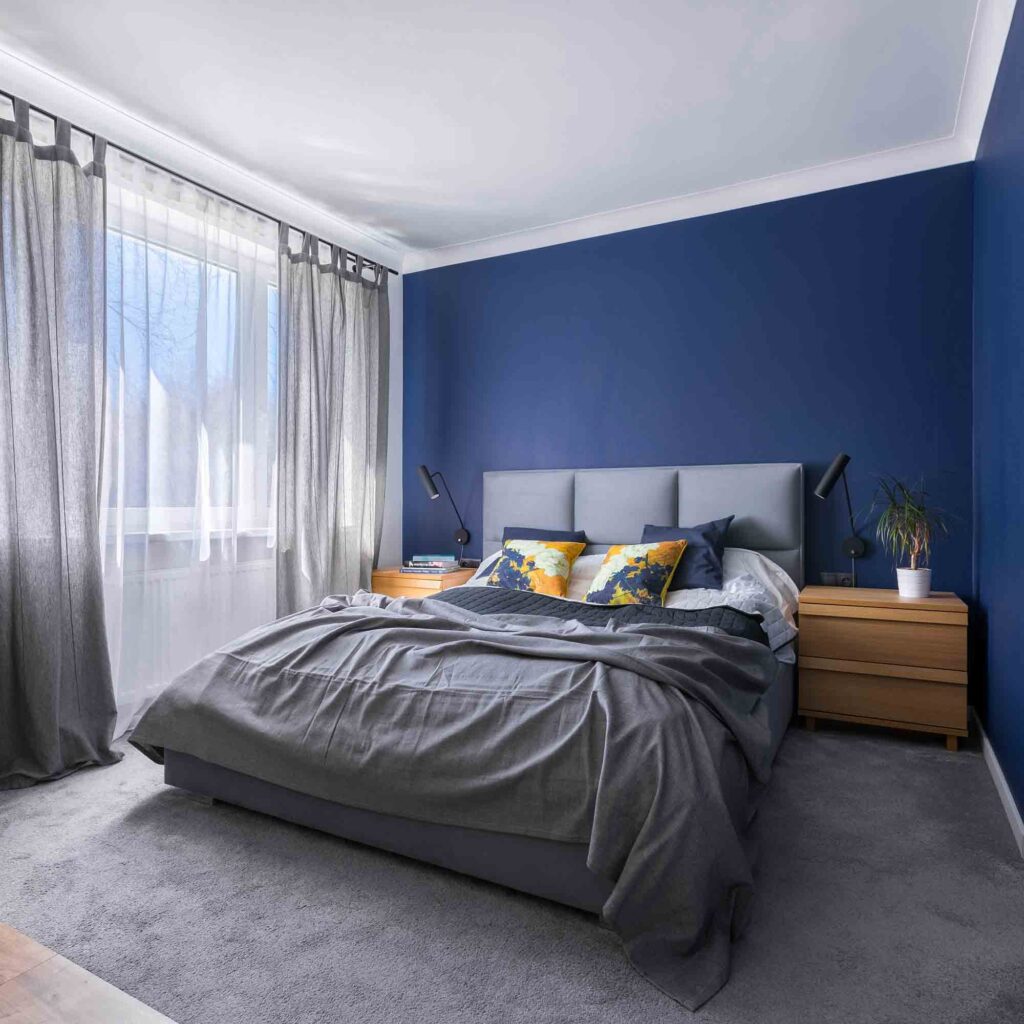

These soothing tones might seem cold in the front rooms of a home. But when relaxation is key, you can’t go wrong with a soothing green or a calming blue, which are excellent relaxing colors.
Keep in mind that you generally want to use larger swaths of more diffuse colors in interior design.
The difference between warm and cool tones can be subtle. You don’t need to use primary colors or bold jewel tones to benefit from a bit of color theory.
Also, many homeowners use warm and cool colors in the same room and that can create a dynamic space. However, keep in mind that the dominant color—whether it is warm or cool—is the one that influences the room’s personality the most.
Painting
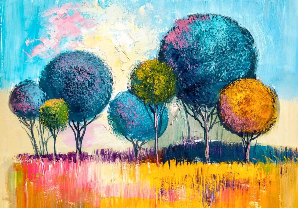
Most artists are well aware of how cool and warm tones can be manipulated to evoke feelings in the viewer. What’s more surprising is that color temperature can improve a painting’s composition.
Use warm hues in the foreground and cool hues in the background to give dimension. Use contrasting color temperatures to create focal points and to draw the eye to important components.

Even if you’re working with a monochromatic color scheme, try using warmer and cooler versions of the same color to take advantage of color theory without deviating from your color scheme.
Web Design
Cool colors are popular choices in web design because they’re easy to look at and recede into the background, making for excellent backdrops.
Warm colors are popular choices for businesses thanks to their ability to instill enthusiasm, energy, and vitality. Still, they can be tricky to use because they can quickly feel overwhelming in large quantities.
We recommend using warm colors for action items, logos, and other key items you want your website’s viewers to notice instantly.
If you simply must go with a strong warm palette, make sure to punctuate it with plenty of neutral colors to give the viewer a rest.
Also, consider color psychology and how it relates to the type of website you’re making.
If you’re building a site for a business, take some time to research colors that suit the business’s function. You want their target audience to feel right at home the second they land on that home page.
Did you enjoy this article about warm and cool colors? Then share it with a friend or colleague who might enjoy it too!
Jackie
Tuesday 13th of June 2023
Very well explained, exactly the to the point article I was looking for. Thank you
Valora
Wednesday 10th of August 2022
The best article I have read on this subject so far. Thank you!
Stéphane
Saturday 12th of February 2022
Very informative, a clear and pleasant read. Thanks!