In today’s article, you’ll learn how to master triadic colors, one of the most vibrant color schemes.
When you want to branch out from a simple single-hue color scheme and strike a balance between harmony and harsh contrast, a triadic color scheme is a great way to go.
In this post, we’ll go over how to create the perfect triadic color combination (whether you’re working digitally or in a traditional medium). We’ll also provide a few tips to use triadic colors to the best advantage and how to create your own triadic color palette.
Color Harmony
In color theory, color harmony refers to eye-pleasing and harmonious color combinations. The main seven color harmonies are:
- Complementary colors: pairs of colors that are positioned on opposite ends of the color wheel.
- Split-complementary colors: one primary hue and two hues adjacent to that primary color’s complement.
- Analogous colors: three hues, all positioned next to each other on the color wheel.
- Triadic colors: the vibrant color scheme we’ll talk about in today’s article.
- Tetradic colors: a base color and three more colors, all equidistant from the base color on the color wheel.
- Square colors: four colors spaced evenly around the color wheel.
- Monochromatic color schemes: different shades, tints, and tones of one color family only.
What Are Triadic Colors?
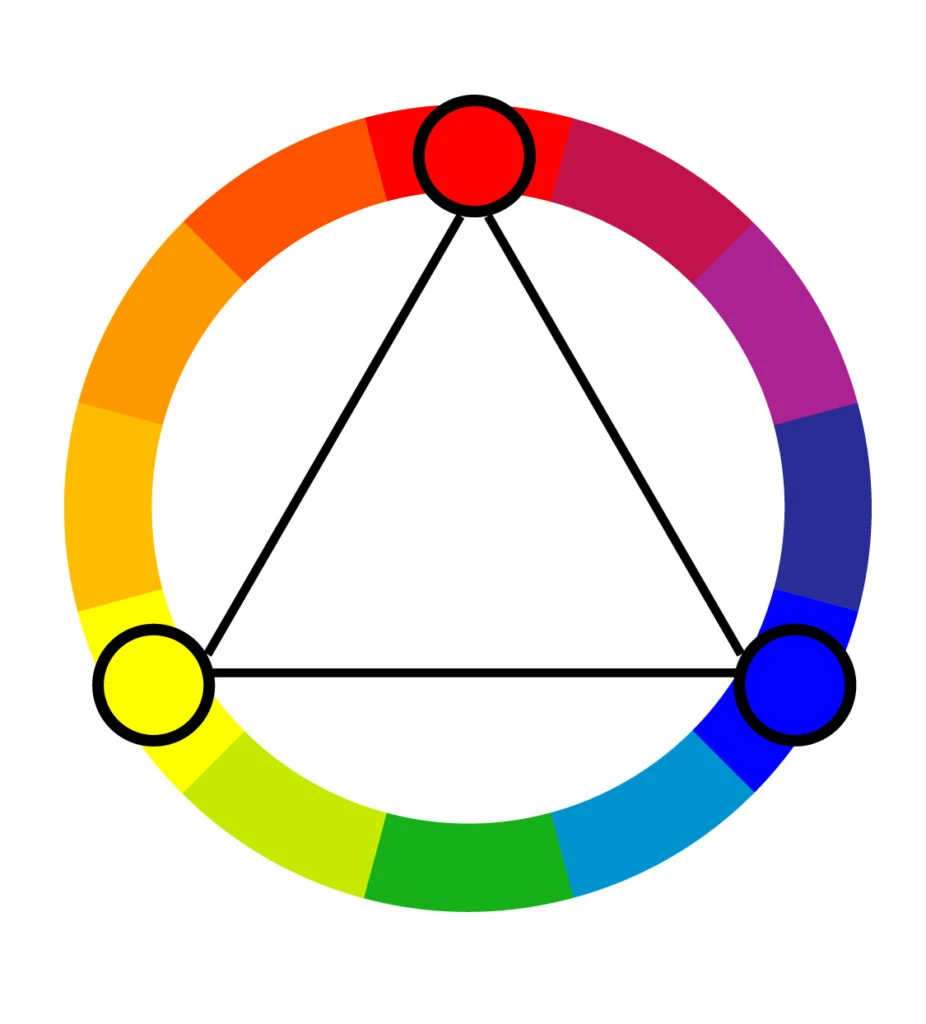
A triadic color combination consists of three colors evenly spaced on the color wheel.

Similar to a complementary color scheme, a triad color scheme offers strong contrast.
Still, they tend to be easier on the eye than a simple complementary pair, making them a pretty safe bet if you want more than one hue to play with, but don’t want to make quite as much of a splash as a complementary pair would.
Different Color Models
To understand how triadic color schemes work, we have to understand the different color wheels and the relationship between colors.
Traditional Color Wheel

The traditional color theory is most relevant to artists, as it deals with the hues available by mixing paint.
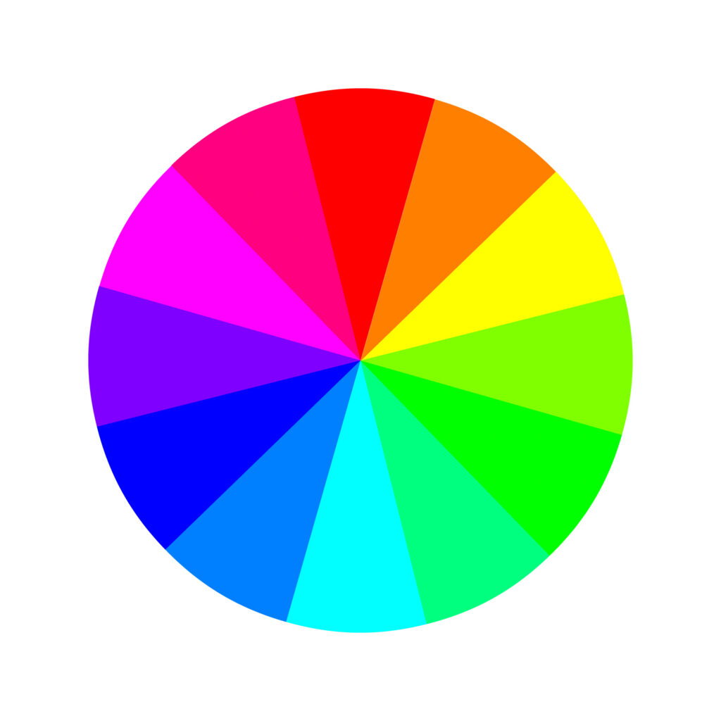
This is the color wheel (RYB = red, yellow, and blue) we all learned in school as kids and was created by Sir Isaac Newton in the 17th century.
Back then, it was made of the seven rainbow colors, but it was later improved and adjusted to 12 colors. Here are its 12 colors:
The color wheel has three primary colors: red, yellow, and blue. Three secondary colors: green, orange, and purple. And six tertiary colors: red-orange, yellow-orange, red-purple, blue-purple, blue-green, and yellow-green.
Further out, the traditional color theory uses three main concepts: hue (a color’s location on the basic color wheel), value (how light or dark a color is), and chroma (saturation).
If you visualize creating different tints, tones, and shades by mixing paint (using white, black, or gray paint to achieve different values and chromas), this is probably pretty intuitive.
The traditional color theory operates on a subtractive color model, meaning pigments are applied to a blank surface that doesn’t reflect its own color.
Think about applying paint to a white piece of paper. The white paper doesn’t change the way the paint looks. This is important as we get into modern color theory.
Modern Color Wheel
As the name suggests, the modern color theory came about with the advent of computers to explain how colors appear on digital screens (and how printers translate digital colors onto paper as per the CMYK color model).
Just as traditional color theory bases its thinking around mixing paint, modern color theory is based on mixing light.
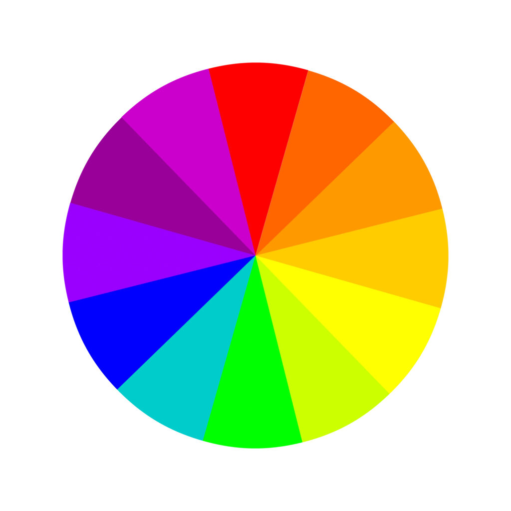
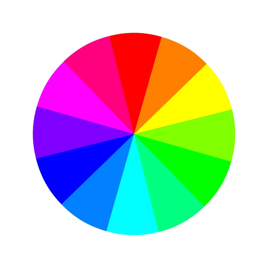
This involves an additive color model. Since digital screens are black instead of white, this changes how the human eye perceives digital colors. Digital screens’ primary colors are red, green, and blue (RGB). Here are its 12 colors:
Three primary colors: red, green, and blue. Three secondary colors: yellow, magenta, and cyan. And six tertiary colors: orange, rose, purple, azure, spring green, and chartreuse.
Printers, on the other hand, still use a subtractive color model. To translate digital colors into ink on paper, they use the primary colors cyan, magenta, yellow, and key (black) – also known as CMY(K).
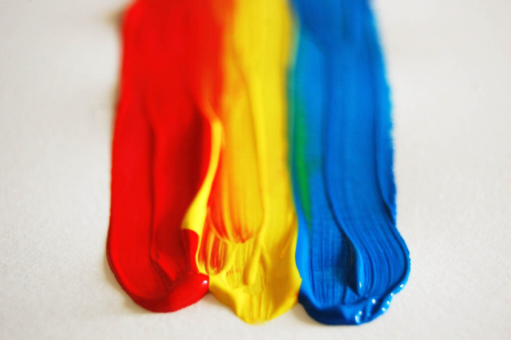
Basic Triadic Colors
The simplest triads can be made out of the primary colors of each color wheel. But the downside to these triads is that they can be quite garish and loud.
If you want a more subdued triad, consider starting with tertiary colors instead.
In the RYB model:
- Red, yellow, and blue (primary colors)
- Green, orange, and purple (secondary colors)
- Blue-green (teal), red-purple (magenta), and yellow-orange (amber) (tertiary colors)

In the RGB model:
- Red, green, and blue (primary colors)
- Magenta, cyan, and yellow (secondary colors)
- Orange, green-cyan (spring green), and blue-magenta (purple)
- Blue-cyan (azure), rose, and green-yellow


Practical Applications of Triadic Colors
Triadic color schemes are very versatile. Depending on the hues you choose, you can either create vibrant, bold color palettes or refined, muted ones.
This gives artists and designers a good amount of freedom and lets them focus on evoking the right tone in their design without risking throwing the overall effect off-balance.
However, there’s a high level of contrast involved, since all the hues are on opposing sides of the color wheel. Here are a few tips to make triadic colors work:
Choose One Dominant Color

Beginners often try not to play favorites with their color palette, using each hue in equal amounts. But this can often result in a child-like effect.
Instead, do the exact opposite: make one color dominant and use the others for accents only creating a cohesive blend.
The main benefit to this approach is that it can give a similar effect as monochromatic designs, but with a layer of added depth.
Monochromatic color schemes are sleek and sophisticated. Working with a triadic color scheme can give you a similar effect, but with the benefit of a supporting color and accent color to add complexity and edge.
Favor a Specific Temperature


With three hues, you’ll always end up with a color palette that either skews warm or cool.
Some people’s impulse is to fight this by trying to keep the balance the color temperature of their design. Instead, lean into it.
If you have two cool colors, let them take center stage. The warm hue will make a great accent color.
Blend a Bright Hue with Muted Shades


Try choosing a single bright, saturated color, then muting (by adding gray) the other two hues in the triad. This contrast creates a natural focal point (the bright shade) while keeping the colors in harmony.
If you’re aiming for a bold effect, the bright hue can be used as the main color, while the more muted tones provide a visual break and play a supporting role.
On the other hand, you can achieve the opposite effect by using the muted colors more heavily and only bringing out the bright color where you want to draw the eye. Both can be striking but in completely different ways.
Experiment with Tints and Shades


Try incorporating a very light shade (or a very dark one) of a single color in your triad. This riff on a classic 3-color triad gives you an extra shade that can almost work as a neutral within the wider color scheme.
This can be especially effective in interior design or in artwork, where you might want to add more depth to a room or project since neutral colors (and pastel shades) make the other hues stand out.
How to Create a Triadic Color Scheme
Based on all tips and advice shared in this article, we’ll briefly cover how you can create your own triadic color scheme.
Regardless of the color scheme, all designs begin with one color, one hue. From there, you have to make color adjustments to achieve the look you want and bring your message across.
To achieve that, many designers work in the HSB color system, which stands for hue-saturation-brightness.
By adjusting the hue, well, you’ll change the color. E.g., blue, red, or yellow.
By adjusting the saturation, you’ll change the richness of the color. E.g., a less saturated blue gives you a muted tone of blue. In contrast, more saturation gives you a bright blue.
Lastly, by adjusting the brightness, you’ll change how the color will look, depending on the saturation–lighter or darker.
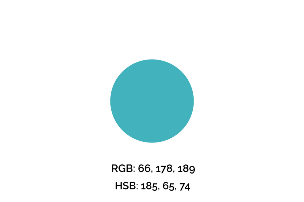
Step One: Pick Your Key Color
The key color we’ll use for this example is #42B2BD (maximum blue-green), one of my favorite shades of blue. However, if you’re picking a color for a brand, logo, or professional design, you can’t simply pick your favorite color.
We recommend you get familiarized with the meaning of the colors before making that decision. Also, many times this color will be given.
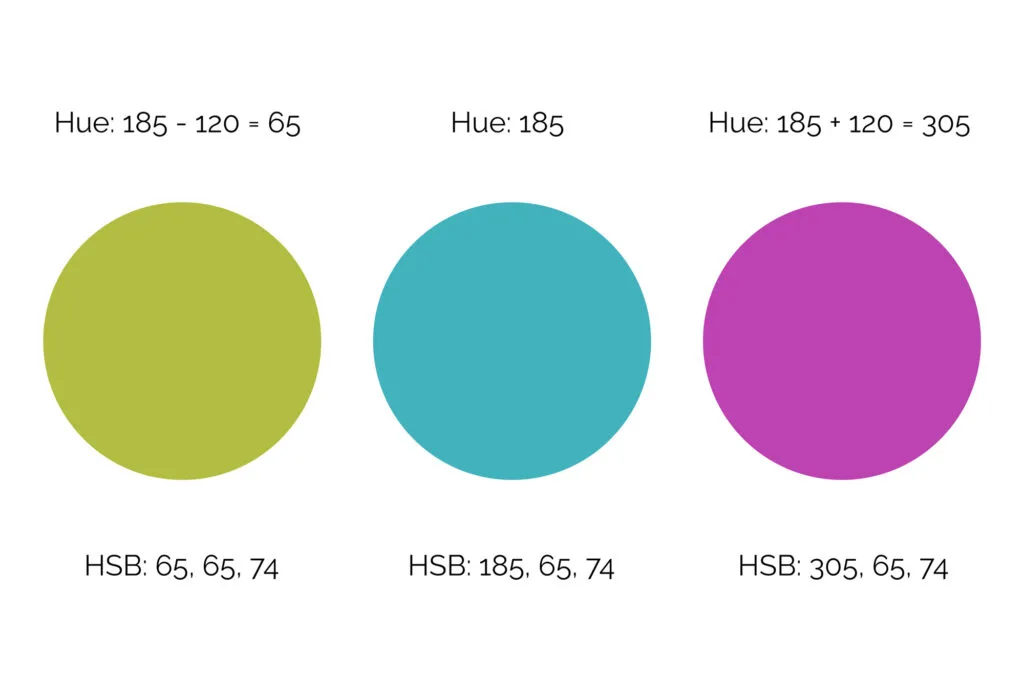
Step Two: Find the Other Colors of Your Triad
Next, we’ll decrease and increase the hue value by 120 to find the other colors of this triad.
The reason for that is the color wheel has 360 degrees, and since a triadic color scheme consists of three colors evenly spaced, we need to draw an equilateral triangle to find the other two colors, so 120 degrees.
You may adjust saturation and brightness to create a more harmonic, natural focal point.

Step Three: Apply the Triadic Color Palette to Your Design
This design has mostly cool colors, but we used a warm color for accents. Also, the scheme’s temperature didn’t affect the overall feeling this color combination evokes.
Namely, this blue-green, green, and fuchsia combination, although cool, has an electric and out-of-the-box vibe and fresh look.


The result is a harmonic design where the colors meet the brand’s needs and tone while drawing attention to the right elements.
Remember, when applying your color palette to a design, you want to use colors strategically, so they won’t overwhelm your clients/audience and will draw attention to what you want them to do, whether that’s a “sign-up,” “buy,” or “click here” button.
Wrapping Up on the Triadic Colors
When you want to catch your audience’s eye without being relegated to the basic complementary color pairs, consider a triadic combination.
By following a few guidelines, you can create websites, products, and artwork with just the right amount of contrast.
Did you enjoy this article about the triadic scheme? Then share it with a friend who might also like it.