In today’s article, you’ll learn how to master square colors, one of the lesser-known color schemes.
Square color schemes are one of the lesser-known color combinations artists and designers have at their disposal.
With so much contrast and so many hue options, these color schemes give the designer plenty of options in their palette and the viewer plenty to look at.
In truth, they can take a bit of finessing to pull off. But square colors, when done right, are extremely rewarding.
In this post, we’ll explain how to build a square color combination and how to wrangle this distinctive color scheme to grab viewers’ attention and never let it go.


Color Harmony
In color theory, color harmony refers to eye-pleasing and harmonious color combinations. The main seven color harmonies are:
- Complementary colors: pairs of colors that are positioned on opposite ends of the color wheel.
- Split-complementary colors: one primary hue and two hues adjacent to that primary color’s complement.
- Analogous colors: three hues, all positioned next to each other on the color wheel.
- Triadic colors: three colors evenly spaced on the color wheel.
- Tetradic colors: a base color and three more colors, all equidistant from the base color on the color wheel.
- Square colors: the vibrant and lesser-known color scheme we’ll talk about in today’s article.
- Monochromatic color schemes: different shades, tints, and tones of one color family only.
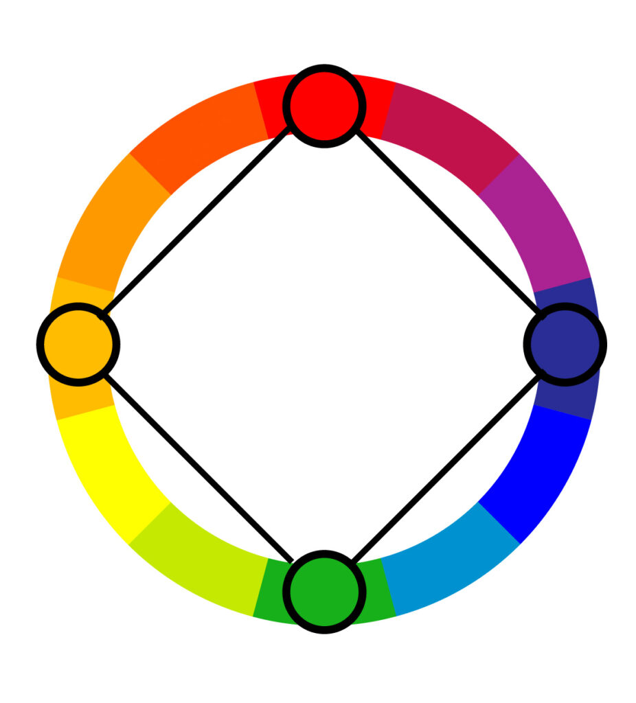
What Are Square Colors?
A square color scheme consists of four colors spaced evenly around the color wheel. To create a square color palette, choose your favorite color to start with. Then identify the other colors that are equidistant from that color. You’ll basically end up with two complementary pairs.

On a more complex color wheel (or if you’re using very specific shades), you’ll want to use an online tool to help you create a visually appealing and comfortable design.
Square colors are not the first choice for beginners, but it doesn’t mean they should be avoided. Just read through the article and you’ll exactly what to consider when creating your design.
Note that there are rectangular tetradic color schemes and square tetradic color schemes. In this post, we’ll be talking about square tetradic colors. For information about rectangular tetradic color combinations and how to use them, check out our post about it at the link above.
Different Color Models
Everything we know about color hinges mostly on two different models of color theory: traditional and modern color theory. Since they’re both important in different settings, we’ll go over each here.
Traditional Color Wheel

The traditional color theory is based on what hues you can achieve by mixing paint together. It’s no surprise, then, that it’s mostly used by artists.
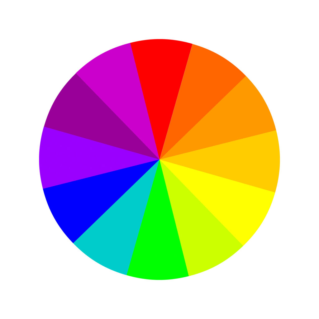
This is also the color wheel (color circle) most of us learned in Elementary School, created in the 17th century by Sir Isaac Newton, which had only the rainbow colors, but it was later improved and adjusted to 12 colors as follows.
Three primary colors: red, yellow, and blue. Three secondary colors: green, orange, and purple. And six tertiary colors: red-orange, yellow-orange, red-purple, blue-purple, blue-green, and yellow-green.
Besides, the traditional color theory hinges on three main concepts: hue (when most people use the word “color,” they’re usually referring to “hue”), value (how light or dark the color is), and chroma (how bold or diffuse the tone is).
Beyond that, the traditional color theory uses a subtractive color model, which means pigments are applied to a blank surface that doesn’t have its own color (like a white piece of paper).
Just like when you apply paint to a wall, the original color of the wall doesn’t shine through or affect the new wall color. This will come into play as we compare traditional and modern color theories.
Modern Color Wheel
The modern color theory explains how colors appear on digital screens (RGB = red, green, blue) and how printers translate those colors onto paper (CMYK = cyan, magenta, yellow, and key/black). RGB is mainly used by web designers and digital artists.
Think of traditional color theory as mixing paint and modern color theory as mixing light (and, in the case of printers, mixing ink).
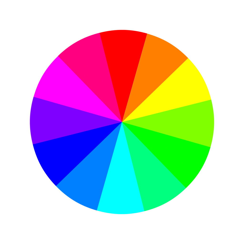
The modern color theory has an additive color model for TV screens and computer monitors – the RGB color wheel. In the RGB color model, the colors are as follows:
Three primary colors: red, green, and blue. Three secondary colors: yellow, magenta, and cyan. And six tertiary colors: orange, rose, purple, azure, spring green, and green-yellow.
This is an important distinction because unlike a piece of paper, digital screens have a black background color, rather than white, by default.
Printers use a subtractive color model (much like traditional color theory). But instead of the RYB primary colors, printers have the CMY(K) primary color wheel – cyan, magenta, yellow, and key (a.k.a., black).
Basic Square Colors
Remember, the way to create a square color scheme remains the same regardless of what color wheel you’re using.
But the colors you have within your palette will vary from RYB and RGB models. Of course, there’s an unlimited number of possible square color combinations if you’re using a complex enough color wheel.
Still, here are a few examples to give you an idea of what square colors look like. All schemes are made of not only primary and secondary colors but also tertiary colors.
In the RYB model:
- Red, yellow-orange (amber), green, and blue-purple (indigo)
- Yellow, blue-green (teal), purple, and red-orange (vermillion)
- Blue, yellow-green (chartreuse), orange, and red-purple (magenta)
In the RGB model:
- Red, green-yellow, cyan, and blue-magenta (purple)
- Green, blue-cyan (azure), magenta, and orange
- Blue, green-cyan (spring green), yellow, and red-magenta (rose)


Practical Applications of Square Colors
Square color schemes are less common than some of the other color combination options, which can provide an opportunity to utilize one and set your design, product, website, or piece of artwork apart from the pack.
Because there’s a lot of contrast built into the hue choices, even a desaturated or pastel palette gives a lively, eye-catching result. This can be great to evoke a sense of fun, playfulness, and vibrancy.
The downside to that, of course, is that it can easily look garish or bring to mind a 1990s bowling alley carpet. Here are a few tips to make a square color scheme work for your project without it looking juvenile:
Let One Color Dominate

When you have so much contrast and a wide range of colors built right into your palette, you don’t have to try hard to get the viewer’s attention.
Instead, the name of the game ends up being reining in the contrast and being judicious about where you draw the viewer’s eye.
By choosing a base color to rely heavily on, you can use the remaining three colors for accents and draw the eye where you want it to go without being too garish.
Pay Attention to the Balance of Warm and Cool Colors

Because a square color combination gives you four hues to work with, you’ll always end up with both spectrums of colors temperature: two cool colors and two warm colors. Be careful about the balance of warm and cool tones.
If you use warm and cool tones equally in your design, this tends to give a festive, lively feel – that can risk feeling hectic or busy if it’s not used judiciously.
If you’re going for a more reserved vibe, try focusing on either the warm or cool hues and using the other two for contrast or accents.
Use Black, White, or Gray as Your Dominant Color

If you’re finding your square color scheme design is getting a little busy, try letting neutral shades take the center stage and using your other hues as accent colors.
This can give a more modern, sleek look that still catches the eye.
How to Create a Square Color Scheme
Based on all tips and advice shared in this article, we’ll briefly cover how you can create your own square color scheme.
Regardless of the color scheme, all designs begin with one color, one hue. From there, you have to make color adjustments to achieve the look you want and bring your message across.
To achieve that, many designers work in the HSB color system, which stands for hue-saturation-brightness.
By adjusting the hue, well, you’ll change the color. E.g., blue, red, or yellow.
By adjusting the saturation, you’ll change the richness of the color. E.g., a less saturated blue gives you a muted tone of blue. In contrast, more saturation gives you a bright blue.
Lastly, by adjusting the brightness, you’ll change how the color will look, depending on the saturation–lighter or darker.
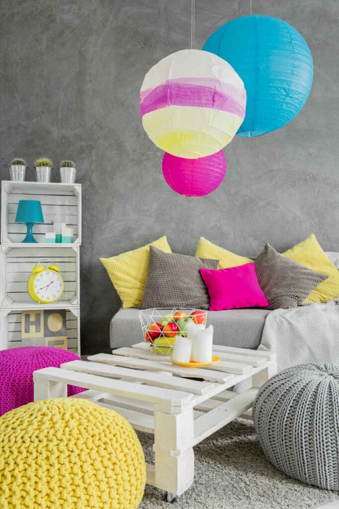
Step One: Pick Your Key Color
The key color we’ll use for this example is #42B2BD (maximum blue-green), one of my favorite shades of blue. However, if you’re picking a color for a brand, logo, or professional design, you can’t simply pick your favorite color.
We recommend you get familiarized with the meaning of the colors before making that decision. Also, many times this color will be given.
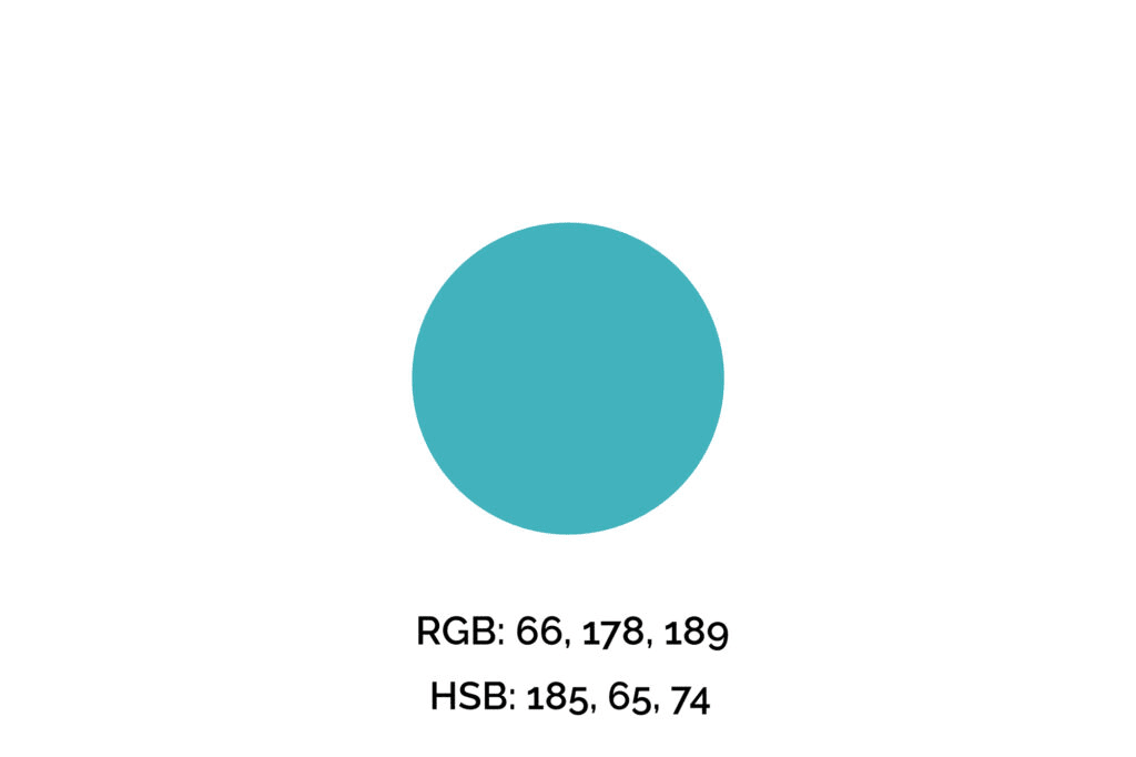
Step Two: Find the Square Colors
Next, we’ll increase the hue value by 90 three times to find its square colors.
The reason for that is the color wheel has 360 degrees, and since a square color scheme consists of four colors evenly spaced out, we need to divide the wheel into four equal parts, so 90 degrees.

Once you’ve found the other colors, you may adjust saturation and brightness for better contrast.
Step Three: Apply the Square Color Palette
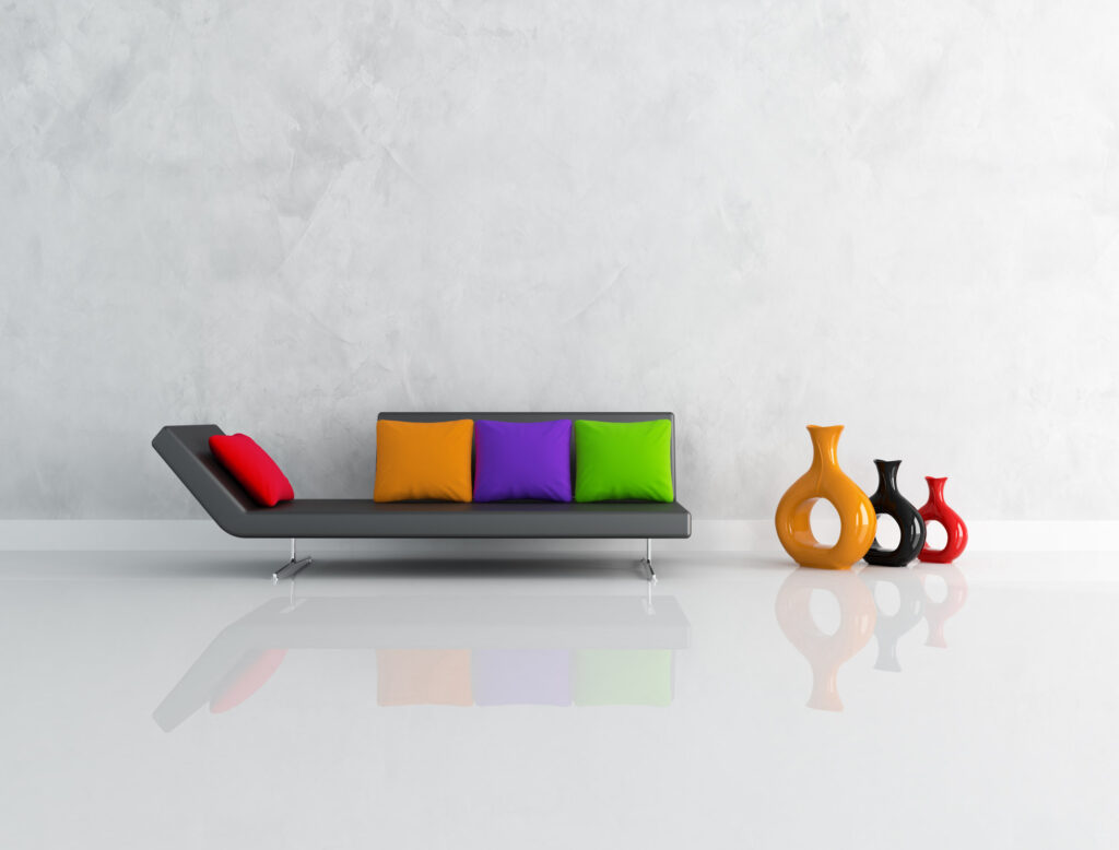
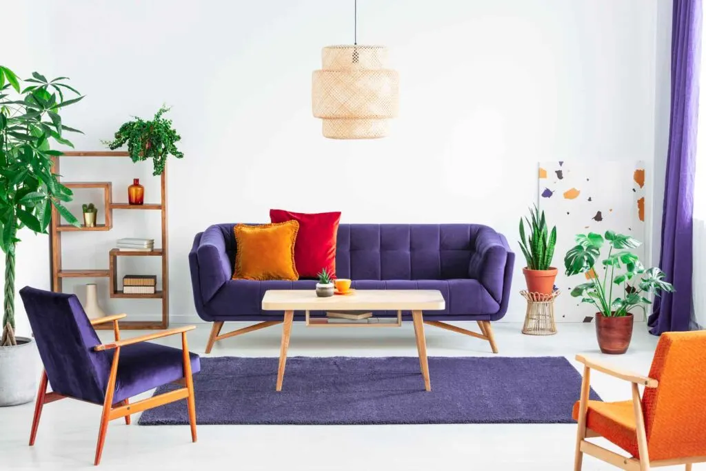
For this example, we let the cool colors dominate (blue and green), and used purple and red for details and call-to-actions.
The result is a colorful but harmonic design where the colors evoke feelings of freshness while drawing attention to the right elements.
Remember, when applying your color palette to a design, you want to use colors strategically, so they won’t overwhelm your clients/audience and will draw attention to what you want them to do, whether that’s a “sign-up,” “buy,” or “click here” button.


Wrapping Up on Square Colors
Using a square color scheme in design is sure to draw the eye toward your website, product, or interior design.
The key is to pick colors and use your palette with a studied eye and a large helping of self-control. Take your time to study the color wheel and this color harmony can be used to evoke the right emotions.
After all, only with the right color choices, you can convey your message properly.
It’s easy to get a viewer’s attention, which is a given with this color combination. The goal is to produce an end result that’s both gripping and aesthetically pleasing.
Did you enjoy this article about square color palettes? Then share it with a friend who might also like it.