Looking for the best accent colors for your interior design project? You’re in luck–we’ve got a complete guide for you!
Incorporating accent colors into your home design is an excellent way to add visual interest, contrast, and texture to a room.
In this post, we’ll go over the concept and usage of accent colors in interior design.
We’ll explain what accent colors are, how to choose them, and we’ll provide ideas and advice to effectively use color accents in any room or space based on accent color principles. Ready? Let’s go!
What Is an Accent Color?
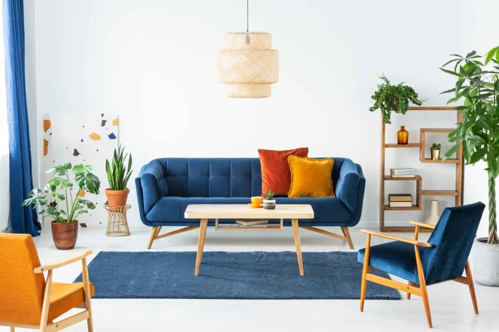
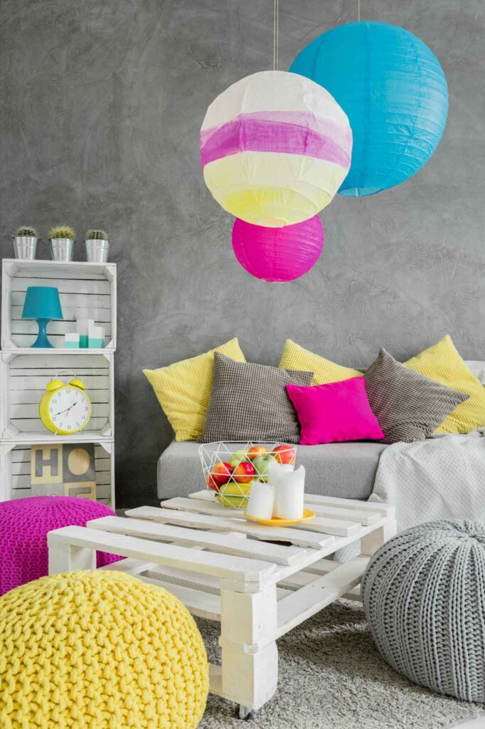
Accent colors are hues used within a color scheme to add emphasis to a room. They’re used sparingly to add emphasis, contrast, or to create visual rhythm.
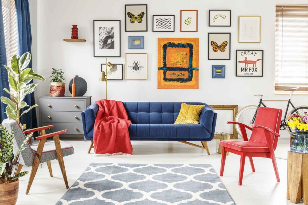
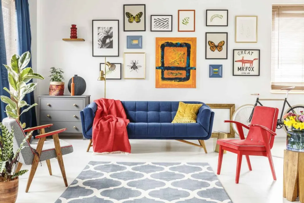
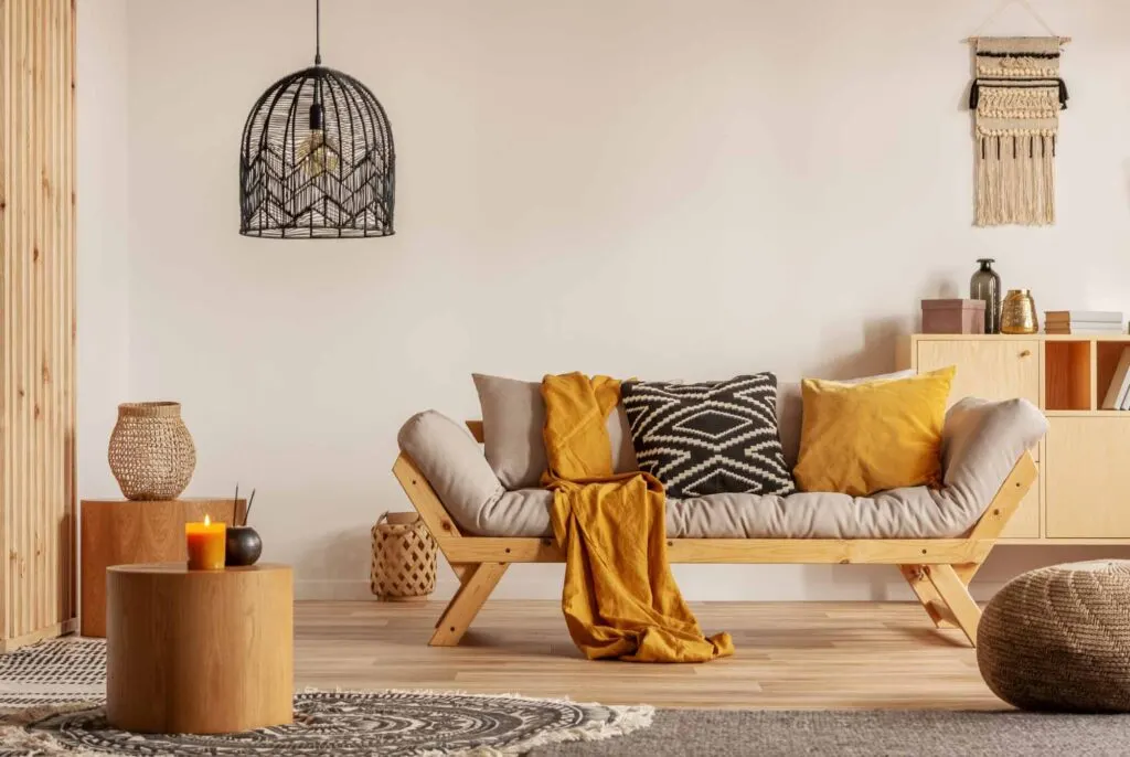
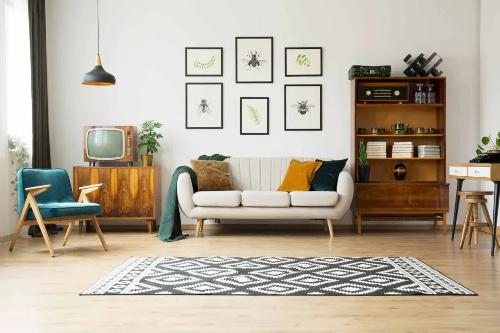
People often choose vivid, bold colors as accents. That’s because bright accent colors can be tricky to use in interior design normally, but when used as accent colors, they can become more approachable while adding life to a space, even in an otherwise-drab design.
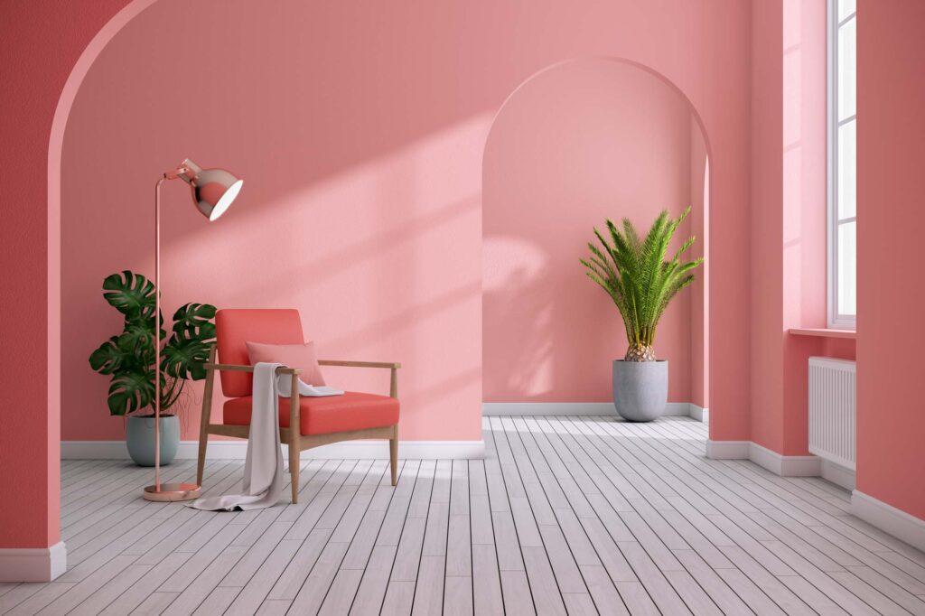
Accent colors for walls can be one of the easiest ways to incorporate accents into a room, but it’s not the only method.
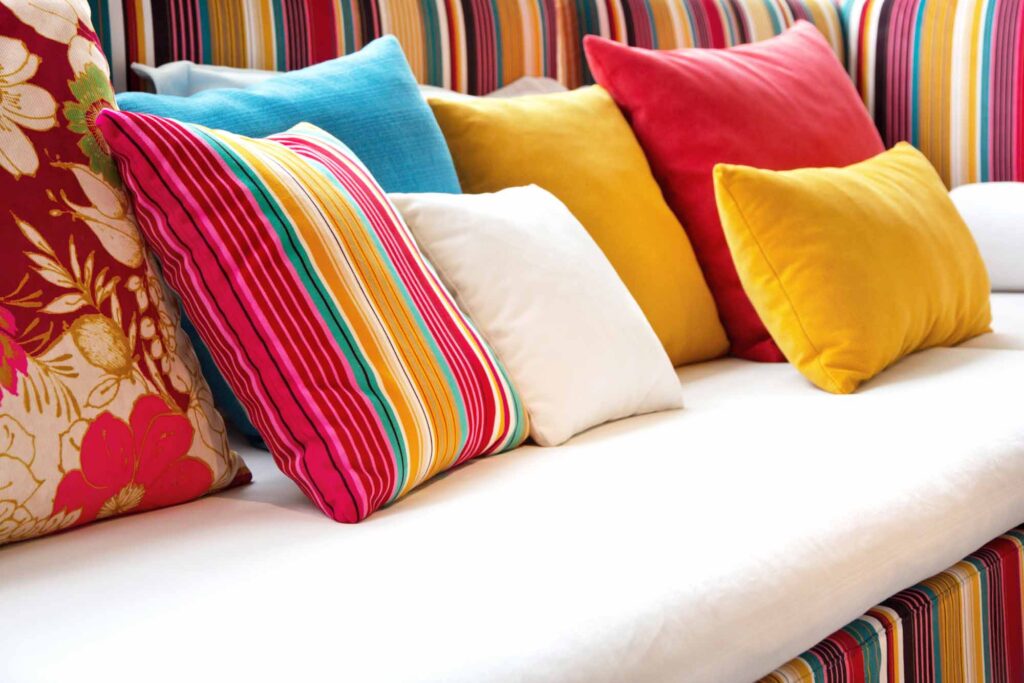
It can also involve incorporating pops of color onto picture frames on a white wall, mirrors, pillows, throws, rugs, wall art, flooring, upholstery, countertops, fixtures, and more. The possibilities are endless!
How to Choose Your Accent Colors
There are no rules to choosing your accent colors. But for guidance, you can look at the mood you want to create or turn to the color wheel.
Set the Mood
If you want to set a certain tone in a specific room, your accent color can be an excellent way to deliver that.
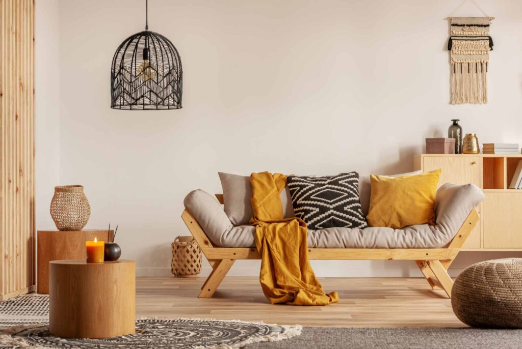
Make sure your accent color matches the overall mood. For an uplifting vibe, choose warm, vibrant colors (like a warm yellow).
For a peaceful room, some good accent color ideas are light, relaxing colors, regardless if they are warm or cool (like light blue and a crisp white).
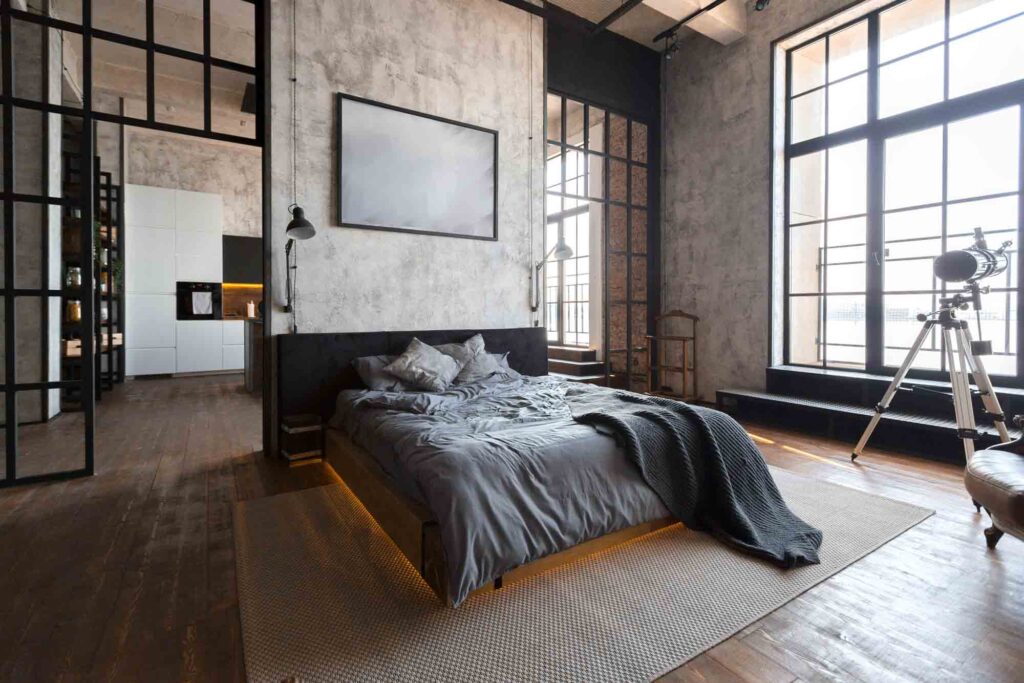
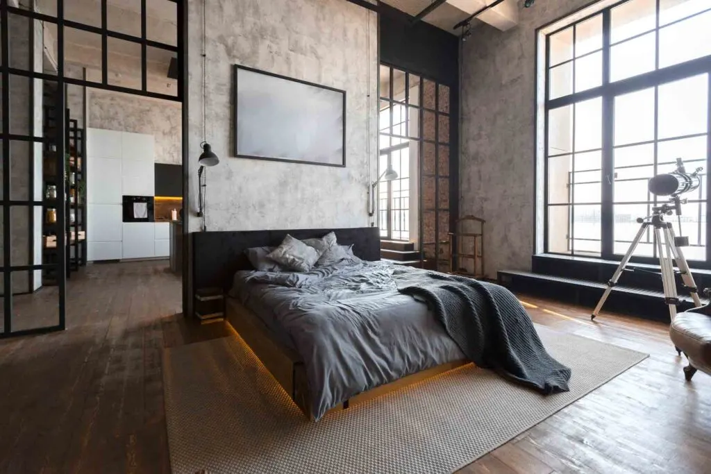
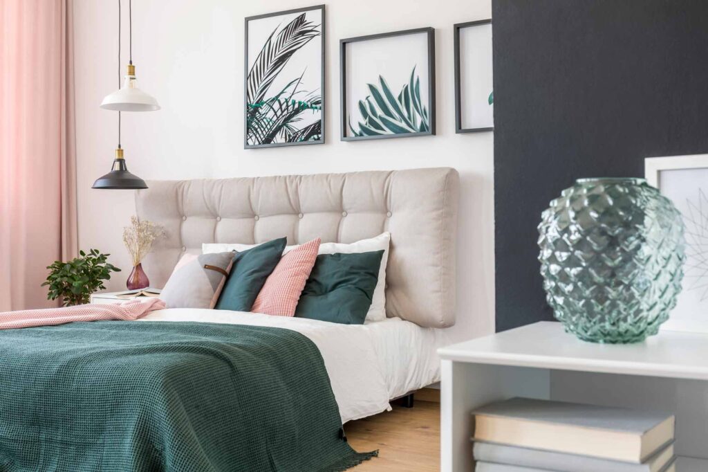
To keep it cozy, warm, muted tones are an excellent choice (like tan or a soft yellow). For a moody, atmospheric look, try darker, unsaturated shades (like dark blue).
Read next: Shade, Tint, and Tone Explained
Use Color Harmony Principles
If you prefer a more systematic approach to your accent color selection process, you can look to a room’s overall color scheme for guidance.
Here’s how to incorporate each of the seven color harmonies into your choice:
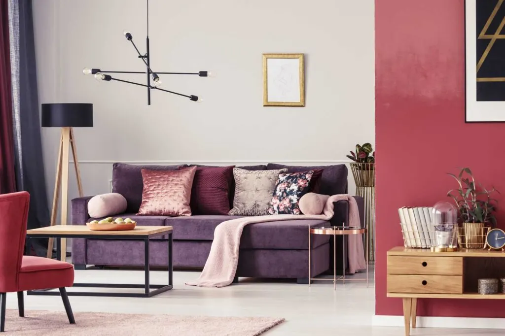
Complementary

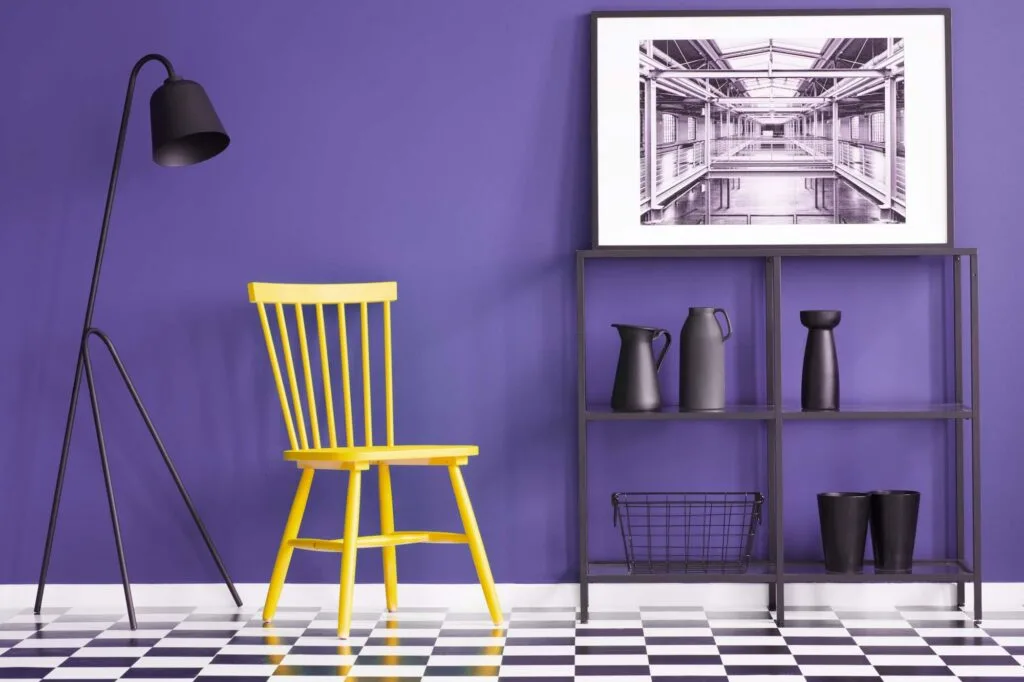
If the main color in a room (usually the wall color) is a non-neutral, the easiest way to pick an accent color is to choose a complementary color. This is the opposite color on the color wheel.
For example, if your walls are blue-green, your complementary accent color will be red-orange. If your room’s main color is yellow, choose a bold violet accent color.
This can work even if your dominant color is a neutral color. Look at the undertone – is it cool or warm? Choose the opposite for your accent color.
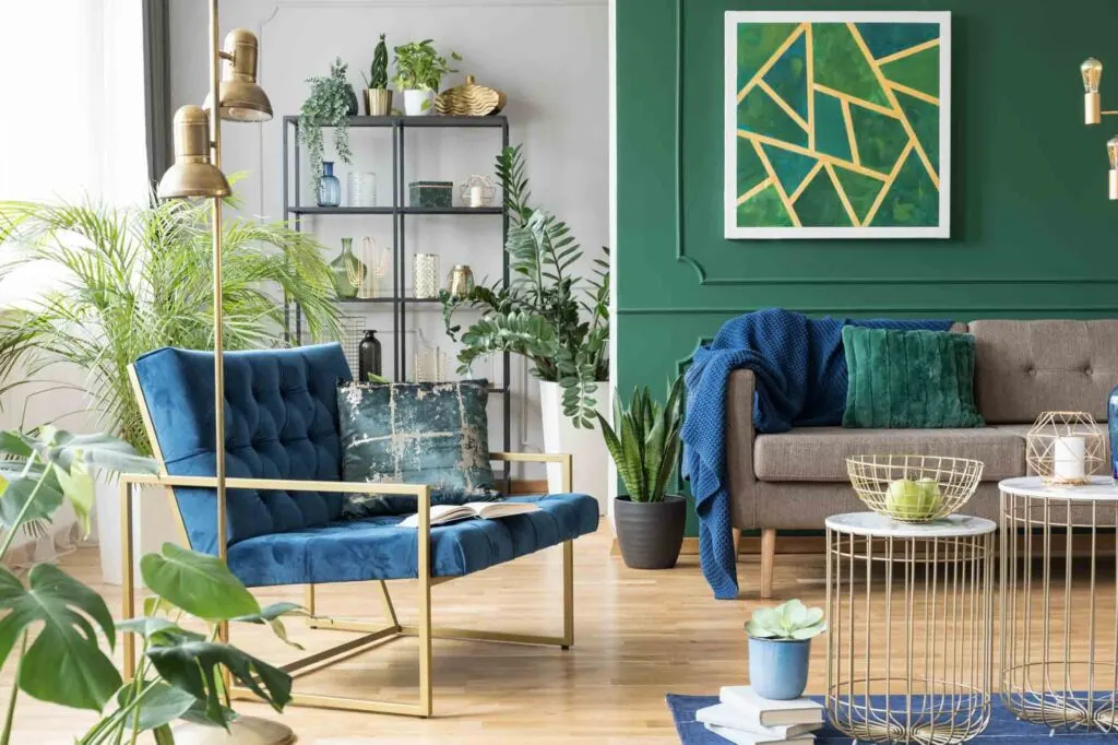
Analogous
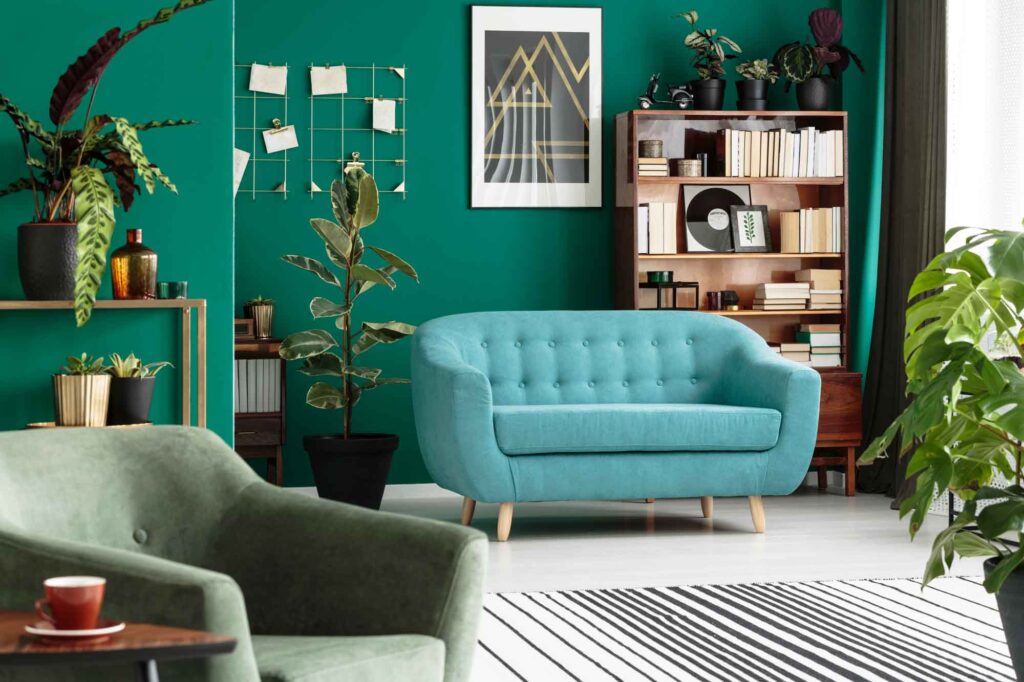

Analogous colors are adjacent to each other on the color wheel.
If you have an entire room with a non-monochromatic color scheme, but whose colors are close to each other on the color wheel (like an entire room of cool or warm colors), you can choose an accent color that’s close to the other colors.
This results in a look that’s not overly jarring and still feels refined but has the benefits of an accent color.
For example, if your color scheme is green, turquoise, and blue-green (teal), choose a beautiful blue as the accent color. If your house color palette is yellow, yellow-orange, and orange, choose red as the accent.
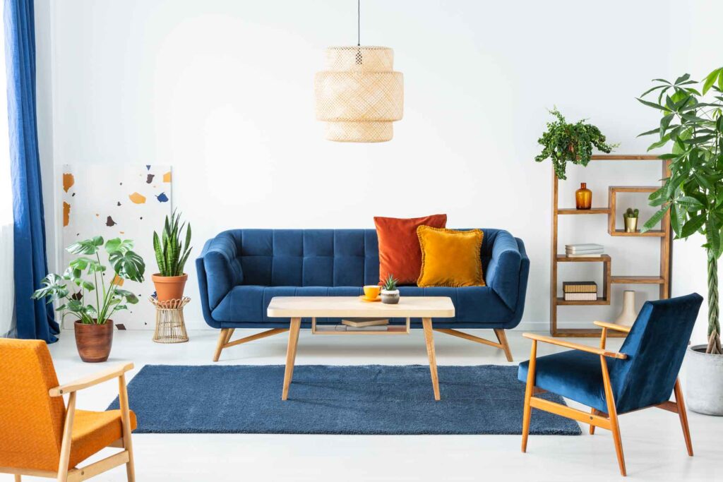
Split-Complementary


Split-complementary is a unique color scheme because it lets you have two accent colors instead of just one. This gives you more room to play and, though challenging, can result in a very fun, eclectic look with plenty of pop.
To attempt a split-complementary accent color, choose the main color in your room, then find the two shades directly adjacent to your main color’s complementary color.
For example, if your main color is blue, your split-complementary accent colors will be yellow and red. This offers plenty of contrast while still being more refined and dialed-back.
This can also go the other direction. In this example, your base colors could be orange and red, with blue-green as your accent color.
Triadic

Triadic color palettes can be tricky to pull off even for color experts but are rewarding when they work well.
They consist of three colors equidistant from each other on the color wheel. Choose two of these colors for the palette in most of your room, then use the 3rd sparingly as an accent.
If you attempt a triad, make sure to stick closely to the 60-30-10 design rule (which we’ll discuss in the next section).
Since triads involve so much contrast, they can be easy to mess up. But when they work, they’re extremely rewarding and create a vibrant space.
Tetradic
Playing with tetradic colors can also be tricky and rewarding. To choose a tetradic accent color, imagine you’re using four corners of a rectangle on the color wheel.
We recommend starting with the dominant color in your room (often the wall color) and choosing the other three colors based on the dominant color.
Choose one of these colors and reserve it for a pop of color throughout the room. Oh, and don’t forget to use plants to create your house color palette.
Square

Square color schemes use four equidistant hues (forming a square) on the color wheel. This gives you four shades to play with. Pick one (usually the boldest shade) to use sparingly throughout the room as your accent color.
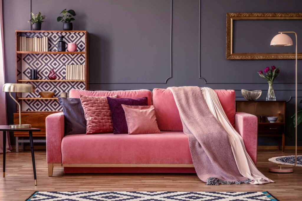
Monochromatic
You don’t have to try too hard to find an accent color with a monochromatic color scheme, since every variation stands out more when you’re only working with one hue.
If you’re using monochromatic colors, choose a tint or shade that’s only one or two steps from your base wall color.
This adds a pop of visual interest without straying from your color palette. Straying too far from your base color can look juvenile and out of place, so keep it reined in.
How to Use Accent Colors
Accent colors can be a fantastic way to draw attention to key focal points in a room or add contrast and elegance to any space. Here are a few tips to help you use them effectively:
Use the Main Accent Color at Least Three Times

If you only use your accent color once or twice, it can look out of place in the rest of the room – especially if your accent color is very different from the rest of your color palette.
Using it a few times makes it look intentional and reinforces its power. Try to use it on pieces of varying sizes and shapes.
You can use it on small accessories or knick-knacks as well as larger swaths like upholstery, statement furniture, artwork, or even a single feature wall.
Use the 60-30-10 Design Rule

If you’re working with a 3-color palette, try to use the main, primary color in 60% of the room, the secondary color in 30% of the room, and limit the accent color to 10% of the space.
This design rule creates a sense of balance and makes sure your accent color is present enough to make an impact but is used sparingly enough to make the biggest impression.
Use the Accent Color Throughout the Room

Avoid clustering every instance of your accent color in a single area of the room. This can look lopsided and imbalanced.
Instead, try spreading the accent color around the room. This creates a sense of balance, makes the accent color look intentional, and draws the eye around the room.
Stick to All Muted Colors or All Bold Colors
Clean colors are closer to what you’d see on a traditional color wheel. Muted colors tend to be desaturated or “grayed-out.”
It’s easier to pull off an accent color when you work with your existing interior design scheme, rather than working against it by trying to mix muted and bold colors.
Take Your Entire Home’s Palette Into Account
If you’re choosing accent colors for a room, draw inspiration from the other colors in your home.
You can often use a similar set of colors in a different combination to create accents throughout your home. By using one accent color palette throughout your home, you create a sense of cohesion without having to reinvent the wheel.
Alternatively, you could choose matching accent colors and use a dominant accent color in different rooms to achieve this cohesive look without limiting your house color plan options.
Use Accent Color to Highlight a Room’s Key Features

If there’s something unique in a specific room, don’t be afraid to use your accent color to draw attention to it!
You can highlight paneling or wainscotting with a coat of paint. Try drawing the eye toward a window seat with a few throw pillows.
If there’s a piece of furniture you love, try sprucing it up with some accessories in your accent color. This will draw the eye toward the best part of the room.
Use Accent Colors to Create Zones
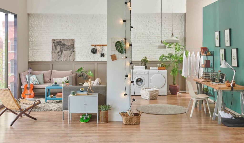

Accent walls are a classic way to use accent colors. But a slightly more advanced way to apply this concept is to create zones within a room.
This technique is especially effective with small spaces, where a single room might serve multiple functions.
If your living room has an office nook, consider painting the portion of your wall that serves as an office your accent color. This serves a functional purpose (by separating the room into sections), but can also make a room feel more spacious and luxurious.
It can also be used in large, spacious rooms to create little nooks, which can add coziness and intimacy.
Besides, an accent wall doesn’t have to be a solid color only. You can use patterns too to make a bold wall color pop even more. The possibilities are endless!
Did you enjoy learning about accent colors? Then share it with a friend who might enjoy this article too!