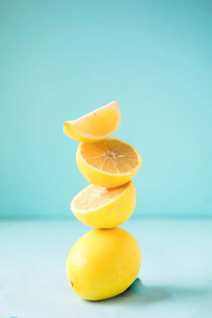
In today’s article, you’ll learn how to master complementary colors, the most basic color scheme.
Color schemes are all around us. They’re the building blocks of every logo, painting, interior decorating scheme, and breathtaking piece of scenery.
Complementary colors are some of the most basic and primal color schemes.
Whether you want to learn more about color contrast to inform your design choices, refine your mental color palette, or help you understand art and design, complementary color combinations are a crucial starting point.
Most people can tell by looking whether a color scheme is pleasing to the eye or not. But knowing why a color scheme does or doesn’t work can be really helpful.
It’s also an essential skill for artists and designers as well as anyone who works with artists or designers on a regular basis.
In this post, we’ll go over what complementary colors are, the most basic contrasting color schemes, why they matter, and how to create a complementary color palette.


Color Harmony
In color theory, color harmony refers to eye-pleasing and harmonious color combinations. The main seven color harmonies are:
- Complementary colors: the rich color scheme we’ll talk about in today’s article.
- Split-complementary colors: one primary hue and two hues adjacent to that primary color’s complement.
- Analogous colors: three hues, all positioned next to each other on the color wheel.
- Triadic colors: three colors evenly spaced on the color wheel.
- Tetradic colors: a base color and three more colors, all equidistant from the base color on the color wheel.
- Square colors: four colors spaced evenly around the color wheel.
- Monochromatic color schemes: different shades, tones, and tints of one color family only.
What Are Complementary Colors?
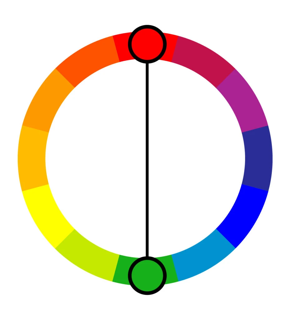
Unlike analogous color schemes that are made of adjacent colors, complementary color schemes are pairs of hues that are positioned on opposite ends of the color wheel (or color circle).

To fully understand what this means and why it matters, let’s have a quick talk about color theory.
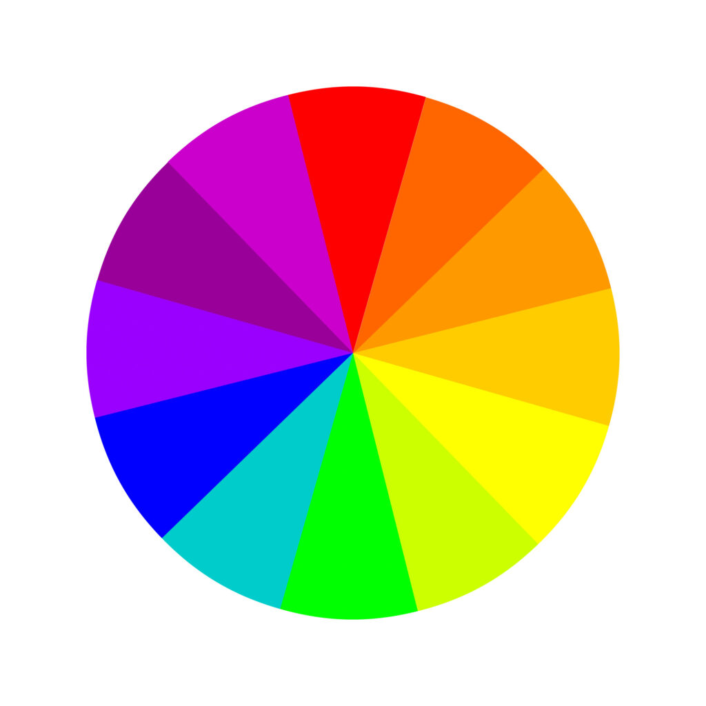
At the heart of color theory is the famous color wheel used by artists and designers alike, which was created in the late 17th century by Sir Isaac Newton.
Best known for his physics breakthroughs, Newton mapped the color spectrum into a circle with the seven colors of the rainbow but that later was refined and improved by scientists into 12 colors.
However, there are two models of color theory we can use to help us determine what colors are complementary to each other. That means there are different wheels for different models.
Anyone passionate about this topic should know about both since they’re relevant in different applications.
Traditional Color Wheel

The traditional color wheel model generally deals with mixing paint, so it’s no surprise that artists, particularly those dealing with traditional art media (like painting and drawing), tend to lean toward this school of thought.
Still, non-artists will be familiar with this theory as well. It’s what we all learned about primary colors in school.
Basic, the traditional color wheel uses the RYB (meaning red, yellow, blue) subtractive color model, and here are its 12 colors:
Three primary colors: red, yellow, and blue. Three secondary colors: green, orange, and purple. And six tertiary colors: red-orange, yellow-orange, red-purple, blue-purple, blue-green, and yellow-green.
Beyond that, the three main principles of traditional color theory are hue (what we think of as the actual color), value (lightness and darkness), and chroma (saturation, or strength, of a color; how neutral or bold the tone is).
Modern Color Wheel
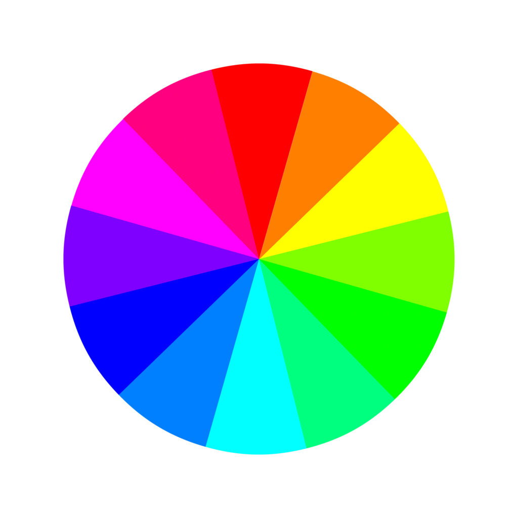
Where traditional color theory thinks of color as mixing paint, modern color theory thinks of color as mixing light.
It’s mostly used by artists and designers who work with the display of images in electronic systems, such as televisions and computer screens.
The modern color theory uses the RGB color model, invented in the 19th century and fully developed in the 20th century, which is the combination of red, green, and blue light against a black background to make the colors seen on a computer monitor or television screen.
This is the color you see on your TV screen and computer monitor. These are additive colors that stimulate the three types of eye color receptions. Here are its 12 colors:
Three primary colors: red, green, and blue. Three secondary colors: yellow, magenta, and cyan. And six tertiary colors: orange, rose, purple, azure, spring green, and green-yellow.
On a side note, CMYK (cyan, magenta, yellow, and key – or black) subtractive color model is also one of the most used models in modern society. It’s our color printing model.
Think of subtractive color as beginning with white. When you’re working on paper or a reflective surface that doesn’t give off its own pigment, you’re essentially starting from scratch.
Modern printers use ink pigments to filter reflected white from the paper underneath to produce the colors you see on the page.
Basic Complementary Colors
As we said, complementary colors are the two colors on opposing sides of the color wheel. Putting them together creates bold, eye-catching color combinations that add fervor and make a statement.
Putting two complementary colors next to each other actually makes each color look brighter.
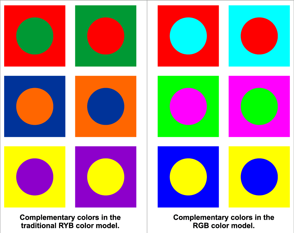
The RYB and RGB color models have different complementary colors because the color wheels operate differently – they have different primary colors. Here are a few basic complementary color pairs for each:
In the RYB color model:
- The direct complementary color of red is green.
- The direct complementary color of yellow is purple.
- The direct complementary of the color blue is orange.


In the RGB color model:
- The direct complementary color of red is cyan.
- The direct complementary color of green is magenta.
- The direct complementary of the blue color is yellow.
Of course, normally in the real world, we’re not working with perfect primary colors; we’re working with secondary colors as well as tertiary colors like the following:
- Orange and azure.
- Purple and green-yellow
- Rose and green-cyan (spring green)

There’s an infinite number of complementary color pairs; the possibilities are as vast as the color wheel itself.
To help you easily find them, there are plenty of tools online you can use to pick out complementary color pairs.
The point here isn’t to memorize every complementary color pair. It’s to understand what complementary colors mean and to learn to recognize them when you see them.
A Note About Color Temperatures

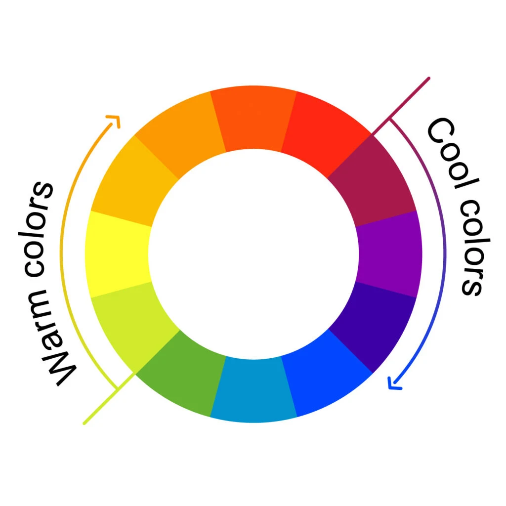
As for color temperature, each complementary pair is made up of one cool color (like blue, green, and purple) and one warm color (like orange, red, and yellow).
Cool colors are generally seen as relaxing colors, while warm colors are generally seen as energizing ones.
That’s one reason why complementary colors make such a splash. They’re on opposite sides of the color wheel, evoke opposing emotions, and display opposing tones while still being pleasing to the eye.
While bold, they don’t feel like an overwhelming onslaught of random color.
Practical Applications of Complementary Colors
Company Logos
Complementary colors make each other pop. They’re also easy for the eye to read visually, so using one of them as the dominant color and the other as the accent color might help keep your design simple and consistent.
Using two complementary colors alongside one another makes it easy to differentiate between different shapes, which is why companies use contrasting colors in their logos so often.
They’re eye-catching and can communicate an image through a simple, recognizable design.
Simultaneous Contrast

Simultaneous contrast is a natural optical illusion where if you put two complementary colors next to each other, both colors look brighter, creating a color scheme more than the sum of its parts.
The theory is that one color can change how we perceive the tone and hue of another when the two are placed side by side. The actual colors themselves don’t change, but we see them as altered.
This grabs people’s attention while staying easy on the eye. Simultaneous contrast makes it fantastic for logos, bold color schemes, and pops of color in interior design.
However, the combination of red and green can be problematic for people who are color blind so for clarity’s sake, steer clear of this duo.
Drawing Attention to a Subject


Complementary colors are one reason why we find sunsets so eye-catching. The deep blues of the night sky blend with the bright oranges of the sun in a natural complementary color pair.
That color combination makes all the colors pop and naturally makes us want to stare at it, drinking in all the detail. This natural phenomenon has applications in art as well. (Vincent van Gogh was especially fond of this color scheme).
If you’re ever stuck working with a color that isn’t bright enough for your taste (like if you have a tube of red paint that isn’t popping quite enough), play with the interaction of colors by positioning it next to something in its contrasting color—green (considering the RYB subtractive color model).
It will make the dull color look brighter and more vibrant. It also signals to the viewer that the point of contrast is where the viewer should focus, creating a natural focal point without you having to find a flashy, overt way of saying “Hey! Look over here!”.
Mixing Complements
When mixing paints, blending complementary colors can open up a whole world of possibilities.
Creating Dynamic Shadows


Most people see shadows as just a darker version of a subject’s main color.
The instinct when painting, then, is to create shadow tones just by blending your main color with black or gray.
Surprisingly, one of the best ways to paint shadows that feel real is actually to blend your main color with a complementary color. That way, your shadows will still feel vibrant and lifelike.
Tone Down Bright Hues
If you’re working with a limited paint set, mixing hues is your bread and butter. If you want to tone down a vibrant hue, add a touch of complementary color.
For example, mixing green with red will create burnt sienna. Add more green and you’ll get darker sienna. If you blend them in equal parts, you’ll get a warm-toned dark brown.
By playing with color value (adding white or black) and chroma (gray), to the original color, you can get an even wider range of tints, tones, and shades, just by starting with two complementary colors.
As a rule of thumb, if you’re ever feeling stuck or limited with your palette, try mixing complementary colors. You’ll often find possibilities that didn’t even occur to you.
The Afterimage Effect
The afterimage effect is an optical illusion where if you look at an image long enough and then look quickly away, you’ll still see an impression of the image in your line of sight for a little while.
You’ve probably noticed this even if you haven’t tried. If you stare at something long enough and suddenly shift your gaze, you’ll see it.
This can happen if you look at a very bright object (like a lightbulb) for a long time. It can also happen if you stare at a very bold-colored object for a long time.
What Does This Have to Do With Complementary Colors?
There are two types of afterimages: positive and negative.
In a positive afterimage, the colors of the original image are maintained. You stare at a bright-white lightbulb for a minute, then look away and you’re left with a bright-white impression in your sight for a little while.
But there are also negative afterimages, where the colors are inverted – meaning you’ll be left with an impression of the opposing color, or in other words, the complementary color.
Let’s make a fun experiment. Stare at the center of the heart below for uninterrupted 30-40 seconds. Then, look at a white wall. What do you see?


Chances are, you’ll see a cyan heart for a brief moment—red’s complementary color! You’ve just exhausted the red receptors in your eye, in other words, you briefly wore out those red cells.
There are tons of optical illusions for this online. It’s a fun way to experiment and experience complementary colors in the natural world.
How to Create a Complementary Color Scheme
Based on all tips and advice shared in this article, we’ll briefly cover how you can create your own complementary color scheme.
Regardless of the color scheme, all designs begin with one color, one hue. From there, you have to make color adjustments to achieve the look you want and bring your message across.
To achieve that, many designers work in the HSB color system, which stands for hue-saturation-brightness.
By adjusting the hue, well, you’ll change the color. E.g., blue, red, or yellow.
By adjusting the saturation, you’ll change the richness of the color. E.g., a less saturated blue gives you a muted tone of blue. In contrast, more saturation gives you a bright blue.
Lastly, by adjusting the brightness, you’ll change how the color will look, depending on the saturation–lighter or darker.
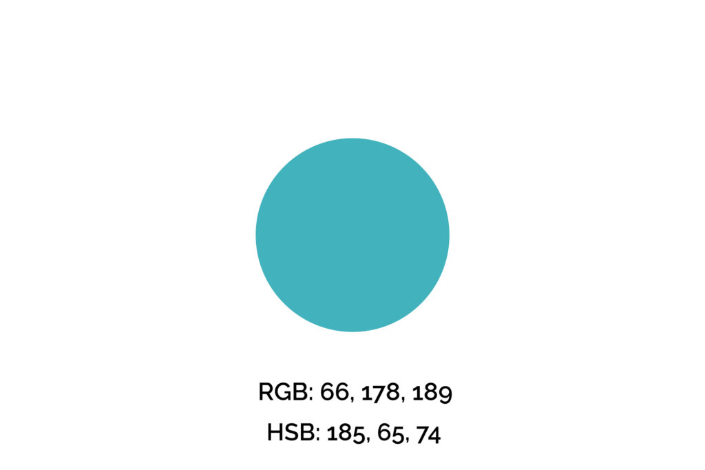
Step One: Pick Your Key Color
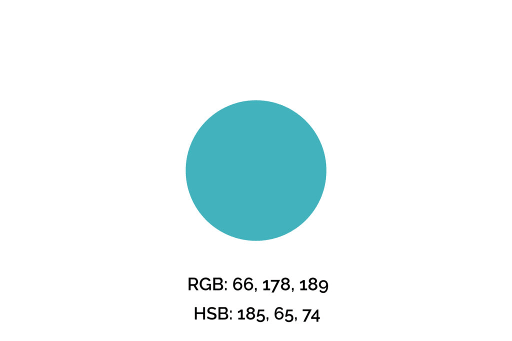
The key color we’ll use for this example is #42B2BD (maximum blue-green), one of my favorite shades of blue. However, if you’re picking a color for a brand, logo, or professional design, you can’t simply pick your favorite color.
We recommend you get familiarized with the meaning of the colors before making that decision. Also, many times this color will be given.
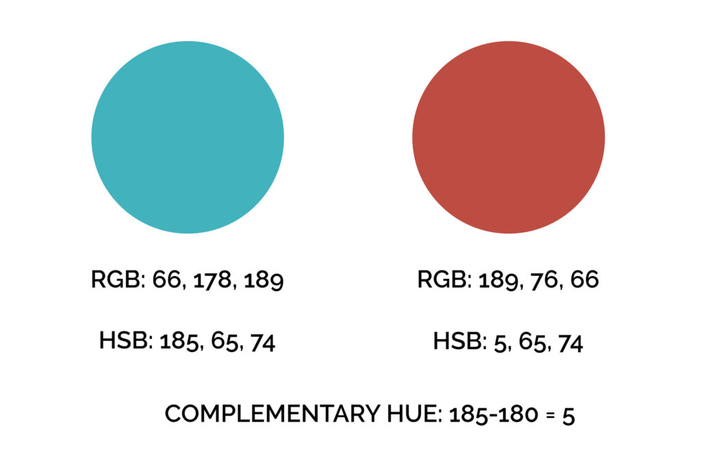
Step Two: Find the Complementary Color
Next, we’ll increase (or decrease, it doesn’t matter) the hue value by 180 to find its complementary color.
The reason for that is the color wheel has 360 degrees, so to find this blue’s opposite color, we need to travel halfway through the wheel, so 180 degrees.

Step Three: Make a Few Color Variations
Now we have two complementary colors to play with. But, if we want to create a color palette, we still need a few shades and tints more.
Below, you’ll find the HSB adjustments with the respective results we achieved.
For instance, we got a muted and darker shade of these colors by decreasing saturation and brightness.
Put simply, the muted shades have lower saturation and brightness. The result is a dark, muted color that evokes seriousness and sophistication.
Next, the dark shades have lower brightness, however, contrary to the muted versions, they have higher saturation, which results in deep and rich colors.
Lastly, the lighter tints have lower saturation and higher brightness to avoid a garish look.

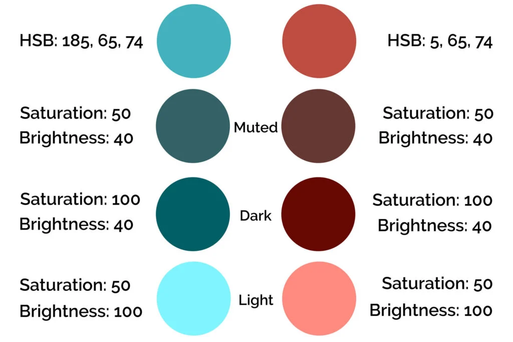
Note that we made the exact same changes to both colors. That’s essential.
Step Four: Select the Hue for Your Color Palette
Among the tints, tones, and shades we made above, we’ll select a few for the design.
The #42B2BD (maximum blue-green) is the primary color of this design.
We’ll go for the rich (dark) shade of the key color for titles and subheadings. For accents, like secondary buttons and details of the page, we’ll pick the secondary color (complementary to the blue) in its original values and its lightest tint.


The result is a harmonic design where the colors meet the brand’s needs and tone while drawing attention to the right elements.
Remember, when applying your color palette to a design, you want to use colors strategically, so they won’t overwhelm your clients/audience and will draw attention to what you want them to do, whether that’s a “sign-up,” “buy,” or “click here” button.
Wrapping Up on Complementary Colors
For many people, understanding complementary colors are the first step when diving into color theory.
Whether you’re an artist who works with color day in and day out, a designer who needs to feel comfortable assembling color palettes, or simply want to improve your eye for color, start by keeping an eye out for complementary colors in the world around you.
You’ll be surprised how often you find them.
Did you enjoy this article about complementary colors? Then share it with a friend who might also like it.
Kathryn
Wednesday 21st of June 2023
Beautiful explanations and clear layout. Thank you