Wanna learn what warm colors are and how to use them? Then you’ll enjoy reading this article!
Using color skillfully is a vital part of any visual creative profession. But understanding color temperature is more complex than you’ve probably been led to believe.
Trust us, the world of warm colors is more varied and expansive than just red, yellow, and orange.
In this post, we’ll explain the more comprehensive definition of warm colors, how to identify them, what their effects are, and give tips on how to effectively use warm and cool colors, no matter what project you’re working on.
What Are Warm Colors?
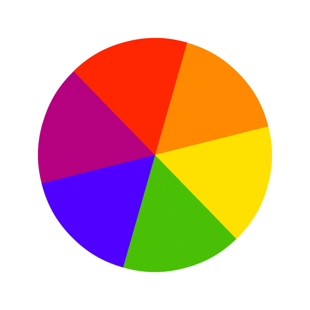
As a rule of thumb, the warm half of the color wheel generally ranges from yellows to red purples.
But as we’ll get into shortly, classifying specific colors as warm or cool is more complicated than that. Try to expand your definition of warm colors.
Instead of relying on specific hues, consider how warm colors make you feel. Warm colors pop into the forefront and give a feeling of warmth, closeness, and energy, as opposed to cool colors that recede.
Classifying Color Temperature Based on Undertones
Conventional wisdom dictates that reds, oranges, and yellows are always warm colors and all other hues are always cool. In practice, all colors have cool and warm tones.
For example, yellow (traditionally thought of as a warm color) can be cool or warm. A cool yellow has a greenish bias, while a warm yellow will have a reddish bias.
Similarly, warm reds have a yellow undertone (bias) and cool reds have a blue undertone. Color temperature ultimately depends on undertones.

By this logic, green and blue (both of which are traditionally seen as exclusively cool colors) can be warm as well. Warm greens have a yellowish bias. Warm blues have a reddish bias.
We recommend developing an eye for color temperature by learning to identify undertones. Paint swatches can be a great tool for this.
Try comparing two similar swatches and determining their temperature based on their differing undertones.
How to Identify Warm Colors
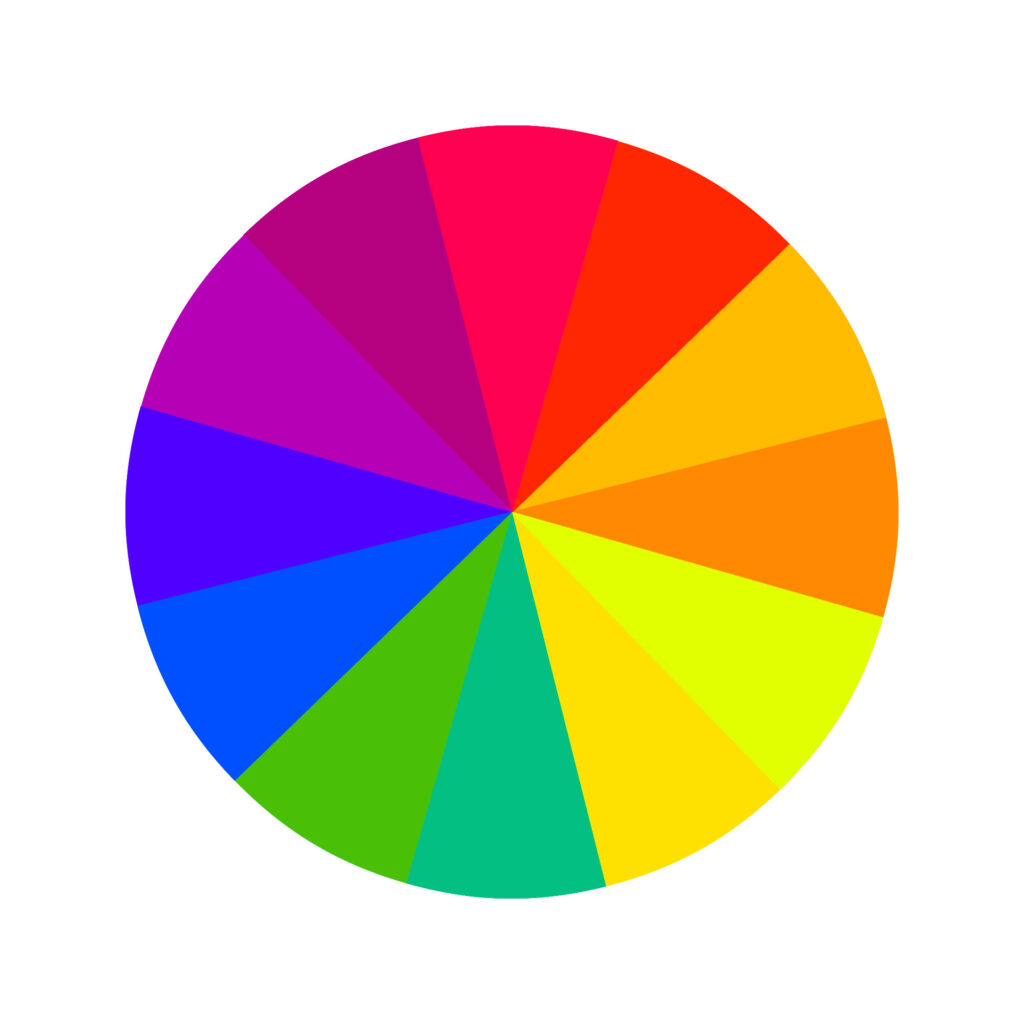
Warm colors look different depending on what color wheel you’re working with.
In the RYB color wheel (the color wheel you’re probably most familiar with), colors are classified based on what pigments are combined to create different hues.
Consider what pigments must have gone into creating the specific color you’re analyzing, and what color temperature dominates.
If you’re working with paints and are having a hard time deciding whether a specific paint is warm or cool, try mixing it with a bit of white. This can make the color’s undertones more apparent and easier to classify.


Digital projects like web design and digital art use the RGB color wheel. Warm colors in this color model have high red (or green) and low blue values.
For printed projects using the CMYK color wheel, warm colors have high magenta and yellow values and low cyan and black values.
In short, color temperature will be relative in most cases because it’s very unlikely you’ll be able to identify a warm blue next to any shade of red, only if you place it next to another shade of blue and can compare the undertones.
Color Theory and Temperature
Every artist and designer needs a firm understanding of color theory in order to master their craft. Color temperature is an integral part of color theory.
Part of this is understanding how color temperature factors into our feelings. Warm colors evoke a sense of closeness, energy, and instill action. Contrast this with cool colors, which instill feelings of relaxation, calmness, and stability.
Being conscious not only of how colors look but how they make us feel will give you greater mastery of how your work is perceived.
It’ll also make it easier to create harmonious color schemes that look visually appealing, whether you’re working with split-complementary, analogous, triadic, tetradic, square, or complementary color schemes.
Warm colors also tend to feel closer than their cool counterparts. They’re also more noticeable; all else equal, our eyes are drawn to warm colors more than cool colors.
Psychology of Color Temperature
As most of us know, each color temperature can evoke specific feelings in people.
However, the human response to color varies a lot per individual and society. This is important because you want to be conscious of how your creations will affect people when working with color.
Warm colors and earthy tones are stimulating and subconsciously remind us of sources of warmth and heat like fire and the sun, and are also considered welcoming colors. They can even increase blood pressure.
On the other hand, cool colors subconsciously remind us of nature and calming things, like grass and water. They’re generally soothing to look at.
Beyond that, it’s important to consider the meanings of the colors when creating branding colors or any design, really.

How to Use Warm Colors
Here are some tips on how to create a visually appealing warm color scheme.
How to Create a Warm Color Palette Using the 80 20 Rule
Even if you’re sure you want the benefits of a warm color palette, you don’t want your entire design to be warm colors.
Too much of the same color temperature or of strong colors can look monotonous – and with warm colors especially, it can get overwhelming.
Since warm colors naturally pop, relying too heavily on them can be exhausting to look at.
Instead, use the 80 20 rule: use about 80% warm shades in your design and let the remaining 20% consist of neutral colors or cooler shades (black accents, for example).
This gives you enough variation to experiment with tone and contrast while still benefiting from warm colors’ lovely energy.

Interior Design
Warm colors tend to come to the forefront. In interior design, that means a warm wall color will make a large room feel cozier and smaller while conveying feelings of happiness, energy, and encourage socializing.
That’s why warm tones are perfect for gathering spaces like living rooms and kitchens.
Remember, color temperature can also trigger our perceptions of taste, smell, temperature, weight, and sound. Therefore, if the dominant colors of a room are warm tones, people will often feel physically warmer than they really are.
However, rooms that receive little natural light are more dependant on artificial light, which plays a role in how the paint color casts. Keep that in mind!
Painting
Color temperature can guide not only your palette but also your composition.
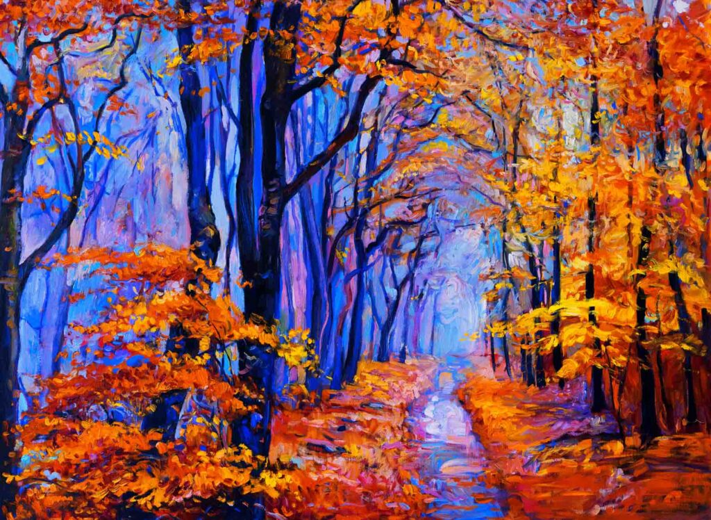
Warm colors feel physically closer than cool tones. You can use this to your advantage by using warm tones to paint focal points for extra emphasis.
If you’re painting a landscape or still-life where depth and dimension are key for adding a feeling of realism, use warm tones for items at the forefront and cool tones for backgrounds.
Even if your palette uses similar hues for both, slightly tweaking the temperature of the colors you’re using will add a subtle realistic touch.


Website Design
Warm colors evoke happiness, enthusiasm, and energy – all great traits for businesses and websites to be associated with.
That makes them popular choices for web design, but they’re surprisingly hard to use effectively. Red and orange can easily be overpowering. Pink is a softer choice, but it can feel too feminine. Yellow is often associated with children.
The key is to mix colors and specific hues that match the tone you’re aiming for. A slightly different shade of yellow can quickly take a website from feeling juvenile to feeling refined, yet cheerful.
The 80 20 rule is especially useful here. Choose your core palette carefully, then punctuate it with neutral or soft cool colors to give the viewer a break from all that warmth.
Did you enjoy reading about warm colors? Then share it with a colleague or friend who might also find it useful!