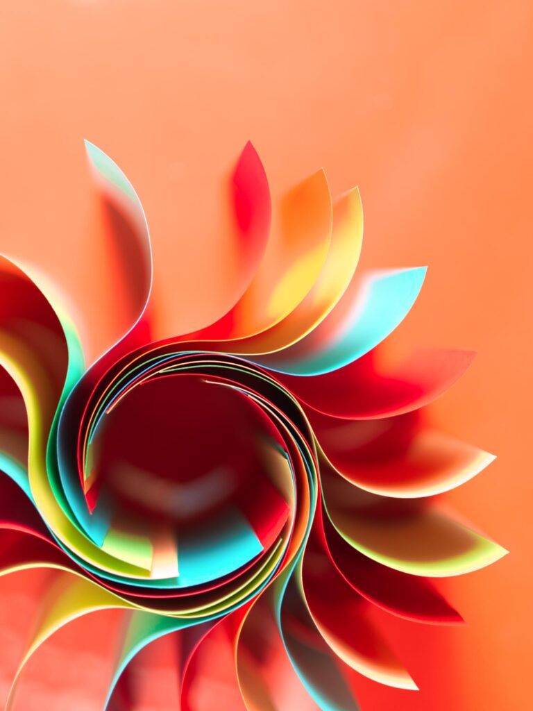
In today’s article, you’ll learn how to master tetradic colors, one of the most complex color schemes.
Tetradic colors (also known as rectangular colors) are one of the hardest color schemes to pull off effectively.
However, that also means when executed properly, they can produce a one-of-a-kind effect that stands out in a crowd. If you want to draw viewers’ attention with bold color contrast, a tetrad is a great way to go.
If you’re about to attempt a tetradic color scheme, read on for inspiration, tips, and how to create your own tetradic color palette.

Color Harmony
In color theory, color harmony refers to eye-pleasing and harmonious color combinations. The main seven color harmonies are:
- Complementary colors: pairs of colors that are positioned on opposite ends of the color wheel.
- Split-complementary colors: one primary hue and two hues adjacent to that primary color’s complement.
- Analogous colors: three hues, all positioned next to each other on the color wheel.
- Triadic colors: three colors evenly spaced on the color wheel.
- Tetradic colors: the complex color scheme we’ll talk about in today’s article.
- Square colors: four colors spaced evenly around the color wheel.
- Monochromatic color schemes: different shades, tints, and tones of one color family only.
What Are Tetradic Colors?
A tetradic color palette has four individual colors or hues if you will: a base color and three more colors, all equidistant from the base color on the color wheel.

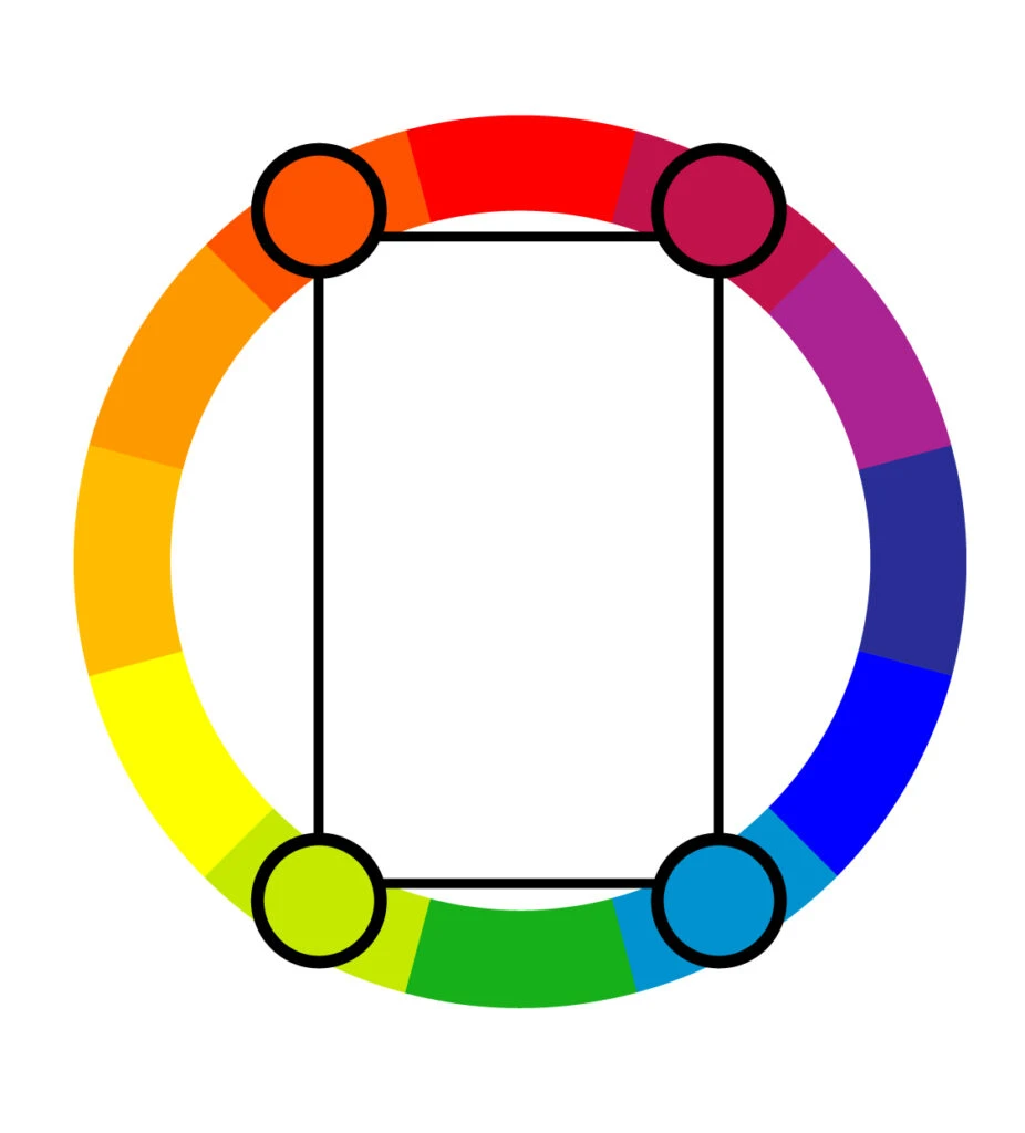
This can also be referred to as a “double-complementary color scheme” because it’s made up of two complementary color pairs.
Like any complementary scheme with a wide range of colors, the result is a vibrant palette rich with contrast.
Still, the tetrad is an aggressive color scheme because of its complementary pairs, which is why it needs good planning and a balanced emotional approach to relations of these colors.
Note that there are square tetradic color schemes and rectangular tetradic color schemes. In this post, we’ll be talking about rectangular tetradic colors.
For information about square tetradic color combinations and how to use them, check out our post about it at the link above.
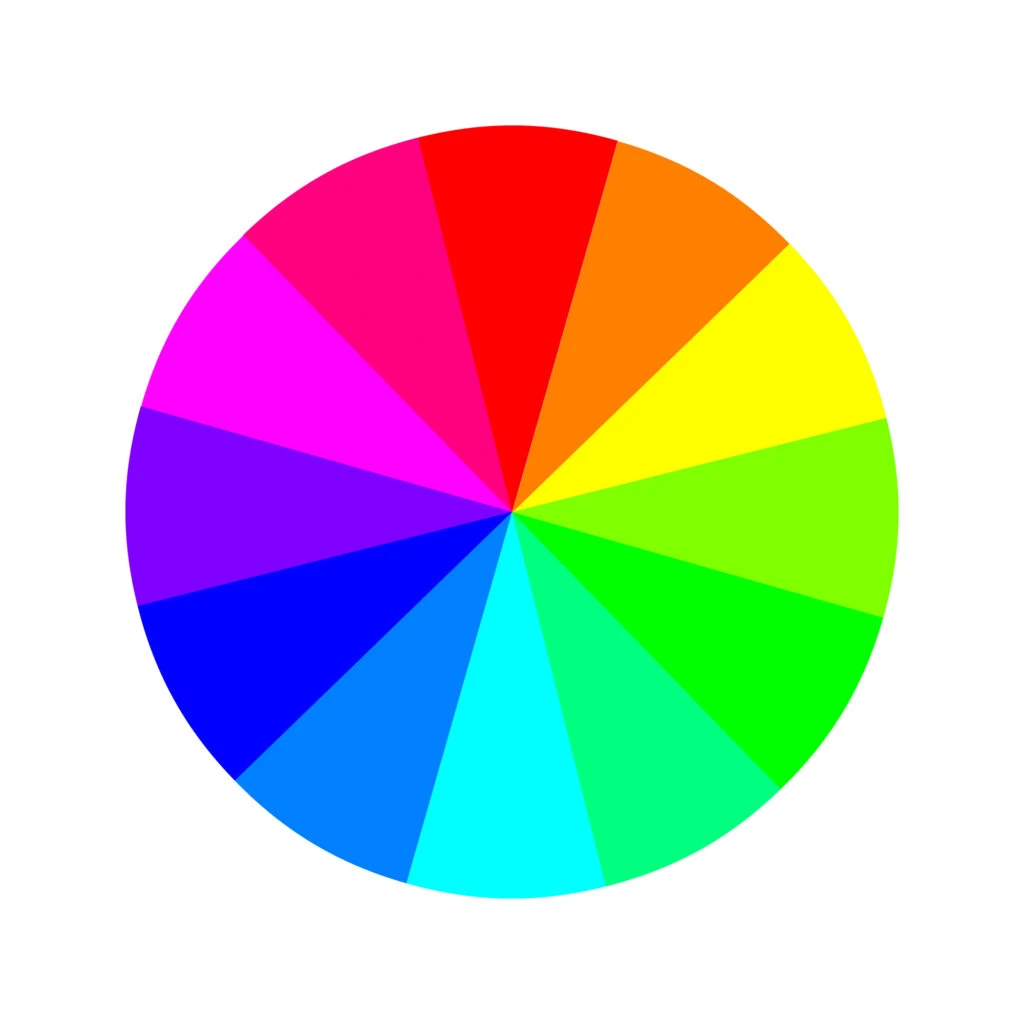
Different Color Models
To understand the full range of tetradic color schemes, it’s essential to have a basic understanding of colors. For that, we’ll take a quick look at both the traditional and modern color wheels.
The traditional color wheel is generally used by artists, while the modern color wheel is mainly used by web designers. However, both are important to understand regardless of what you’ll be using your color scheme for.
Traditional Color Wheel
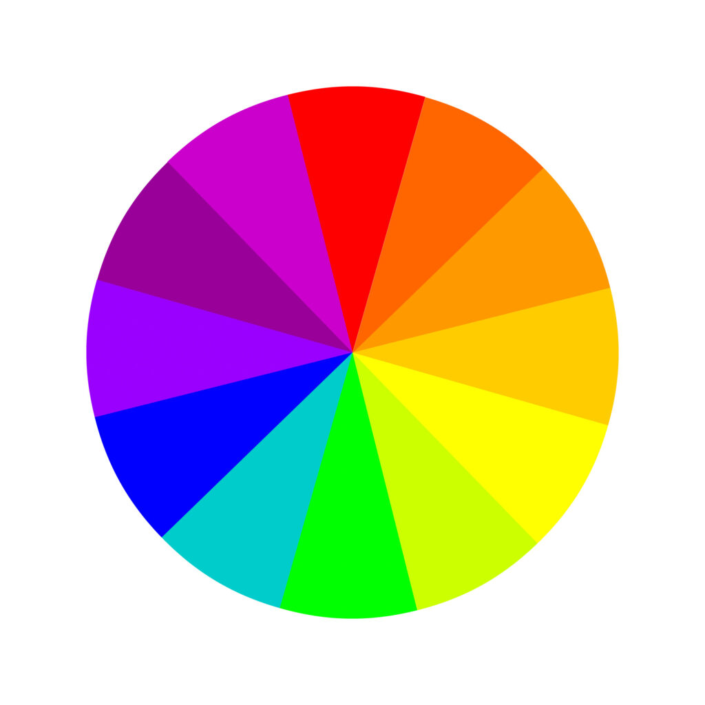

The traditional color theory was developed with paint-mixing in mind and is the classic color wheel we all learned about in Elementary School.
Beyond that, this standard wheel was created by Sir Isaac Newton in the 17th century. Back then, it was made of the seven colors of the rainbow, but it was later improved and adjusted to 12 colors as follows.
The color wheel has three primary colors: red, yellow, and blue. Three secondary colors: green, orange, and purple. And six tertiary colors: red-orange, yellow-orange, red-purple, blue-purple, blue-green, and yellow-green.
Beyond that, the traditional color theory hinges on three main concepts: hue (a color’s position on the basic color wheel), value (lightness or darkness), and chroma (how saturated the specific shade is).
These are all intuitive to conceptualize if you think about mixing paint – using white, black, or gray paint to achieve different values and chromas.
Beyond that, the traditional color theory is a subtractive color model. This means pigments are applied to a blank surface (like a canvas) that doesn’t give off its own color.
Think about when you paint a wall. The wall’s original color doesn’t shine through or change the way the new paint looks. Keep this in mind as we compare traditional and modern color theories.
Modern Color Wheel
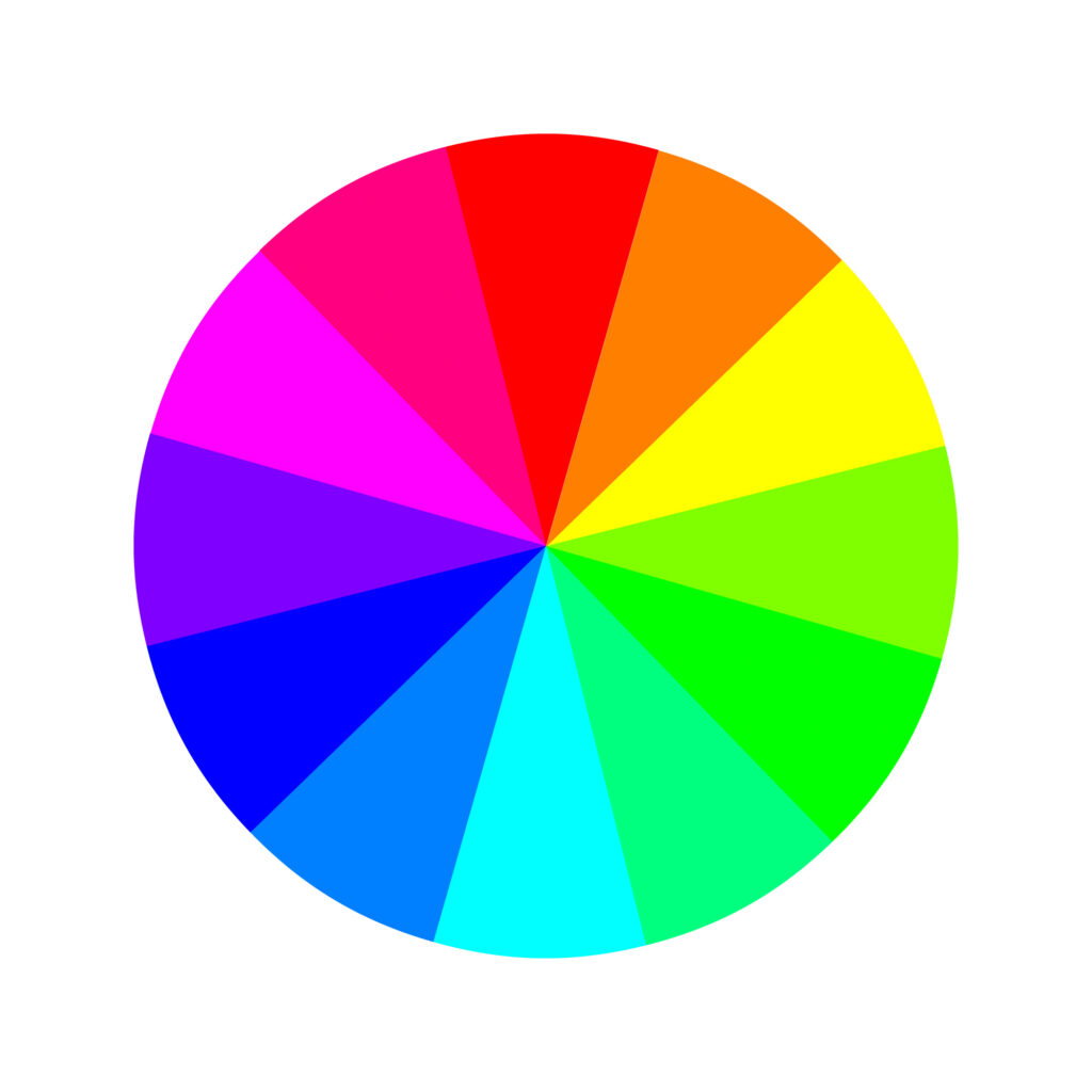
The modern color theory came about with the digital age to explain how colors show up on digital screens (RGB) and how printers translate those colors onto paper (CMYK).
While the traditional color theory is based on mixing paint, modern color theory is based on mixing light.
Making colors appear on a TV screen or computer monitor involves an additive color model.
That’s because digital screens are black, rather than white, by default, which changes how colors are perceived by the human eye. Digital screens operate on an RGB color wheel. Here are its 12 colors:
Three primary colors: red, green, and blue. Three secondary colors: yellow, magenta, and cyan. And six tertiary colors: orange, rose, purple, azure, spring green, and chartreuse.
Printers, however, still use a subtractive color model, since they’re translating digital colors onto a piece of paper. But instead of the RYB primary colors, printers have CMY(K): cyan, magenta, yellow, and key (black).
Basic Tetradic Colors
Because modern and traditional color theories operate with different sets of primary colors, this will affect what tetradic color schemes you can create with each.
Here are a few examples to give you an idea of what we’re talking about:
In the RYB model:
- Red, orange, green, and blue
- Yellow, orange, blue, and purple
- Red-orange (vermillion), yellow-orange (amber), blue-green (teal), and blue-purple (indigo) – all tertiary colors
- Blue-purple (indigo), red-purple (magenta), yellow-orange (amber), and yellow-green (chartreuse)


In the RGB model:
- Red, yellow, blue, and cyan
- Green, blue, yellow, and magenta (primary and secondary colors)
- Red-magenta (rose), orange, green-cyan (spring green), and blue-cyan (azure)
- Green-cyan (spring green), green-yellow, red-magenta (rose), and blue-magenta (purple)


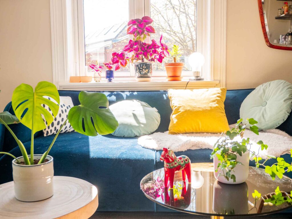
Practical Applications of Tetradic Colors
Tetradic colors are some of the boldest, most vibrant color schemes in the designers’ toolkit.
More often than not, this color combination will look vibrant, cheerful, and colorful. While that’s a great thing, it also means they should be used judiciously and with caution.
If applied with an unpracticed hand, tetrads can look aggressive and even a little nervous. You’ll always turn heads with a tetrad, but you run the risk of people quickly looking away if you veer into garish territory.
Let One Color Dominate

Beginners often try not to play favorites with their color palette, using each hue in equal amounts.
But this can often result in an aggressive color scheme, even if you use lighter shades or unsaturated versions of your hues.
Instead, do the exact opposite: use a dominant color and use the others for accents only.
Use the others hues as accent colors or for any pops of color which support the main hue and add complexity and edge.
Be Careful Balancing Warm and Cool Tones


No matter what hues you choose, you’ll always end up with two warm colors and two cool colors in a rectangular tetrad.
It might sound like a good idea to use them in equal measure to produce a balanced effect. And in the right hands, that can produce a lively, festive feeling.
But you also run the risk of creating a hectic, busy end result that brings to mind the decorations at a children’s birthday party.
If you’re going for a more reserved vibe, commit to relying more on one color temperature, either warm or cool tones. Bring out the other two hues sparingly.
Keep Your Chromas and Values Similar


This almost goes without saying, but it’s particularly important with a tetradic palette, which has so much potential for chaos.
If you want a subdued effect, make all the colors equally diffuse. If you’re going for bold, make sure every hue is balanced in its boldness.
If you’re having a hard time making your tetradic color scheme blend together nicely, try muting the colors or going for a more pastel look. You’ll keep that lovely contrast, but the palette itself will be a bit easier on the eye.
Use Neutrals for Text and Accents
Neutrals and paler versions of a hue are essential colors in a design, especially with so much contrast.
That’s why you need a neutral to anchor this color scheme. If you’re designing a website or product packaging, keep key information and most of your text a neutral color.
That will give the eye a rest and let the colors pop where they belong – in the background.
How to Create a Tetradic Color Scheme
Based on all tips and advice shared in this article, we’ll briefly cover how you can create your own tetradic color scheme.
Regardless of the color scheme, all designs begin with one color, one hue. From there, you have to make color adjustments to achieve the look you want and bring your message across.
To achieve that, many designers work in the HSB color system, which stands for hue-saturation-brightness.
By adjusting the hue, well, you’ll change the color. E.g., blue, red, or yellow.
By adjusting the saturation, you’ll change the richness of the color. E.g., a less saturated blue gives you a muted tone of blue. In contrast, more saturation gives you a bright blue.
Lastly, by adjusting the brightness, you’ll change how the color will look, depending on the saturation–lighter or darker.
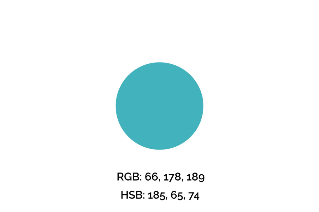
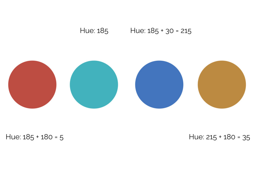
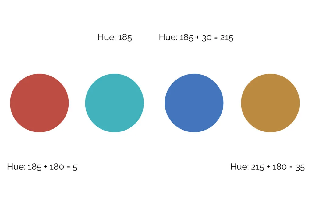
Step One: Pick Your Key Color
The key color we’ll use for this example is #42B2BD (maximum blue-green), one of my favorite shades of blue. However, if you’re picking a color for a brand, logo, or professional design, you can’t simply pick your favorite color.
We recommend you get familiarized with the meaning of the colors before making that decision. Also, many times this color will be given.
Step Two: Find the Tetradic Colors
Now, we’ll adjust the hue value by 30 to find its analogous color. You can increase or decrease this value based on the colors you want to use. Next, adjust both hue values by 180 to find the double complementary pairs.
The reason for that is the color wheel has 360 degrees, so to find this rectangle of colors, we need to first find these two pairs.
If necessary, adjust saturation and brightness to achieve more contrast between colors.
Step Three: Apply the Tetradic Color Palette to Your Design
Because this is such a colorful scheme, we’ll stick to a cool tone and let the blues dominate this design. Still, there are many other possible combinations.
For the project below, the outcome is a harmonious design that uses warm colors in the details and accents without being overwhelming.
Remember, when applying your color palette to a design, you want to use colors strategically, so they won’t overwhelm your clients/audience and will draw attention to what you want them to do, whether that’s a “sign-up,” “buy,” or “click here” button.


Wrapping Up on Tetradic Colors
Tetradic color schemes can be tricky – they’re high-risk, high-reward.
Still, if you follow a few guidelines and work with a practiced hand, you’ll have no trouble turning heads and getting your viewers’ attention.
Whether you’re a graphic designer, student, or interior designer, this rich color scheme offers plenty of possibilities for basically any purpose.
Did you enjoy this article about tetradic colors? Then share it with a friend who might also like it.