In today’s article, you’ll learn how to master split complementary colors, one of the most basic color schemes.
The simplest color combinations have just one or two hues, but introducing a third color can add complexity and lead to some really nice results, which is a good choice for beginners.
One of the simplest and most approachable color schemes is the split complementary scheme (also known as a compound color scheme).
In this post, we’ll talk about what split complementary colors are, list a few common split complementary color combinations, explain how you can put this scheme to use in your designs, and how to create this scheme yourself.


Color Harmony
In color theory, color harmony refers to eye-pleasing and harmonious color combinations. The main seven color harmonies are:
- Complementary colors: pairs of colors that are positioned on opposite ends of the color wheel.
- Split-complementary colors: the simple but effective color scheme we’ll talk about in today’s article.
- Analogous colors: three hues, all positioned next to each other on the color wheel.
- Triadic colors: three colors evenly spaced on the color wheel.
- Tetradic colors: a base color and three more colors, all equidistant from the base color on the color wheel.
- Square colors: four colors spaced evenly around the color wheel.
- Monochromatic color schemes: different shades, tones, and tints of one color family only.
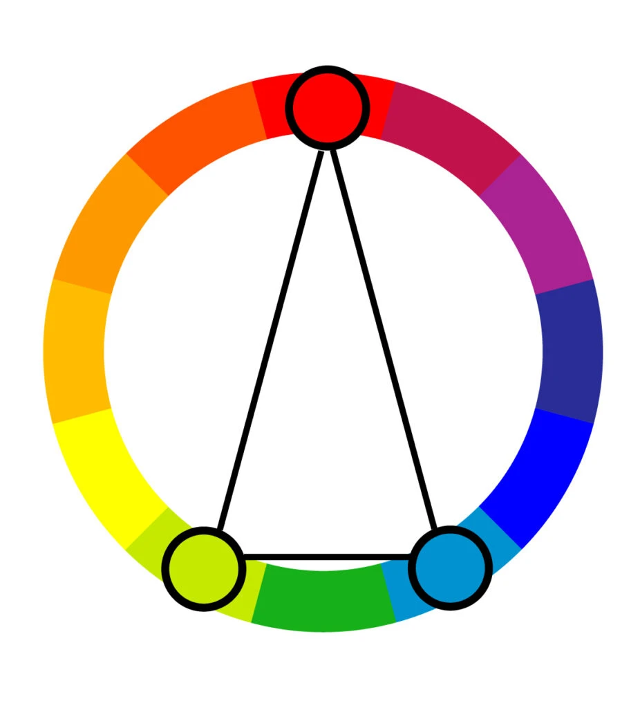
What Are Split Complementary Colors?
The split-complementary color scheme can be thought of as the simpler two-color complementary color scheme’s cousin.
Split complementary combinations are slightly more complex because they have three hues like the analogous color scheme. This is desirable for a number of reasons, which we’ll get into below.
The simplest split complementary color schemes have one key color and two colors adjacent to that key color’s complement. But you can choose any base color you like.
To create a split complementary color scheme, start by choosing a base color. Then find its complement, the color directly across the color wheel from it. Identify the two evenly spaced colors directly adjacent to the complementary color. Those are your three split complementaries.

For a more vibrant palette, you generally want a wider distance between the two secondary colors.
For a reserved palette, choose secondary or tertiary colors that are very close together (just make sure they don’t blur together too much).
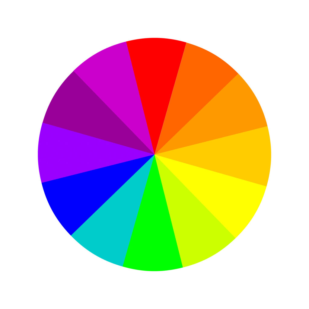
Beyond that, the 17th-century color wheel (color circle) created by Sir Isaac Newton is the base for all color combinations we know today. It was made of the seven colors of the rainbow, but it was later improved and adjusted to 12 colors.
Different Color Models
There are two different sets of split complementary color combinations. That’s because there are two main models of color theory, each with its own color wheel (or color circle, if you will).
Both are important in different situations, so it’s worth reviewing both models.
Remember, the rules to identify a set of split complementary colors remain the same regardless of which color model we use.
But the split-complementary color schemes we can create from each color wheel will differ.
Traditional Color Wheel

The traditional color theory is what most people learn about in school as kids. It’s mainly used by artists and in traditional art methods (like drawing and painting).
The classic color wheel is based on what happens when you mix paint colors together. But it’s still relevant to non-artists.
In this model, the primary colors are red, yellow, and blue (RYB). The traditional color wheel theory operates on the three principles of hue (what non-artists often call “color”), value (light or darkness), and chroma (saturation). Here are its 12 colors:
Three primary colors: red, yellow, and blue. Three secondary colors: green, orange, and purple. And six tertiary colors: red-orange, yellow-orange, red-purple, blue-purple, blue-green, and yellow-green.
Modern Color Wheel
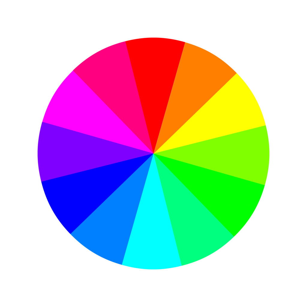
The modern color theory came about with the advent of computers and is mainly used by web designers and people who work with color on a computer screen.
This color theory is more comprehensive because it accommodates how colors appear on digital screens.
While traditional color theory talks about mixing paint, modern color theory considers how computers mix light.
The (RGB) additive color model, starts with black (a screen) and adds pigment to that surface to create colors. That’s how your computer monitor and TV screen display color. Here are its 12 colors:
Three primary colors: red, green, and blue. Three secondary colors: yellow, magenta, and cyan. And six tertiary colors: orange, rose, purple, azure, spring green, and chartreuse.
In contrast, printers operate on a CMY(K) primary color wheel – cyan, magenta, yellow, and key (another term for black).
This is a subtractive model, which means the pigment is applied to a white background that doesn’t give off its own pigment (like paper). In a subtractive model, color is basically being created from scratch.
Basic Split Complementary Colors
Because the traditional and modern color theories each have their own color wheels, you can access different split complementary color combinations depending on which color wheel you’re using.
Here are a few basic combinations for each:
In the RYB model:
- The direct complement of red is green – the hue directly across from red on the color wheel. The split complement for red would include green-yellow and blue-green (teal).
- The direct complement of yellow is purple, so the split complement for yellow would include red-purple (magenta) and blue-purple (indigo).
- The direct complement of blue is orange, so the split complement for blue would include yellow-orange (amber) and red-orange (vermillion).


In the RGB model:
- According to the RGB model, the direct complement of red is cyan, so the split complement for red would include green-cyan (spring green) and blue-cyan (azure).
- The direct complement of green is magenta, so the split complement for green would include rose and purple.
- The direct complement of blue is yellow, so the split complement for blue would include orange and green-yellow.
- The direct complement of yellow is blue, so the split complement for yellow would include purple and blue-cyan.


Practical Applications of Split Complementary Colors
Split complementary color combinations are generally easy to use. Beginner artists and graphic designers often gravitate toward these types of combinations as they start to branch out into more complex color schemes since they’re approachable and intuitive.
They work especially well with artwork since it gives you enough colors to work with and it’s easy to understand how to use them: use the two base colors for most of the artwork and the accent color for – you guessed it – accents.
In web design, use the two nearly adjacent colors for most of the web page. Reserve the accent color to draw attention to crucial information like a company logo or actions you want visitors to the site to make.
Identify the Most Dominant Color


For example, if you’re working with yellow, blue-purple, and red-purple, the two purples will be more dominant than the lone yellow hue.
Try focusing more on the purple hues and reserving yellow for accents.
Don’t Overdo it With the Accent Color
Triadic color schemes are usually quite vibrant, even if you use pale or unsaturated versions of your hues.
So lean into the two hues that naturally look nice together. Don’t overcomplicate things by separating them. More often than not, you’ll only need touches of the third color.
Embrace the Scheme’s Temperature


With this color scheme, you’ll always be working with a combination of one warm and two cool colors (or vice versa).
That means your overall design, artwork, website, or product will be mainly the same color temperature as the two supporting colors.
Choose them accordingly to make sure you set the right tone. Otherwise, you might find yourself relying too heavily on the accent color, which will lead you in the wrong direction.
How to Create a Split-Complementary Color Scheme
Based on all tips and advice shared in this article, we’ll briefly cover how you can create your own split-complementary color scheme.
Regardless of the color scheme, all designs begin with one color, one hue. From there, you have to make color adjustments to achieve the look you want and bring your message across.
To achieve that, many designers work in the HSB color system, which stands for hue-saturation-brightness.
By adjusting the hue, well, you’ll change the color. E.g., blue, red, or yellow.
By adjusting the saturation, you’ll change the richness of the color. E.g., a less saturated blue gives you a muted tone of blue. In contrast, more saturation gives you a bright blue.
Lastly, by adjusting the brightness, you’ll change how the color will look, depending on the saturation–lighter or darker.
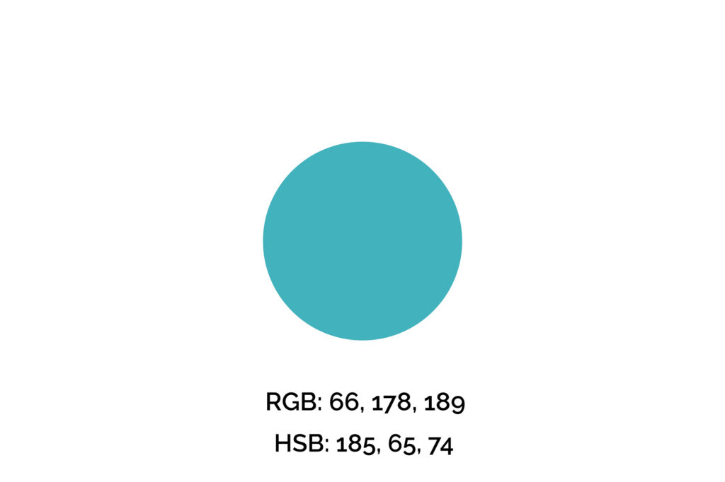
Step One: Pick Your Key Color
The key color we’ll use for this example is #42B2BD (maximum blue-green), one of my favorite shades of blue. However, if you’re picking a color for a brand, logo, or professional design, you can’t simply pick your favorite color.
We recommend you get familiarized with the meaning of the colors before making that decision. Also, many times this color will be given.
Step Two: Find the Split-Complementary Colors
Next, we’ll decrease and increase the hue value by 150 to find its split-complementary colors.
The 150 value isn’t random, though. The reason for that is the color wheel has 360 degrees, so to find this blue’s split-complement colors, we need to create a narrow triangle on the wheel, so 150 degrees.


You may adjust saturation and brightness for better contrast between the colors.
Step Three: Apply the Split-Complementary Color Palette
The third and final step is to apply the colors we’ve found to the project below.
In this case, we let the warm tones take the center stage and used the #42B2BD (maximum blue-green) in the call-to-action button.
The outcome is a harmonic and eye-pleasing design where the colors convey the brand’s message while drawing attention to the right elements.


Remember, when applying your color palette to a design, you want to use colors strategically, so they won’t overwhelm your clients/audience and will draw attention to what you want them to do, whether that’s a “sign-up,” “buy,” or “click here” button.
Wrapping Up on Split Complementary Colors
If you find yourself limited by simple complementary pairs, branching into split complementary triads can open up plenty of possibilities where you can create your own exclusive color palettes.
While this color scheme is approachable and almost always looks nice, take care to rein yourself in so it doesn’t veer into the overwhelming territory.
After all, this is a strong color scheme that’s hard to mess up. Still, you want to use it judiciously. When used incorrectly, split complementary colors can look busy.
It can take some finessing to get them to play nicely together because the colors often don’t initially look like they’d go well together.
Did you enjoy this article about split complementary colors? Then share it with a friend who might also like it.