Wanna learn what cool colors are and how to use them? Then you’ll appreciate reading this post!
Harnessing the power of warm and cool colors is a crucial skill for anyone who frequently works with color.
But working with cool colors is about more than just using blues and greens and avoiding reds and yellows.
In this article, we’ll go over the definition of cool colors (it’s more complex than you probably think), how to identify them, what their effects are, and how to skillfully use them in your work.

What Are Cool Colors?
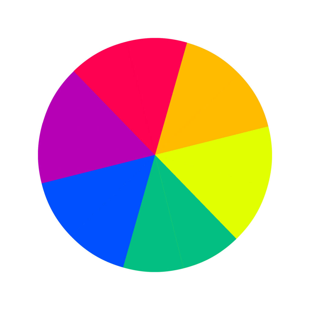
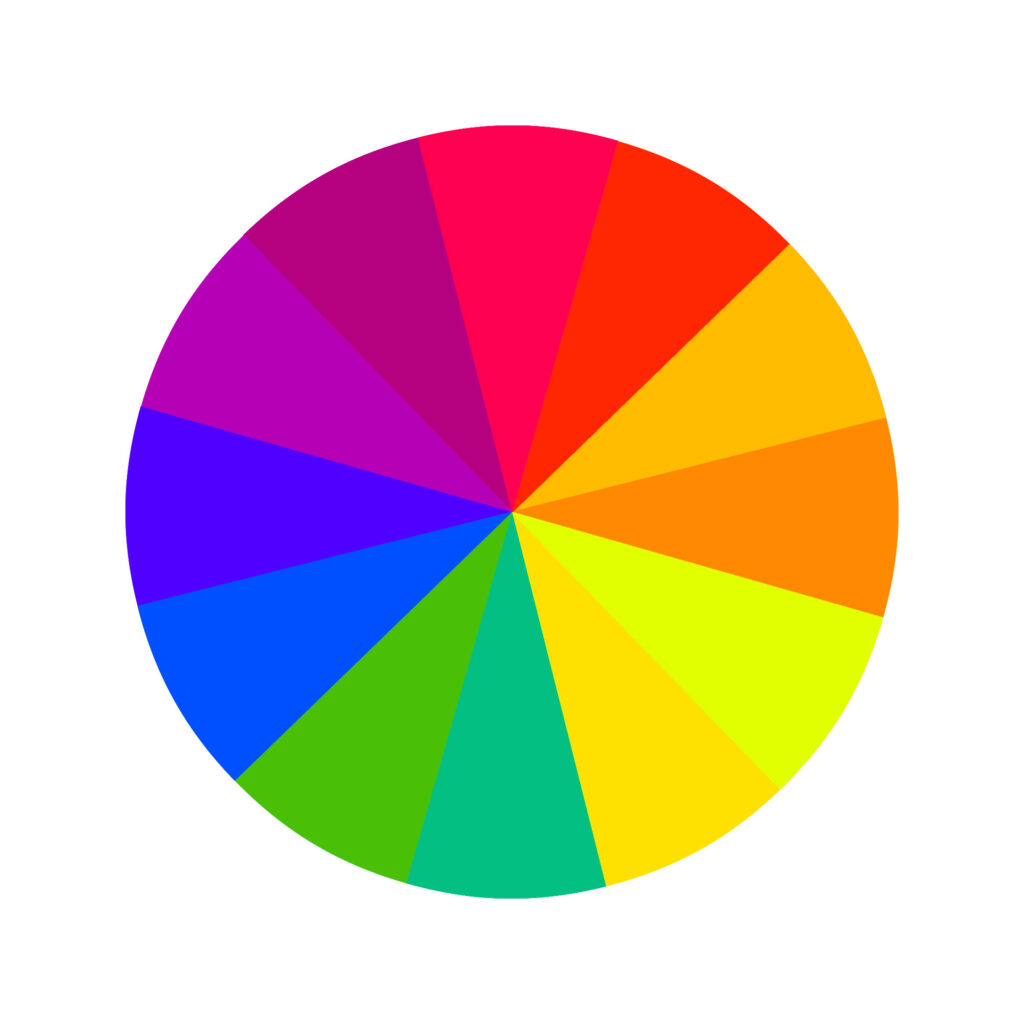
The color wheel is split evenly between cool and warm colors.
As children, we’re often told that blue, green, and purple are cool colors, and red, yellow, and orange are warm colors. They’re grouped by color family. But it’s not that simple (we’ll get more into this later).
A better (though less cut-and-dry) way to define cool colors is that cool colors are “passive” hues. They evoke a sense of calmness, harmony, stability, and relaxation.
While blue, green, and purple are excellent relaxing colors, they can also be warm colors.
Classifying Color Temperature Based on Undertones
As a general rule, greens, blues, and purples are cool colors. But in practice, all colors contain cool and warm tones – it’s part of what makes the world of color so rich and varied.
So while you can use this “all greens, blues, and purples are cool” rule as a starting point, it ultimately depends on what shade you’re working with.
That’s why red and yellow can be cool-toned sometimes. Depending on the specific shade, you might have a warm yellow with a red tint or a cool yellow with green undertones.

Similarly, you can have a warm red with yellow tones or a cool red with blue undertones.
Because blue is the coolest primary color, any color with a blue undertone will be considered a cool color, whether that’s red or green.
To develop an eye for spotting cool and warm tones, instead of relying on basic rules, try comparing similar color swatches and determining their temperature.
How to Identify Cool Colors
While this seems simple, it can get tricky to know whether an individual color falls on the warm or cool end of things when you’re working with the whole rainbow and a wide range of hues.
When deciding whether a specific hue is cool, consider what type of color wheel applies in your situation.
If you’re painting, the RYB color wheel applies. Ask yourself, “what pigments had to be mixed together to create this color? What color temperature is dominant?”
Digital projects use the RGB color wheel. Cool colors can easily be identified by those with low red (or green) and high blue values.
For printed projects on the CMYK color wheel, you can tell which colors are cool by which ones have low magenta and yellow values and high cyan or black values.
In short, color temperature will be relative in most cases because it’s very unlikely you’ll be able to identify a cool red to any shade of blue, only if you place it next to another shade of red and can compare the undertones.

Color Theory and Temperature
A solid understanding of color theory is invaluable for designers and artists who want to use visually appealing color harmonies in their work, whether they’re working with split-complementary, analogous, triadic, tetradic, square, or complementary color schemes.
Color temperature is a key part of color theory. Not only do certain colors look nicer together than others, but cool and warm colors behave differently.
Cool colors recede and appear more distant than warm colors, which evoke a feeling of closeness.
Classifying color temperature based on undertones is a key aspect of color theory. Another core principle is harnessing the psychological power of warm and cool colors and the feelings they can evoke.
Psychology of Color Temperature
As most of us know, each color temperature can evoke specific feelings in people.
However, the human response to color varies a lot per individual and society. This is important because you want to be conscious of how your creations will affect people when working with color.
Cool tones convey feelings of relaxation, calmness, and stability. Conversely, warm colors energize, rejuvenate, and encourage action. They’re often seen as vibrant colors from an energizing standpoint.
This comes into play frequently when choosing color palettes for real-world projects.
Beyond that, it’s essential to consider the meanings of the colors when creating branding colors or any design, really.


How to Use Cool Colors
In order to have a masterful command of color in your work and create a harmonious cool color scheme, be mindful not only of what colors look nice in your project but of how they behave from a color theory standpoint.
Remember, cool colors recede and fade into the background, seeming more distant and literally farther away. They also convey feelings of relaxation and calmness.
If those are part of your objectives for your project, a cool palette might be right for the task at hand.
How to Create a Cool Color Palette Using the 80 20 Rule
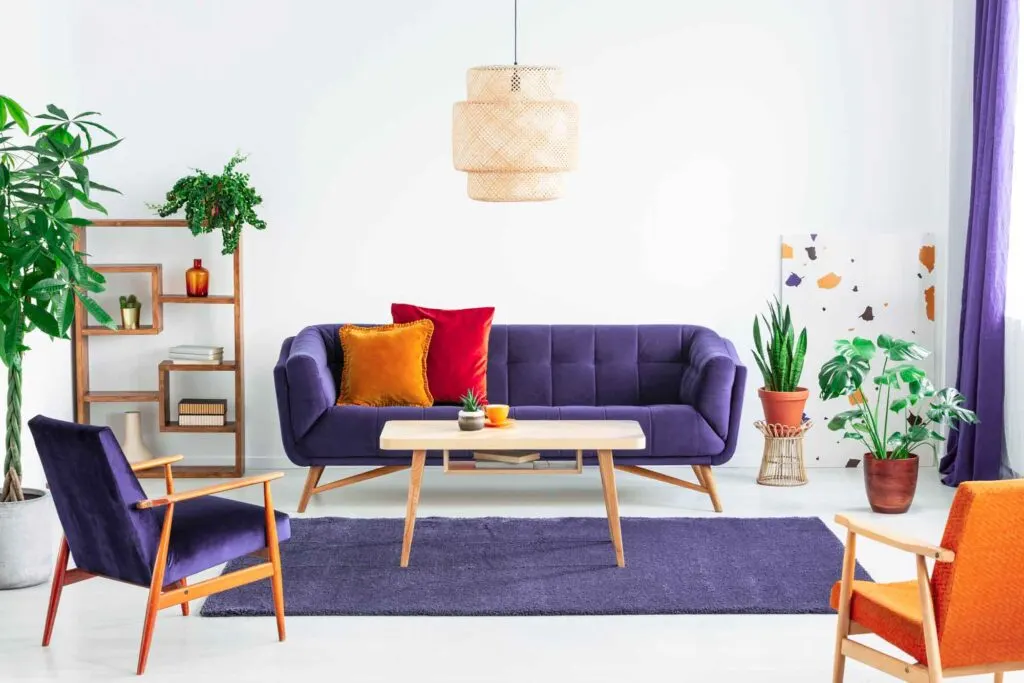
If you’re aiming for a predominantly cool palette, use about 80% cool tones in your design. For the remaining 20%, use warm tones or neutral colors.
Too much of the same tone can be boring or seem overly cold. Incorporating pops of warmth retains the comfort of cool tones without getting lost in a sea of receding colors.
It also makes it easier to introduce contrast into your design, making it more readable and visually interesting.
By using the 80 20 rule, you can drive home the vibe you’re aiming for while having some room to play. You can use accent colors to direct the viewer’s attention where you want it to go.

Interior Design
When most people design an interior space, they tend to start with personal preference rather than color theory. But understanding color theory can help you harness the power of color and wield it more deliberately.
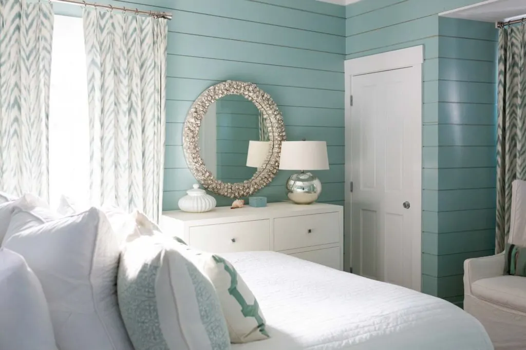
Because cool colors seem to fade into the background, painting walls cool colors can help small rooms (like compact bedrooms or cramped powder rooms) seem larger and more spacious.
Cool colors also instill soothing, airy, and steady feelings. Try using this to complement the aesthetic or function of a room, like a bedroom or a bathroom, both of which are designed for relaxation.
In general, cool colors are usually better for private rooms, while warm colors may be better for social and public rooms (to inspire togetherness).
Painting
Choosing hues based on their undertones can help your artwork’s mood as well as its composition.
You want to have a handle on how colors affect viewers to make your art more effective and to help viewers see what you want them to see when they look at your art.
Use cool colors to evoke feelings of relaxation and tranquility. Pops of warm tones can energize, create a sense of urgency, and draw the eye toward focal points.
Because cool colors recede, you can use this to your advantage to create dimension. For example, paint distant mountains in cool tones and nearby objects in warmer tones.


Even if you’re using similar colors (like a palette heavy in blues and greens), you can use cool and warm versions of similar colors to give dimension and the illusion of depth.
If you’re ever struggling to determine whether an actual color is cool or warm (which can be especially challenging for darker hues), try mixing in a bit of white paint.
In most cases, you’ll be able to distinguish the color’s bias based on that.
Web Design
Cool colors are easy on the eye, making them easy to use in large swaths. Also, because they recede, cool colors are ideal background colors for a number of projects, such as a cool shade of light blue.
If you want to create a website that’s easy on the eyes, consider using cool colors for most of your site’s design. Then rely on pops of warmth for action items and to draw attention to key items.
Did you enjoy reading about cool colors? Then share it with a colleague or friend who might also find it useful!