In today’s article, you’ll learn how to master monochromatic colors, one of the richest color schemes.
Monochromatic color combinations often get a bad rap for being boring or overly simple. But when used well, monochromatic colors can pack a huge visual punch.
In this post, we’ll discuss what monochrome colors are, the benefits of monochromatic color schemes, how to use these color schemes effectively, and how to create a monochromatic color palette.


Color Harmony
In color theory, color harmony refers to eye-pleasing and harmonious color combinations. The main seven color harmonies are:
- Complementary colors: pairs of colors that are positioned on opposite ends of the color wheel.
- Split-complementary colors: one primary hue and two hues adjacent to that primary color’s complement.
- Analogous colors: three hues, all positioned next to each other on the color wheel.
- Triadic colors: three colors evenly spaced on the color wheel.
- Tetradic colors: a base color and three more colors, all equidistant from the base color on the color wheel.
- Square colors: four colors spaced evenly around the color wheel.
- Monochromatic color schemes: the rich color scheme we’ll talk about in today’s article.
What Are Monochromatic Colors?
People tend to assume monochromatic color schemes only consist of a single hue in the same shade, but that’s incorrect.
Monochromatic color schemes use a single base hue and extend the color scheme by using different shades, tones, and tints of that color family.

Instead of resulting in a flat, lifeless look (like you would if you were to only use a single shade of the same color throughout), monochromatic color schemes can be deceptively complex and rich.
Components of Monochromatic Schemes
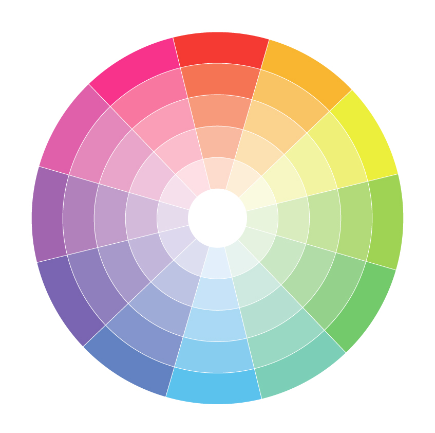
Before we dive into monochromatic schemes, it’s essential to have a certain understanding of color. Let’s begin with the color wheel.
The 17th-century color wheel (color circle) created by Sir Isaac Newton is the base for all color combinations we know today. It was made of the seven colors of the rainbow, but it was later improved and adjusted to 12 colors.
These 12 colors are divided into three types of hues as follows:
Three primary colors: red, yellow, and blue. Three secondary colors, which are made by mixing two primary ones: green, orange, and purple. And six tertiary colors, which are made by mixing a primary and a secondary hue: red-orange, yellow-orange, red-purple, blue-purple, blue-green, and yellow-green.
However, according to the RGB color wheel, these are circle colors:
Three primary colors: red, green, and blue. Three secondary colors: yellow, magenta, and cyan. And six tertiary colors: orange, rose, purple, azure, spring green, and green-yellow.
Knowing these hues can help you pick the right colors for your design, which you can do by using an online tool too.

While there are plenty of tools online to help you create a monochromatic color scheme, all you really need to create a perfect monochromatic color palette is a single hue and white, gray, and black to mix with it.
- Hue: This is the single base color the rest of your color scheme hinges.
- Tint: Lighten your base hue by adding white to it.
- Tone: Adjust the saturation and intensity of your base hue by mixing it with gray. This can create a more diffuse tone.
- Shade: Adjust the shade of your base hue by adding black to it.
You can create a nearly endless palette from a single hue by adjusting how much white, gray, and black you add to the single color.
With just a bit of experimentation, you’ll find a monochromatic color scheme that can actually include a huge range of options.
Things to Consider When Using Monochromatic Colors
How to Choose Your Base Color


If you’re designing a logo or product for a company, most of the time your base color will already be chosen for you.
But if you’re decorating a room or completing an art project, you might have the entire color wheel to choose from. Your decision could be based on pure preference–your favorite color.
You can even choose a neutral color as your base color, which is a safer option for beginners.
However, you might consider narrowing your search down to either warm or cool tones, depending on what feeling you’re trying to evoke. When in doubt, look at the color wheel.
Also, remember that setting matters. If you’re choosing the base color to paint the walls of a small room with little daylight, consider a lighter base color to brighten the room and help it appear larger.
A dark shade or overly saturated base color across a wide expanse can feel overwhelming.
Why Color Temperature Matters in a Monochromatic Color Palette

Any color enthusiast knows different colors make us feel different things. Warm tones tend to energize and invigorate, but can be overwhelming or stressful to look at depending on how they’re used.
Cool colors tend to be soothing and relaxing but can feel flat and lifeless if used poorly.
When you’re working with a monochromatic palette, that adds extra weight to the temperature of the color you’re working with. Carefully consider what feelings you’re trying to evoke and let that purpose guide you in your choice.
Practical Applications of Monotone Colors
Contrary to popular belief, monochromatic color schemes can be extremely eye-catching.
A mural comprised entirely of green shades, for example, would stand out quite a bit from surrounding gray buildings. And since there’s only one hue to choose from, it’s hard to mess up.
Logos and Corporate Use
Since colors carry a lot of meaning, some companies often gravitate toward monochromatic color schemes.
A sustainable makeup brand, for instance, might use a monochromatic green color palette on their website to effectively convey the philosophy behind their products.
An ocean-focused nonprofit organization might use an all-blue logo to immediately associate its logo with water and nature.
Monochromatic palettes can be especially effective for web design, keeping the focus on the content of the website or on the desired design elements. With only one hue, there’s little distraction from other elements of the website’s design.
Consumer Products
When used correctly, monochromatic color palettes can evoke an air of sophistication. That’s why it’s often used to adorn products for clients with discerning tastes.
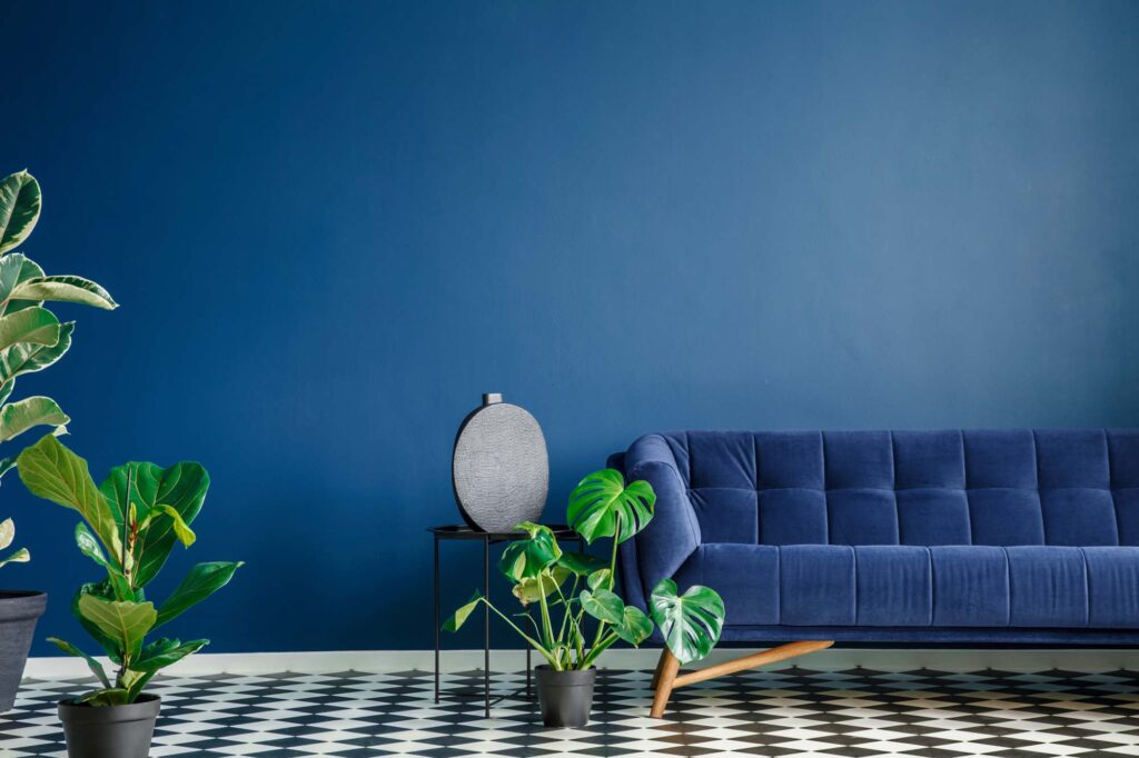
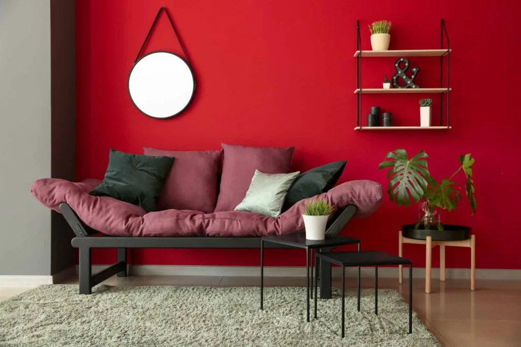
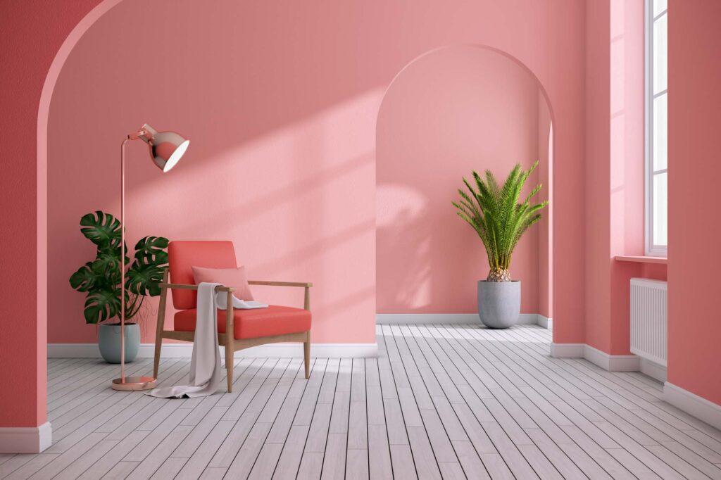
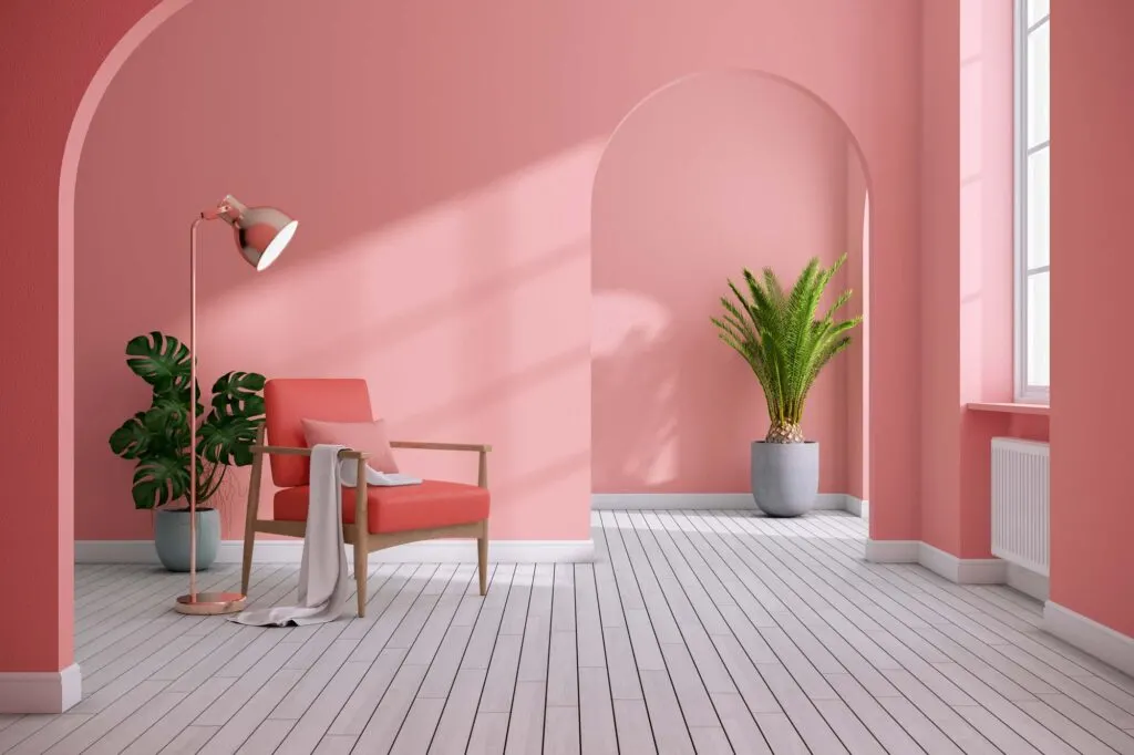
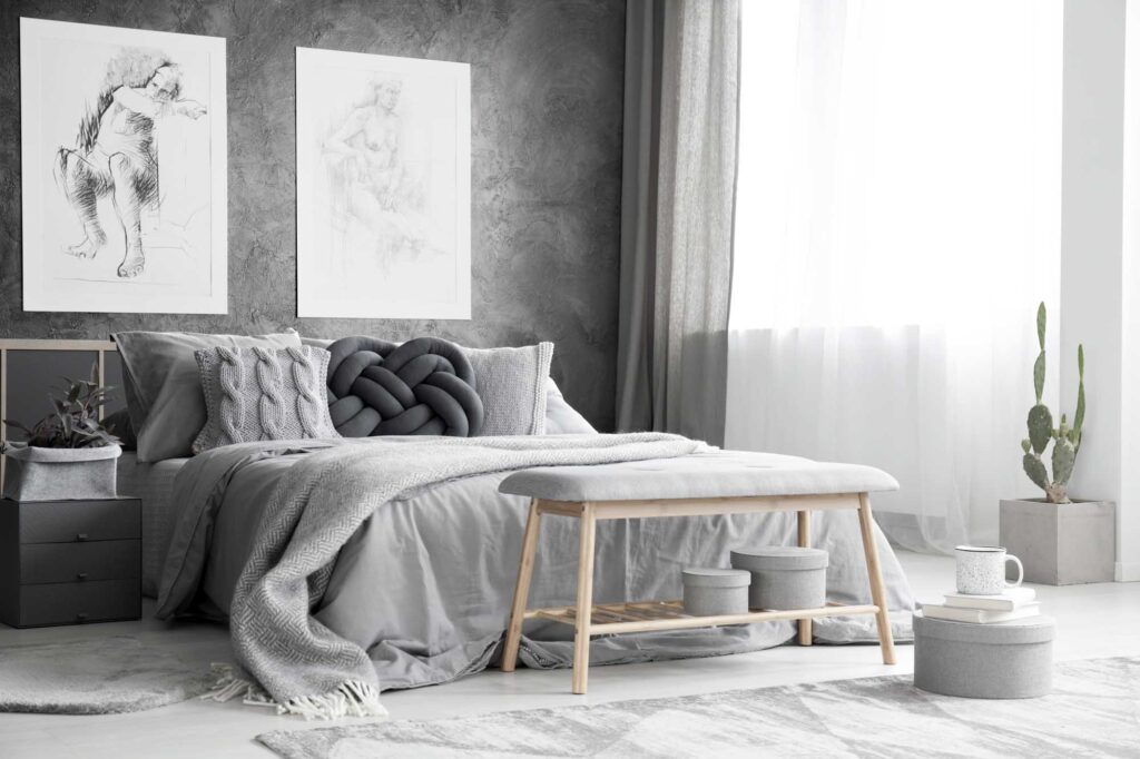
Interior Decorating

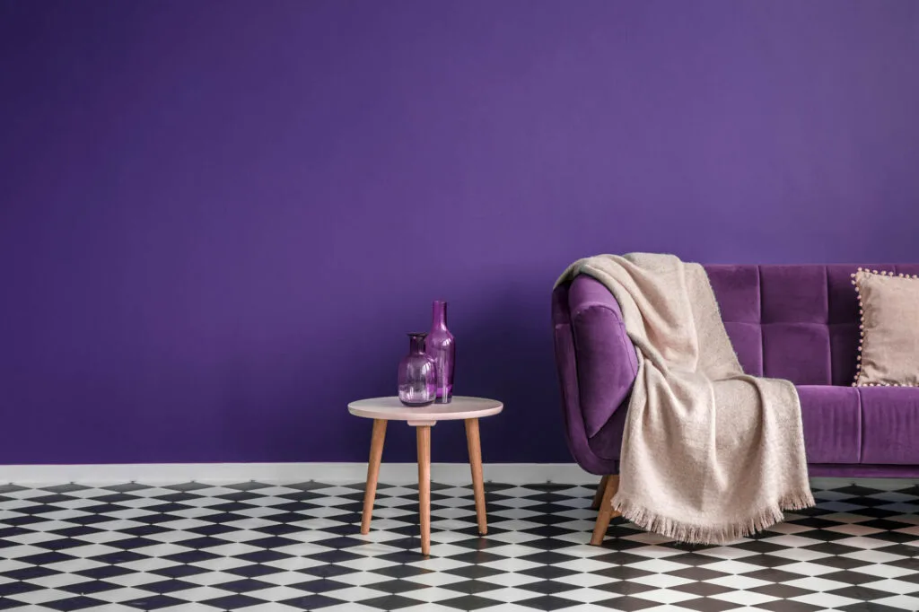
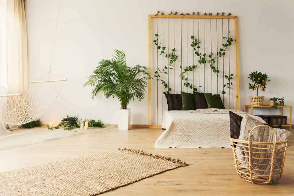
In interior decorating, monochromatic spaces can evoke specific emotions extremely effectively.
A therapist might adorn their entire office in shades of blue to encourage their patients to feel calm and welcome. After all, most blue shades are quite relaxing colors.
On the other hand, a candle shop for spell casting might use many objects in the most inspiring shades of purple to evoke the right feelings of wisdom and spirituality.
Positive and bold people might decorate their entire living room in shades of orange to evoke positivity and spontaneity.
Tips for Using Monochromatic Color Schemes
Use these tricks to make the most of your monochromatic color scheme:
Use Monochromatic Colors With Purpose
Monochromatic color schemes don’t have to be synonymous with “boring” or “plain,” but when used poorly, they can veer into that territory.
When you choose to use a monochromatic color scheme, know why you’re going in that direction.
Embrace Contrast
Be careful to add enough variation in the shades and tones of a monochromatic design.
This adds visual interest, but it also prevents the individual components of your project from blending together and being hard to read.
Work Within Limitations

Monochromatic colors are excellent if you’re working in a small space (whether that be when decorating a small room or working with a small canvas) or making the most of limited options.
A prime example of this is if you’re completing an art project and find yourself with only one hue to work with.
Incorporate Pattern and Texture to Add Depth
Just because you’re sticking to one hue doesn’t mean you can’t use patterns or textures.
When you only have one hue, that means you can let contrast and other visual elements take center stage in ways you can’t get away with if you have more colors to complicate things.
Embrace the opportunity and use these contrast in an accent color, for example. The design will shine.
The Benefits of Monochromatic Color Schemes
Monochromatic color schemes carry many benefits across fields, from graphic design to interior decorating:
- Support brand recognition
- Give a cohesive look
- Easy to create memorable color schemes that are pleasing to the eye
- Easy to “read” because there’s only one hue for viewers to process
- Sleek
- Strong sense of visual cohesion
- Harmonious
How to Create a Monochromatic Color Scheme
Based on all tips and advice shared in this article, we’ll briefly cover how you can create your own monochromatic color scheme.
Regardless of the color scheme, all designs begin with one color, one hue. From there, you have to make color adjustments to achieve the look you want and bring your message across.
To achieve that, many designers work in the HSB color system, which stands for hue-saturation-brightness.
By adjusting the hue, well, you’ll change the color. E.g., blue, red, or yellow.
By adjusting the saturation, you’ll change the richness of the color. E.g., a less saturated blue gives you a muted tone of blue. In contrast, more saturation gives you a bright blue.
Lastly, by adjusting the brightness, you’ll change how the color will look, depending on the saturation–lighter or darker.
For a monochromatic color palette, however, you only need to adjust the brightness.
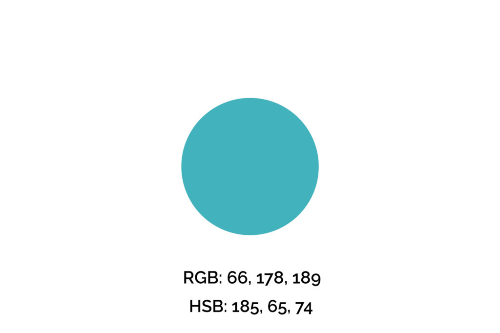
Step One: Pick Your Key Color
The key color we’ll use for this example is #42B2BD (maximum blue-green), one of my favorite shades of blue. However, if you’re picking a color for a brand, logo, or professional design, you can’t simply pick your favorite color.
We recommend you get familiarized with the meaning of the colors before making that decision. Also, many times this color will be given.
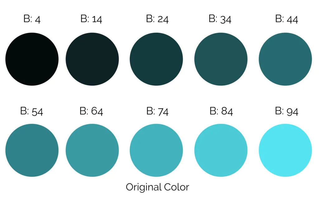
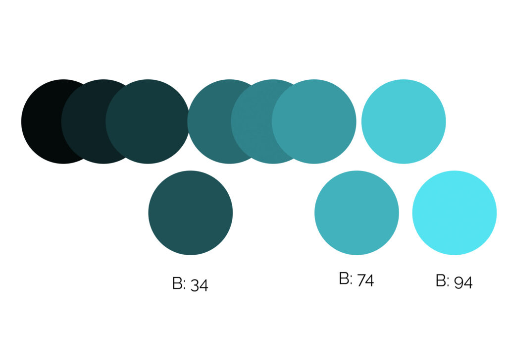
Step Two: Adjust the Brightness and Compare the Samples
Next, we’ll create multiple samples of this hue, so that we can adjust the brightness value by 10 multiple times.
You could have used other values, but 10 was the best for simplicity reasons.
In the example below, we sorted the colors from the least bright to the brightest so that it’s easier to visualize and compare them.

Step Three: Pick Three Colors with Enough Contrast
Now we have ten variations to play with, but, for this project, we only need three colors.
You could use more, there are no hard rules for how many you should choose, but three is usually a good number.
Further out, we selected three colors with very distinct brightness values so the final design has enough contrast not only for appealing reasons but also for accessibility ones.

Step Four: Apply the Monochromatic Color Palette
The example below is made of only one hue, blue-green, but in different brightnesses, and it’s eye-pleasing and harmonious.
For accessibility reasons, we used the darker blue for the text and subheadings, the medium blue (the original color) for call-to-actions, and the lightest blue for accents.
Note how the colors are balanced and nicely distributed. To achieve this look we used the 60-30-10 formula and the result is a harmonic design where the colors meet the brand’s needs and tone while drawing attention to the right elements.


Remember, when applying your color palette to a design, you want to use colors strategically, so they won’t overwhelm your clients/audience and will draw attention to what you want them to do, whether that’s a “sign-up,” “buy,” or “click here” button.
Wrapping Up on Monochromatic Colors
Whether you’re an artist who works with color day in and day out, a designer who needs to feel comfortable assembling one-color palettes or simply want to improve your eye for color, start by keeping an eye out for monochromatic colors in the world around you.
If you find yourself in a position where a monochromatic palette works best, don’t fret. Instead, take careful steps to make sure your design still packs a punch and delivers visual interest.
Did you enjoy this article about monochromatic colors? Then share it with a friend who might also like it.