Wanna learn more about color harmony and harmonious color combinations? Then you’re in the right place because we’ll cover it in detail.
Color harmony is the base of any design and artwork because designers use these color relationships to convey messages and create a particular look or feel.
While it might seem intimidating and even overwhelming to play with colors and create harmonious color combinations, it’s easier than you think, especially if you follow some rules.
In today’s article, we’ll discuss color harmony definition, why it is crucial in any design, essential terms and concepts to create harmonious color schemes. Obviously, we’ll also mention the most common color harmonies with respective examples.

Color Harmony
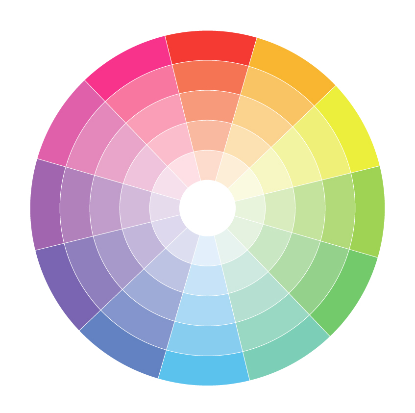
In color theory, color harmony refers to aesthetically pleasing and harmonious color combinations based on geometric relationships on the color wheel.
These colors in harmony produce consonant and eye-pleasing contrasts that are used in various projects, from websites to logos to interior design.
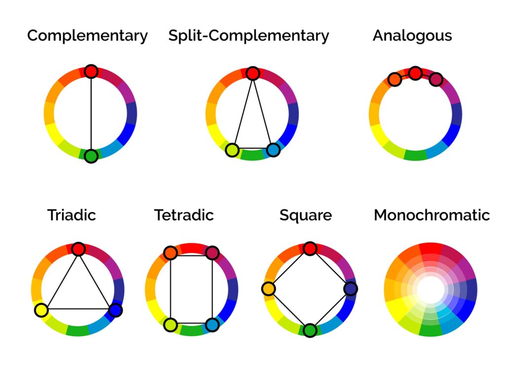
You can create harmonious color schemes by placing these geometric shapes on top of the color wheel and adjusting saturation and brightness as needed.
Back in the late 17th century, Sir Isaac Newton created a circular diagram of colors or color wheel that would be the base of color theory and a revolution in understanding the relationships between colors.
That color wheel, which was made of the seven colors of the rainbow, was later improved to 12 different hues.
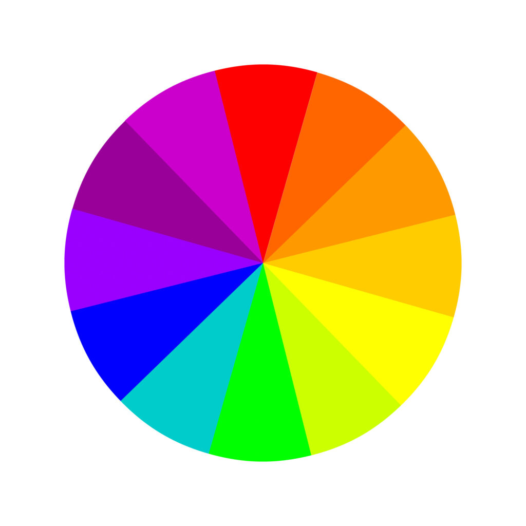

Nowadays, artists and designers use rules of color combinations to find color harmonies on that color wheel. The result? Pleasing and harmonious color combinations.
However, you must know which color wheel to look at since there are types available.
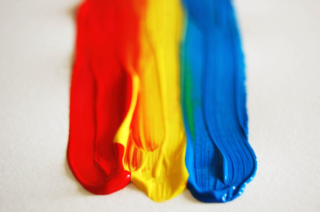
The RYB or red, yellow, blue color wheel is typically used by artists, as it helps with combining paint colors.
On the other hand, the RGB, or red, green, and blue color wheel, is designed for online use, as it refers to mixing light – like on a computer or TV screen.
So for the RYB color wheel, the 12 hues are classified as follows:
- Primary colors: blue, red, and yellow
- Secondary colors (made by mixing two primary colors): green, orange, and purple
- Tertiary colors (made by mixing one primary and one secondary color): red-purple, blue-purple, blue-green, yellow-green, yellow-orange, and red-orange.
These are the main hues you will use to create harmonious color schemes.
Before we dive into the most common color harmonies, let nudge on one more concept, key color.
Every design has a key color, which can either be intentional or by necessity. Key color is the most important color of your design. It’s the color you can’t change or the color of the element you want to draw attention to.
For instance, if you’re doing product photography, let’s say, Tide detergent, which is orange. In this case, your key color is orange because you can’t change that.
Why is it important to know this concept? Because you need to know your key color before you can determine your color harmony. This will be your starting point.
What color harmony you’ll choose depends on the feelings you want to evoke based on the principles of color psychology. We recommend you get familiarized with the meaning of the colors before making that decision.
Most Common Color Harmonies
Once you have the key color on paper, it will be easier to identify harmonious colors using the color wheel.
For that, you can use any or a combination of the color harmonies below. Still, regardless of which harmony you choose, it’s essential to pay attention to your use of warm and cool colors because you don’t want your design to look garish.
Last but not least. Consider shade, tint, and tone when working on your color scheme, as they allow you to create rich, layered color combinations.
You can always use an online color wheel or a color picker. Still, we described how to create your own color harmony palette for each of the seven color scheme articles below.
Here are some color harmony examples:
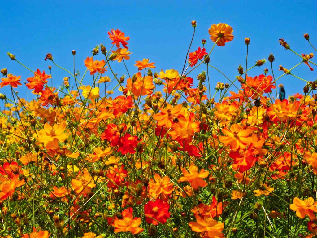
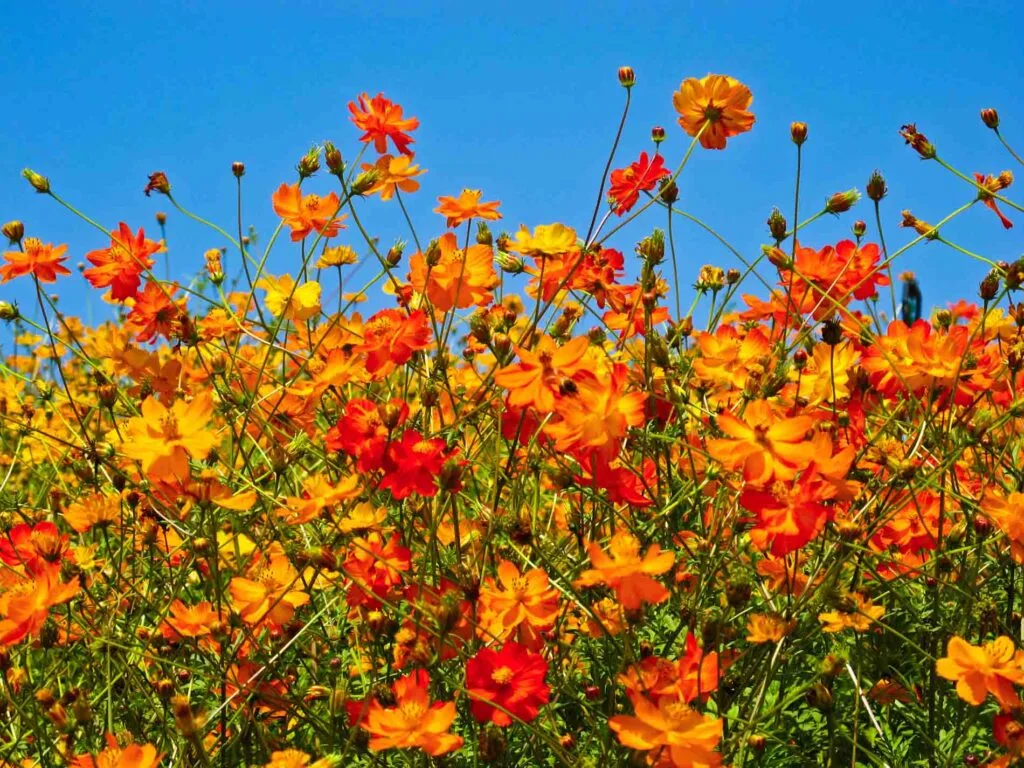
Complementary

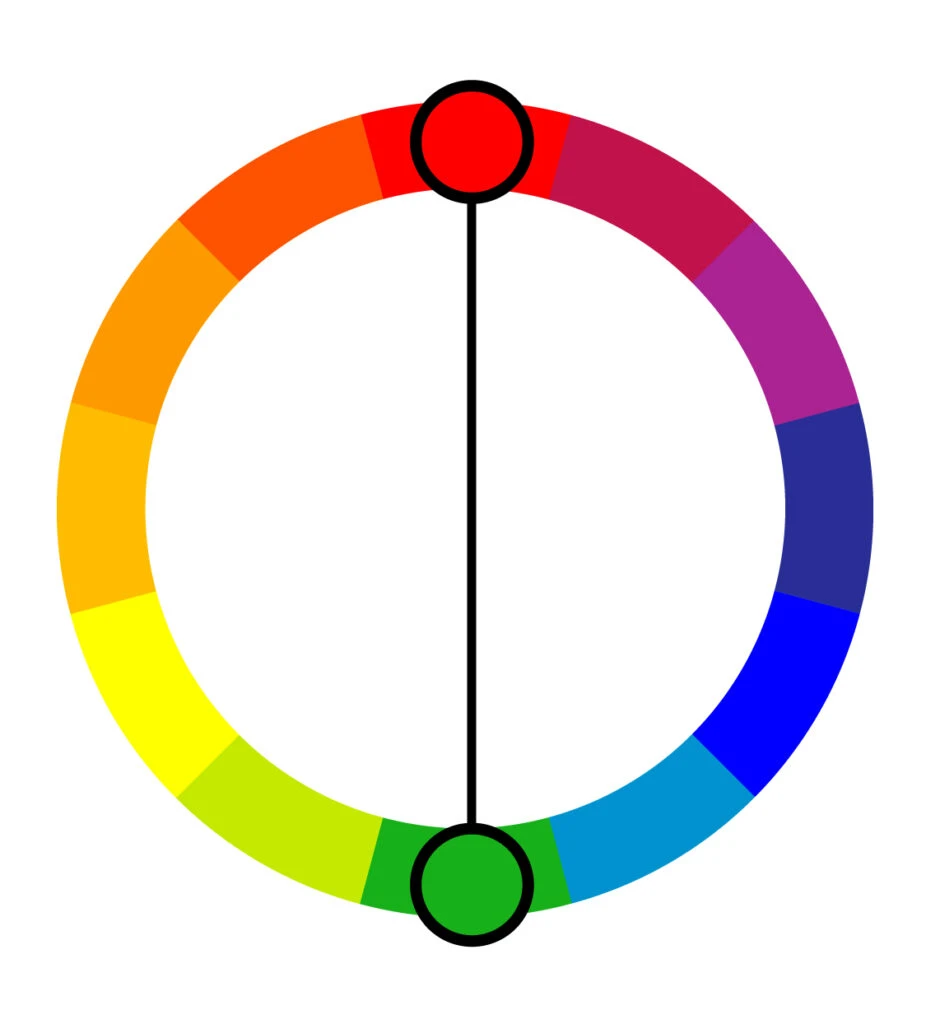
Complementary color schemes are the most basic of all harmonies. They’re often used in the world of design because of their simplicity.
Put simply, complementary pairs are colors positioned on opposite ends of the color wheel (or color circle), and they can be either primary, secondary, or tertiary colors.
These harmonious color combinations create vibrant color palettes with high contrast. While that’s desirable in a number of designs, it can be jarring if not appropriately managed.
For instance, text and background in complementary colors are tough to read, so steer away from that.
Further out, these color schemes are ideal for making something stand out and create eye-catching elements. Some great examples of complementary color schemes are:


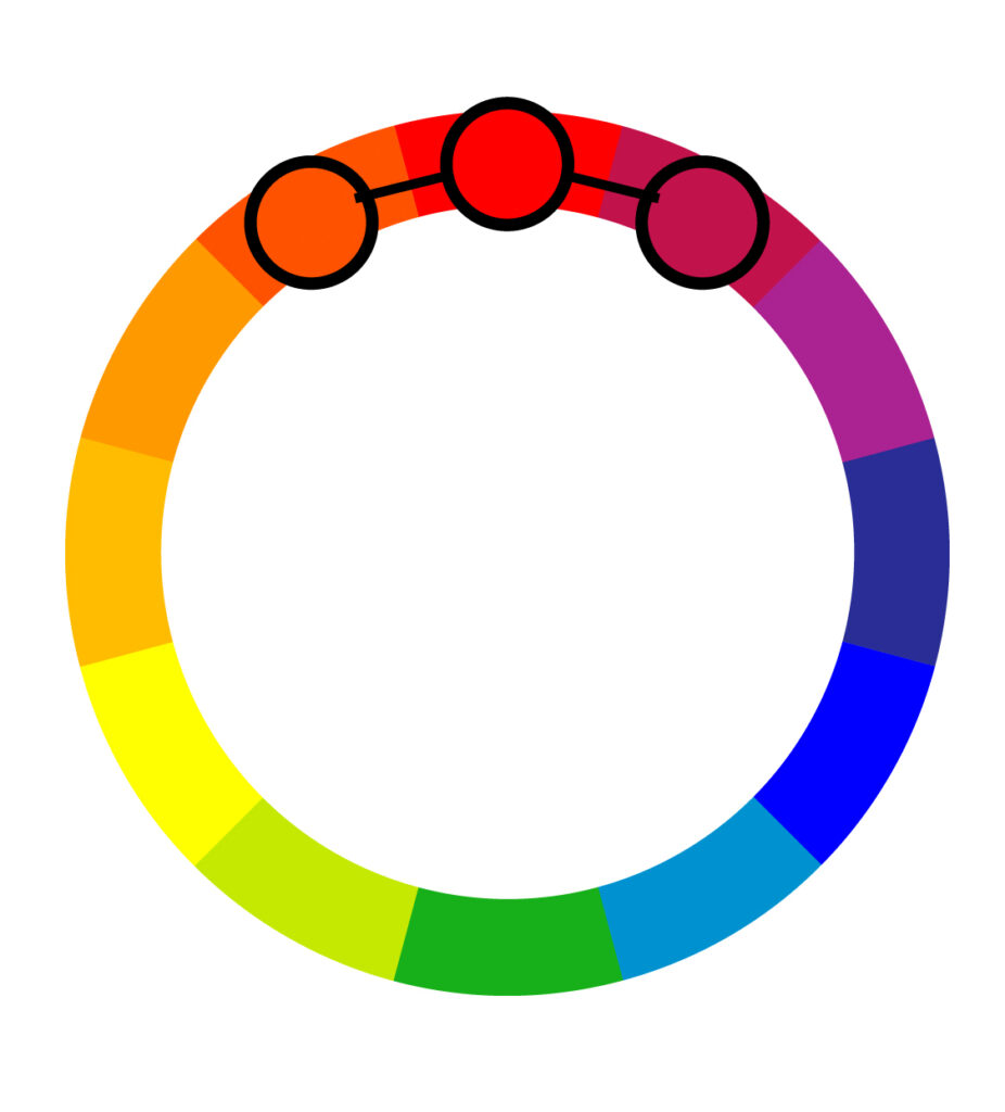
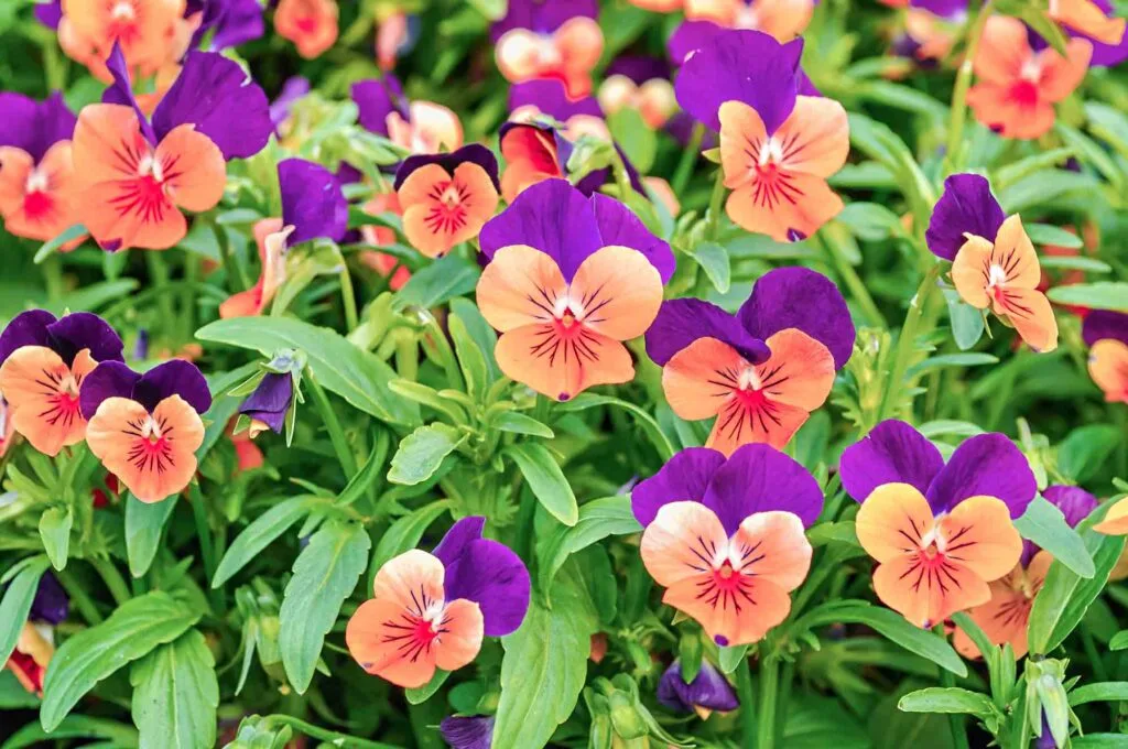
Split-Complementary

Split complementary combinations are slightly more complex than complementary colors because they have three hues.
The simplest split complementary color schemes have one key color and two colors adjacent to that key color’s complement. Because of that, this color harmony has a vibrant contrast that is generally easy to use.
Beginner artists and graphic designers often gravitate toward these types of combinations as they start to branch out into more complex color schemes since they’re approachable and intuitive.
Beyond that, split complements work exceptionally well with artwork since it gives you enough colors to work with.
Also, it’s easy to understand how to use them: use the two base colors for most of the artwork and the accent color for – you guessed it – accents.


Analogous

Unlike complementary color schemes that pick complementary pairs, the analogous color schemes consist of three hues, all positioned next to each other on the color wheel.
They usually consist of one dominant color, then a supporting color. The third color can be the first two colors blended together or an accent color that pops.
Analogous color schemes are widespread in decorating and interior design. These color harmonies tend to be eye-soothing and have a sense of visual cohesion without being too flat, overwhelming, or monochromatic.
Still, make sure you have enough contrast when choosing your analogous color scheme.
When employing an analogous color scheme, stick to the 60-30-10 rule to maintain a visually appealing balance.
Also, stick to warm or cool colors because your design will give a sense of cohesion and harmony by using only one color temperature.


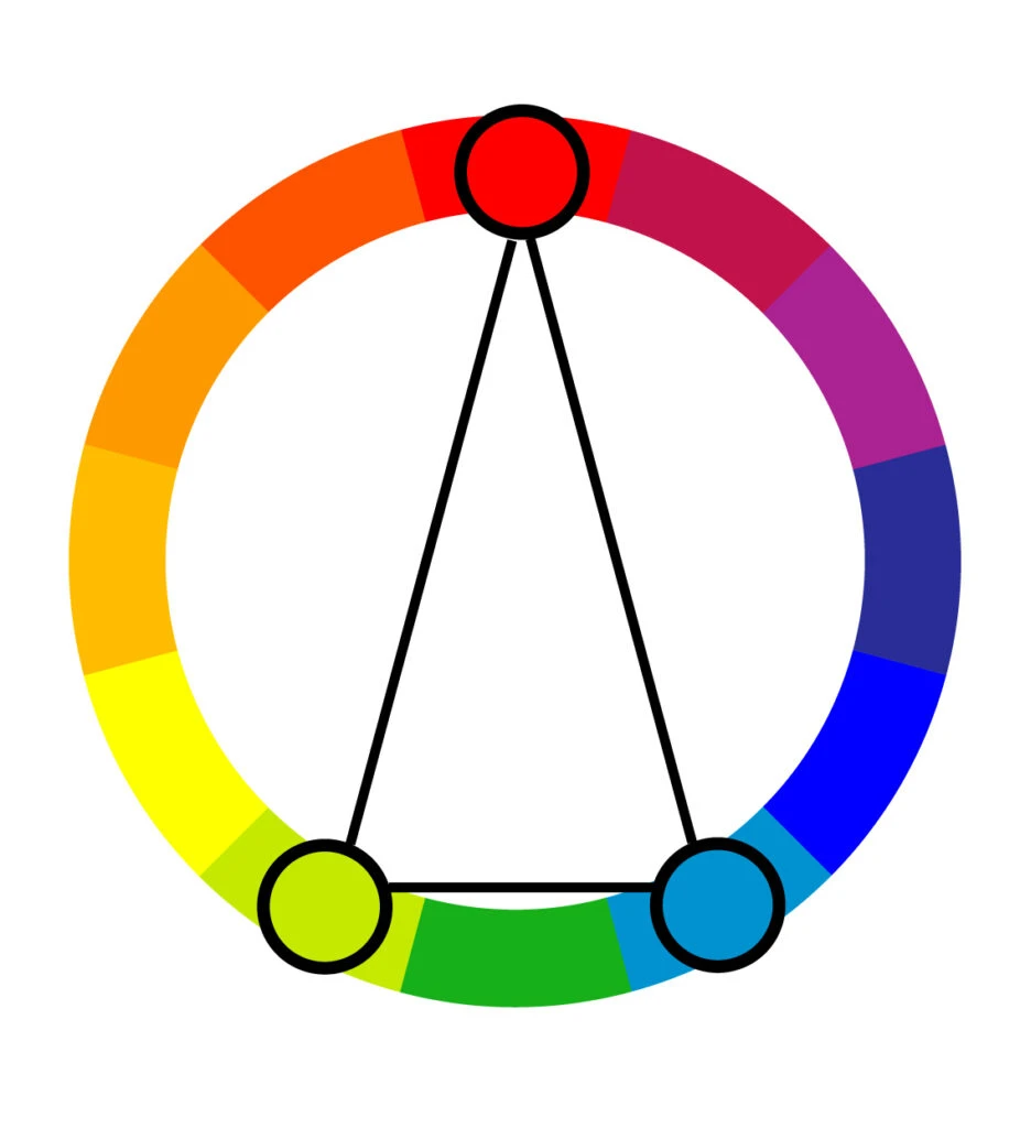
Triadic

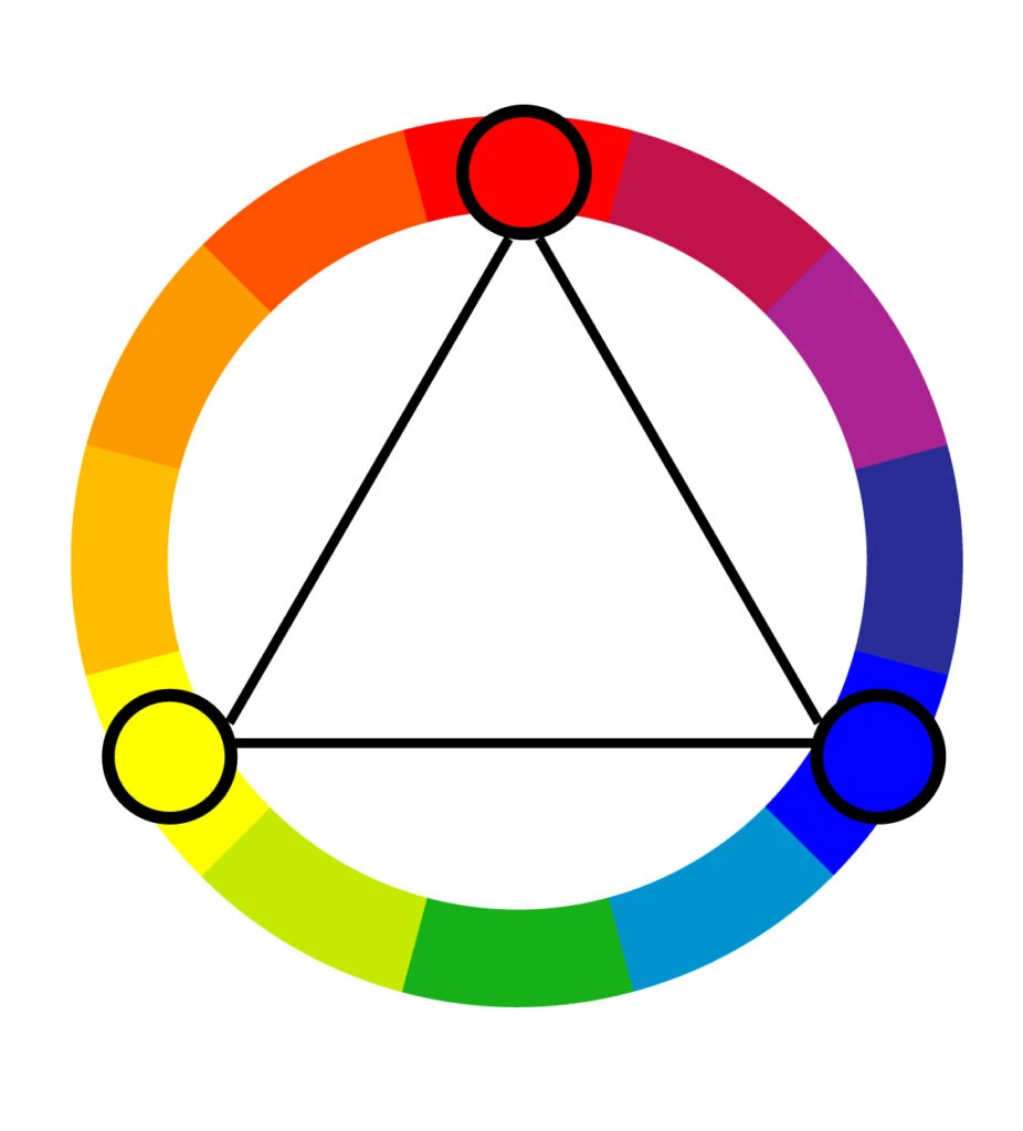
Triadic color combinations consist of three colors evenly spaced on the color wheel. They are very versatile, and more often than not, they create a vibrant, bold color palette.
Similar to complementary color schemes, triadic color schemes offer strong contrast.
Still, they tend to be easier on the eye than a simple complementary pair, making them a pretty safe bet if you want more than one hue to play with, but don’t want to make quite as much of a splash as a complementary pair would.
When choosing your colors in harmony, let one hue dominate and use the others for accents only. This way, you avoid a child-like effect that can ruin your design.


Tetradic

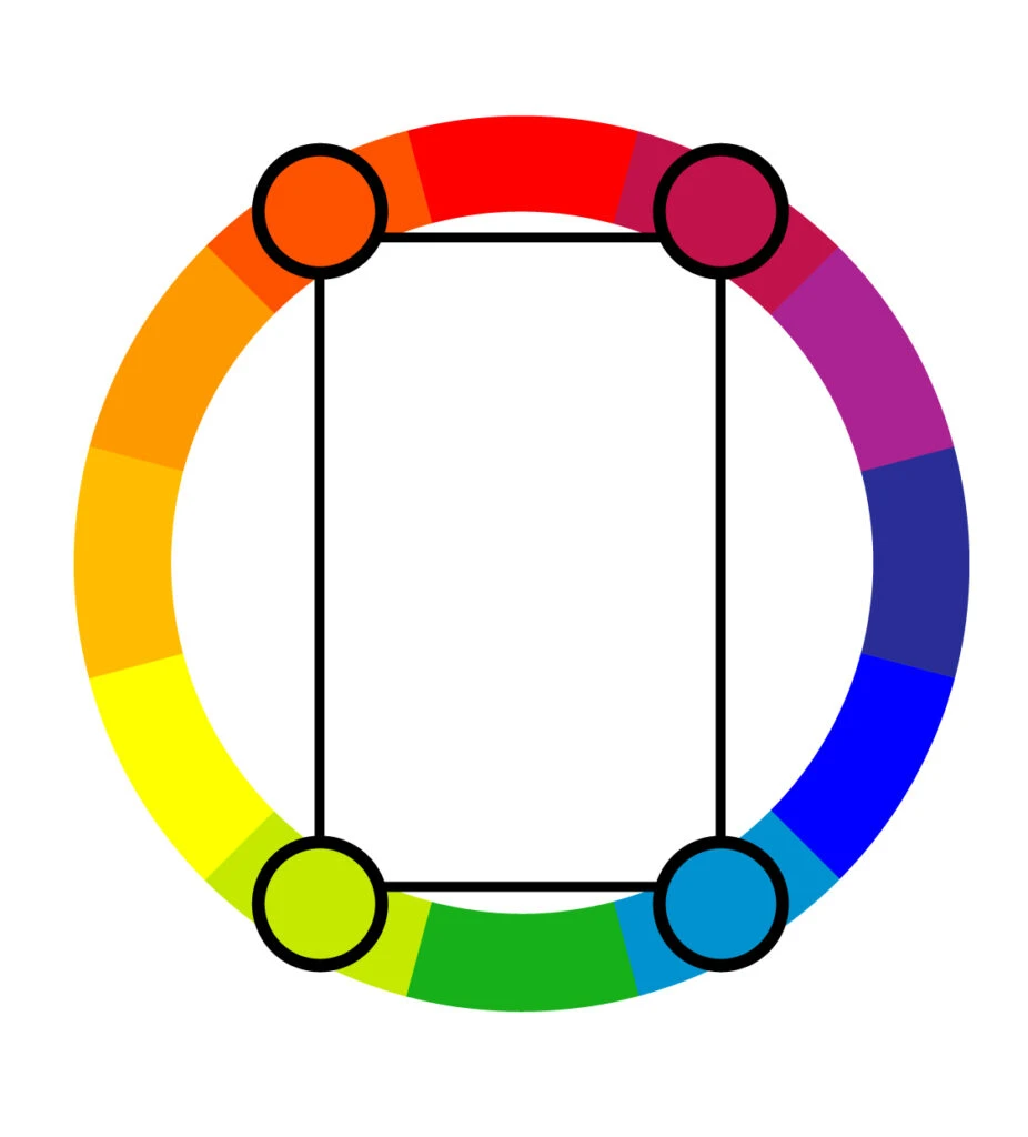
Tetradic color schemes have four individual colors: a key color and three more colors, all equidistant from the key color on the color wheel.
This color harmony can also be referred to as a “double-complementary color scheme” because it consists of two complementary color pairs.
Like any complementary scheme with a wide range of colors, the result is a vibrant palette rich with contrast.
In fact, tetradic colors are some of the boldest, most vibrant color schemes in the designers’ toolkit. While that’s a great thing, it also means they should be used judiciously and with caution.
If applied with an unpracticed hand, this color harmony can look aggressive and even a little nervous.
You’ll always turn heads with a tetrad. Still, you run the risk of people quickly looking away if you veer into the garish territory.
To avoid that, let one color dominate, balance the use of warm colors and cool colors wisely, and use neutrals so that the colors pop where they’re supposed to.


Square
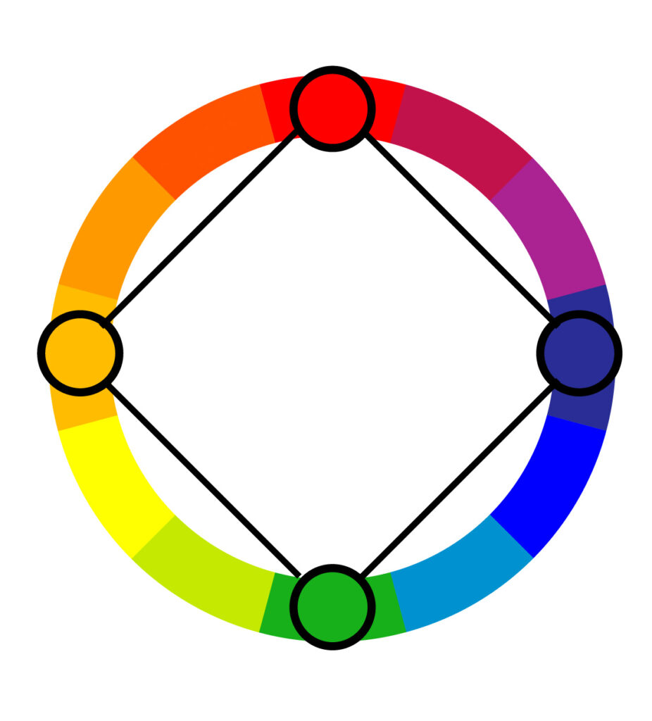

Square color schemes consist of four colors spaced evenly around the color wheel. To create a square color palette, pick the key color to start with. Then identify the other colors that are equidistant from that color. You’ll basically end up with two complementary pairs.
This color harmony is very similar to the tetrad above, however, instead of a rectangular color scheme, it is a square color scheme.
Beyond that, square color schemes are less common than some of the other color combination options, which can provide an opportunity to utilize one and set your design, product, website, or piece of artwork apart from the pack.
Because there’s a lot of contrast built into the hue choices, even a desaturated or pastel palette gives a lively, eye-catching result. This can be great to evoke a sense of fun, playfulness, and vibrancy.
Of course, the downside is that it can easily look garish or bring to mind a 1990s bowling alley carpet.
You can always let one color dominate and balance the color temperature to make a square color scheme work for your project without it looking juvenile.
Alternatively, you can let an achromatic color (black, white, or gray) dominate and let your four hues as accent colors. This can give a more modern, sleek look that still catches the eye.


Monochromatic

Monochromatic color schemes use a single base hue and extend the color scheme by using different shades, tones, and tints of that color family.
The result is a complex and rich design very different from the common misconception that monochromatic color harmonies are dull and lifeless.
When choosing your color schemes, make sure to add enough contrast in the shades to create visual interest. Also, don’t shine away from patterns and texture–they will add depth to your design.
This color harmony is vibrant and eye-pleasing, so be sure to make the most of it.


Wrapping Up on Color Harmony Schemes
With colors in harmony, you can set a mood, draw attention, or make a statement in your design.
By picking a harmonious color scheme, you can energize or cool down the project, create an ambiance of elegance, warmth, or tranquility, or you can convey an image of playful youthfulness.
Whatever you choose, use the concept of color harmony to make your design stand out from the crowd.
Colors in harmony have the power to convey messages effectively and evoke the right feelings. In other words, it’s your most powerful design element.
Did you enjoy reading about color harmony? Then share this article with a friend who might enjoy it too!
Nathan Kondabatni
Thursday 18th of May 2023
Thanks! I'm in 5th grade, and I'm using your website for my informational writing( don't worry, I have to include workers cited and citations) Anyway, Thanks!
VIPUL JAIN
Wednesday 1st of February 2023
Sooo interesting!
Mary
Tuesday 29th of November 2022
Extremely helpful! Thanks.
Maria
Wednesday 5th of October 2022
👍