In today’s article, you’ll learn how to master analogous colors, one of the most eye-soothing color schemes.
Analogous color schemes are an excellent way to add depth and visual interest to a painting, website, or product without being too aggressive.
That’s because analogous colors feel comfortable and organic to the eye – perhaps because this is one of the most common color schemes in nature.
In this post, we’ll go over the definition of analogous colors, a few examples of key analogous color schemes, how to put analogous colors to good use in multiple settings, and how to create your own analogous color palette.

Color Harmony
In color theory, color harmony refers to eye-pleasing and harmonious color combinations. The main seven color harmonies are:
- Complementary colors: pairs of colors that are positioned on opposite ends of the color wheel.
- Split-complementary colors: one primary hue and two hues adjacent to that primary color’s complement.
- Analogous colors: the eye-soothing color scheme we’ll talk about in today’s article.
- Triadic colors: three colors evenly spaced on the color wheel.
- Tetradic colors: a base color and three more colors, all equidistant from the base color on the color wheel.
- Square colors: four colors spaced evenly around the color wheel.
- Monochromatic color schemes: different shades, tones, and tints of one color family only.
What Are Analogous Colors?
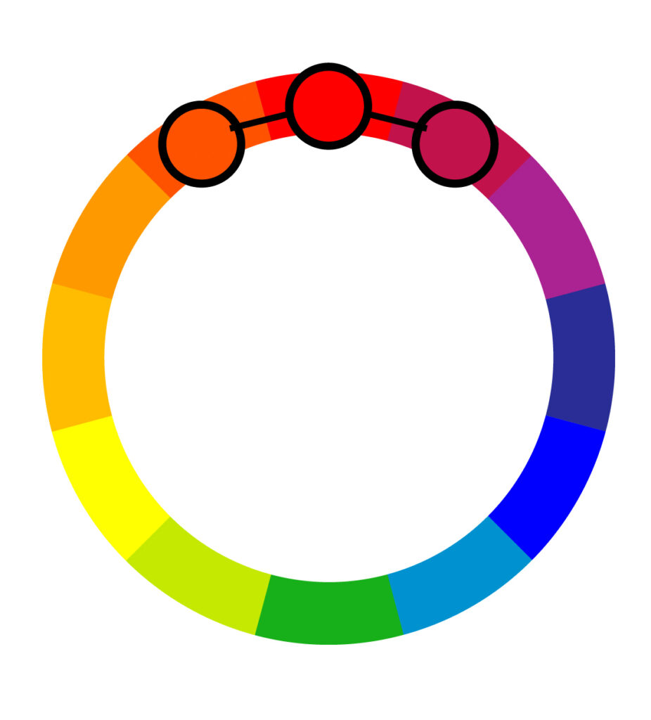
Unlike the complementary color scheme that picks complementary pairs, the analogous color scheme consists of three hues, all positioned next to each other on the color wheel.
They usually consist of one dominant color (usually but not necessarily a primary or secondary color), then a supporting color (either a secondary or tertiary color).
The third color can be the first two colors blended together or an accent color that pops.

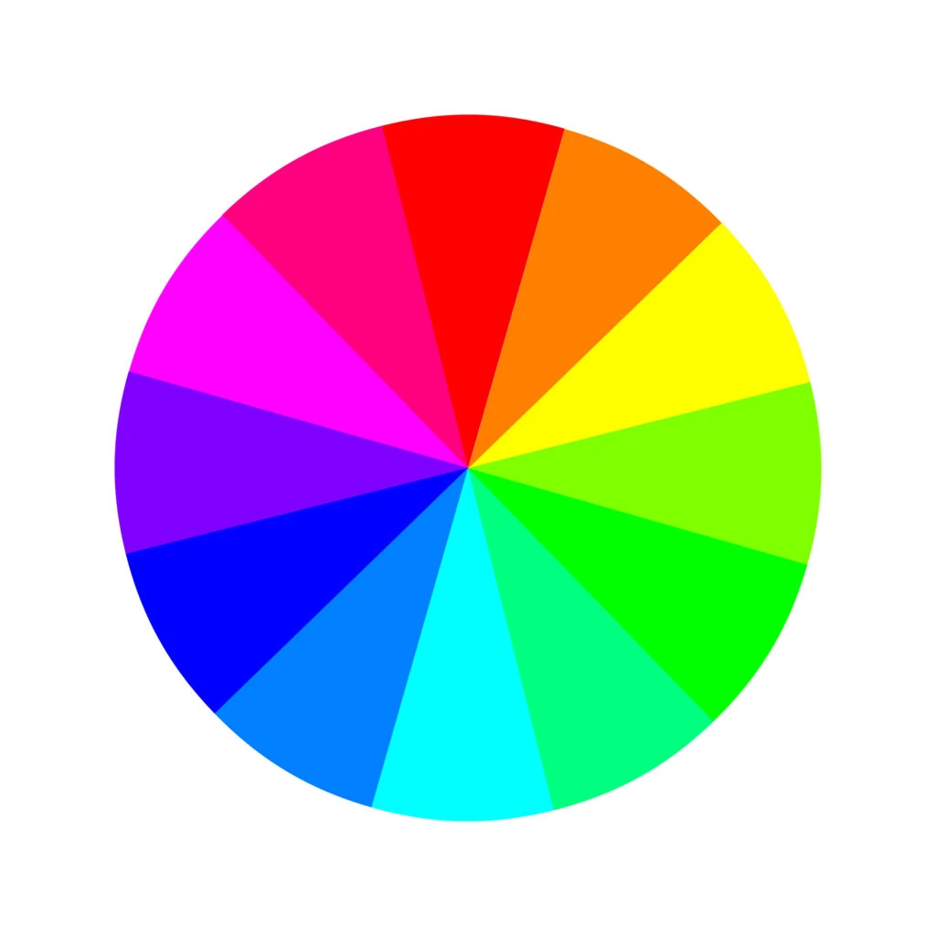
The 17th-century color wheel (color circle) created by Sir Isaac Newton is the base for all color combinations we know today. It was made of the seven colors of the rainbow, but it was later improved and adjusted to 12 colors.
Different Color Models
There are two different models of color theory we can look at to find analogous color schemes: traditional and model color theory.
Both are equally important in different settings, so it’s crucial to know and understand both models.
While the rules to determine an analogous color scheme remain the same regardless of which color wheel we use, the color wheels themselves (and the resulting color schemes we can create) differ depending on each model.
Traditional Color Wheel

The traditional color theory is mainly used by artists and traditional art methods (like drawing and painting). This theory comes from what happens when you mix paint colors together.
Still, it’s relevant to non-artists as well; this is the color theory most of us learned about in school as children.
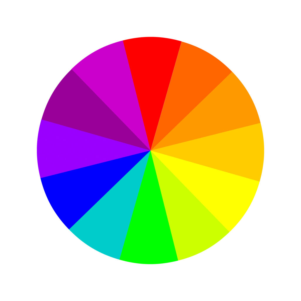
Traditional color wheel theory’s primary colors are red, yellow, and blue (RYB). This color wheel operates on a subtractive color model. Here are its 12 colors:
Three primary colors: red, yellow, and blue. Three secondary colors: green, orange, and purple. And six tertiary colors: red-orange, yellow-orange, red-purple, blue-purple, blue-green, and yellow-green.
The traditional color theory rests on the three main principles of hue (what non-artists think of as the color itself), value (light or darkness), and chroma (how neutral or bold the tone is, also known as saturation).
Modern Color Wheel
The modern color theory is mainly used by web designers and digital artists. It’s more expansive because it accommodates how colors appear on digital screens.
While traditional color theory focuses on how mixing paint produces colors, modern color accommodates how computers and screens mix light.
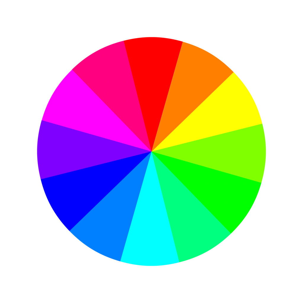
The modern color theory’s RGB (red, green, blue) additive color model starts with black and adds pigment to that surface. That’s how your TV screen and computer monitor work. Here are its 12 colors:
Three primary colors: red, green, and blue. Three secondary colors: yellow, magenta, and cyan. And six tertiary colors: orange, rose, purple, azure, spring green, and chartreuse.
In contrast, printers operate on a CMY(K) primary color wheel – cyan, magenta, yellow, and key (another term for black).
This is a subtractive model, which means the pigment is applied to a white surface that doesn’t give off its own pigment (like paper). That means the color is basically being created from scratch.
Basic Analogous Colors
As we said, analogous color schemes are made up of three adjacent colors on the color wheel. These create harmonious color combinations that are easy on the eyes and are easy to combine.
Because modern and traditional color theories have different primary colors – RYB versus RGB – they also have different analogous color combinations.
Analogous Color List
Here are a few basic analogous color combinations for each model:
In the RYB model:
- Red, red-orange (vermillion), red-purple (magenta)
- Yellow, yellow-orange (amber), yellow-green
- Blue, blue-purple (indigo), blue-green (teal)


In the RGB model:
- Orange, red, rose
- Red, rose, magenta
- Rose, magenta, purple
- Magenta, purple, blue
- Purple, blue, blue-cyan (azure)
- Blue, blue-cyan, cyan
- Blue-cyan, cyan, green-cyan (spring green)
- Cyan, green-cyan, green
- Green-cyan, green, green-yellow (chartreuse)
- Green, green-yellow, yellow
- Green-yellow, yellow, orange
- Yellow, orange, red


Practical Applications of Analogous Colors
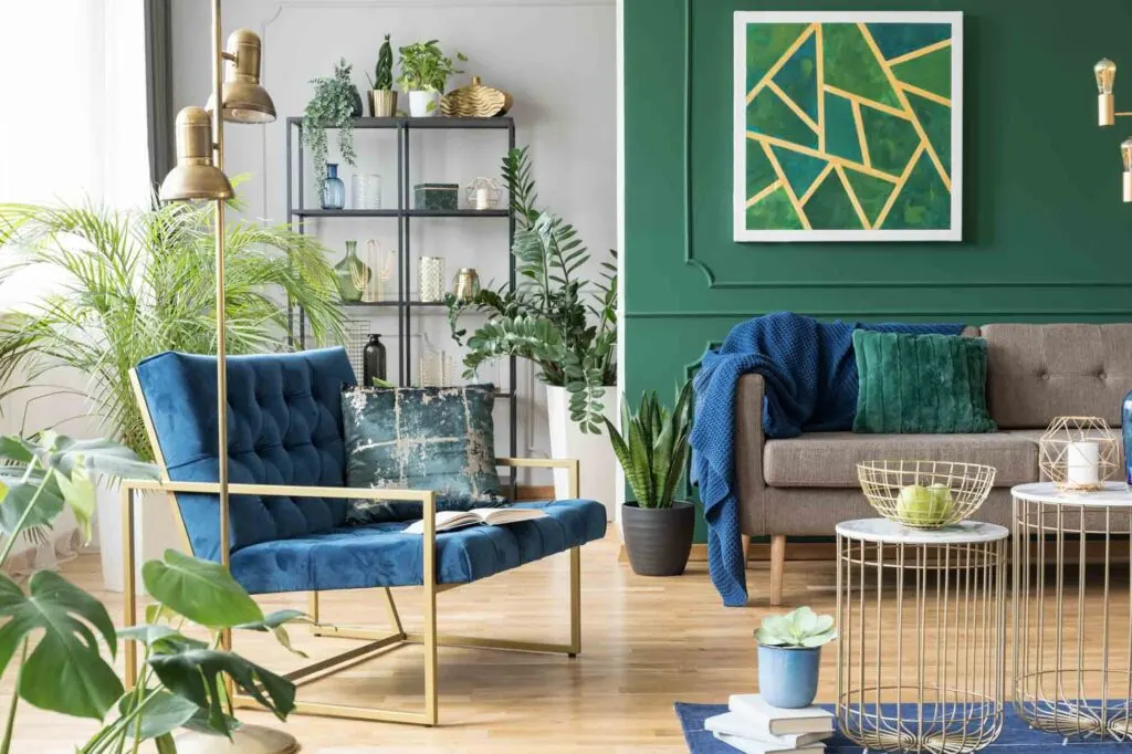
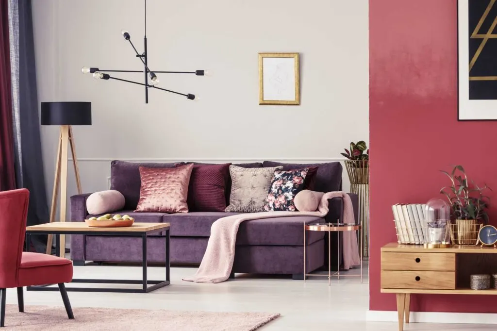
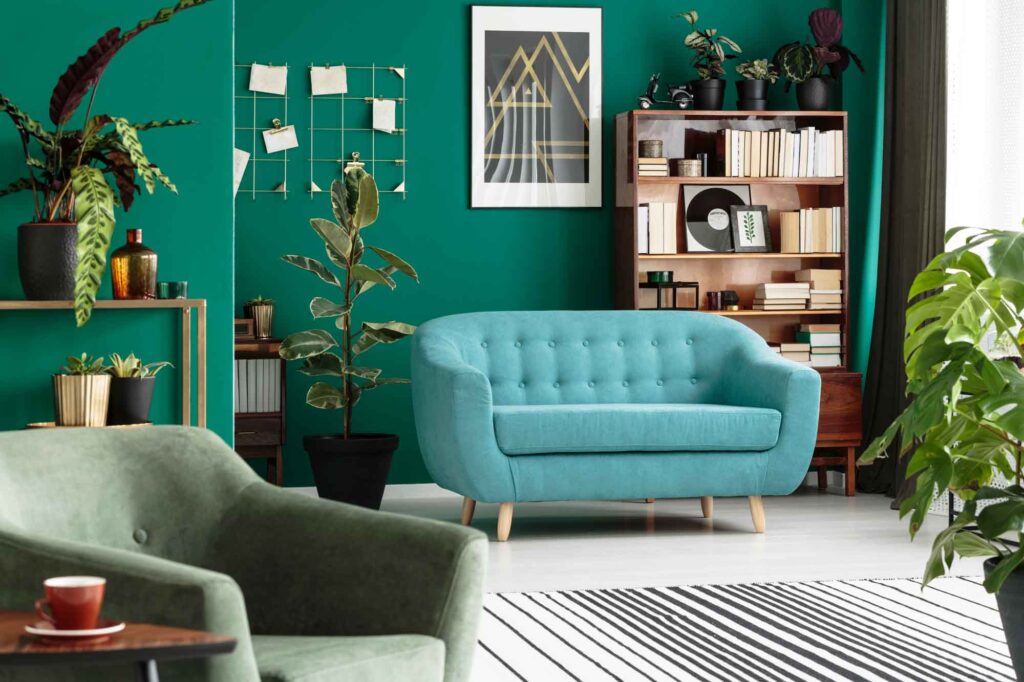
Analogous color schemes are very common in decorating and interior design. They tend to be soothing to the eye and have a sense of visual cohesion without being too flat, overwhelming, or monochromatic.
Being able to choose from a palette of three colors adds enough depth to create visual interest without being too much to handle.
Graphic designers can make good use of analogous color schemes for website palettes. They can also be put to good use to create an outfit with a cohesive, but varied look.
Beyond that, analogous color schemes can also be used when designing products, logos, and other designs, but keep in mind that the feeling this color scheme evokes is very different from that of a bold complementary color scheme.
Use the 60-30-10 Rule

When employing an analogous color scheme, try the 60-30-10 rule to keep a visually appealing balance.
Let the base color take up 60% of space, the accent color take up 30% of space, and the pop of color take up 10% of space.
Stick to Warm or Cool Colors

Because analogous color schemes employ three hues, you could technically create a palette that uses both warm and cool colors.
However, analogous color schemes tend to work best when the colors stick to the same color temperature. This gives a sense of cohesion and harmony. It also clearly communicates the right mood.
Look to Nature


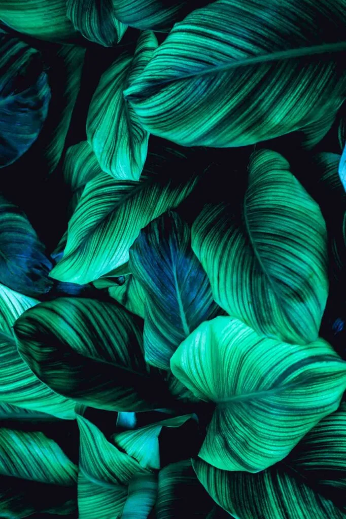
One of analogous color schemes’ greatest strengths is the sense of balance it creates. This may be because of its connection with nature.
From a sunset’s combination of red, orange, and yellow to the blue, green, and blue-green leaves of a succulent plant to the ever-changing (but ever rich and cohesive) colors of fall foliage, analogous color schemes feel natural to the eye.
How Not to Use Analogous Colors
Don’t Overdo It

Just because analogous schemes are soothing and harmonious doesn’t mean you don’t need neutrals.
Even a soothing analogous palette of blues and greens can feel like an onslaught of color if an entire room is covered in it. A little can go a long way, especially with deeply saturated colors.
Try using muted, desaturated tones or using neutrals as a base and layering the analogous colors against that neutral backdrop. Analogous colors can work as lovely accents in an overall more neutral palette.
Avoid Overly-Similar Hues
Too much harmony can be a problem. When choosing your palette, choose colors that are distinct from one another with enough contrast.
When necessary, break up large swaths of color with neutrals. This can highlight the differences between the hues instead of letting them blur together.
How to Create an Analogous Color Scheme
Based on all tips and advice shared in this article, we’ll briefly cover how you can create your own analogous color scheme.
Regardless of the color scheme, all designs begin with one color, one hue. From there, you have to make color adjustments to achieve the look you want and bring your message across.
To achieve that, many designers work in the HSB color system, which stands for hue-saturation-brightness.
By adjusting the hue, well, you’ll change the color. E.g., blue, red, or yellow.
By adjusting the saturation, you’ll change the richness of the color. E.g., a less saturated blue gives you a muted tone of blue. In contrast, more saturation gives you a bright blue.
Lastly, by adjusting the brightness, you’ll change how the color will look, depending on the saturation–lighter or darker.
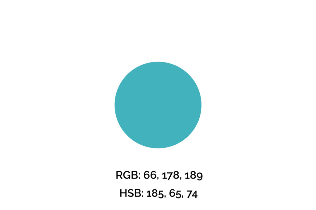
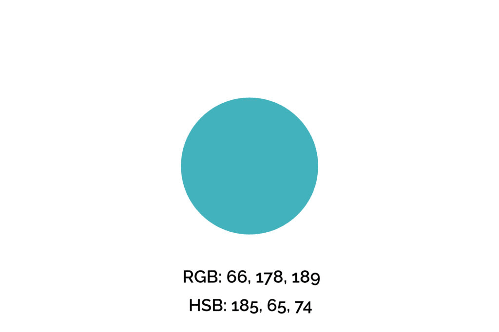
Step One: Pick Your Key Color
The key color we’ll use for this example is #42B2BD (maximum blue-green), one of my favorite shades of blue. However, if you’re picking a color for a brand, logo, or professional design, you can’t simply pick your favorite color.
We recommend you get familiarized with the meaning of the colors before making that decision. Also, many times this color will be given.
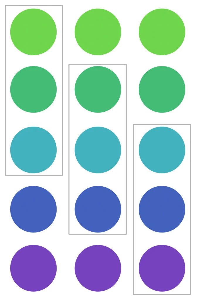
Step Two: Find a Few Analogous Colors
Next, we’ll decrease and increase the hue value by 40 a couple of times to find a couple of analogous colors.
We chose to adjust the hue value by 40 because of contrast, but you can increase or decrease that value a bit as long as you do the same for all colors.
Also, you may adjust saturation and brightness to achieve better contrast between the hues.


Step Three: Choose a Color Palette
Now we have five analogous colors to play with. But, for our design, we need to pick three only.
Below, we highlighted the groups of three colors so you can easily see them together.
Each group would suit a different project or brand, so consider what your brand wants to convey when picking your analogous color palette.
For this example, we’ll choose the middle one. Notice how each one of them evokes different feelings and emotions.

Step Four: Apply the Color Palette
Now it’s time to apply the chosen colors to our design.
We used the key color #42B2BD (maximum blue-green) on the main call-to-action of the page. The dark blue was applied to titles and eventual subheadings, and the green was used in the page details.
Overall, this harmonic design uses only cool colors which draw attention to the right elements.


Remember, when applying your color palette to a design, you want to use colors strategically, so they won’t overwhelm your clients/audience and will draw attention to what you want them to do, whether that’s a “sign-up,” “buy,” or “click here” button.
Wrapping Up on the Analogous Colors
Recognizing and knowing how and when to apply analogous colors is a big step toward excellent designs.
Not only that but it also helps you understand color harmony and consequently color theory.
Did you enjoy this article about analogous colors? Then share it with a friend who might also like it.