In today’s article, we’ll talk about the three dimensions of color: hue, value, and chroma.
Hue, value, and chroma are traits most people don’t learn about in art class as children. But they’re crucial to how we see the world and interact with color.
In this post, we’ll go over the definitions of chroma, value, and hue, explain why they matter, and give a few pointers about how to apply these principles to create great designs.
Hue, Value, and Chroma: Three Dimensions of Color
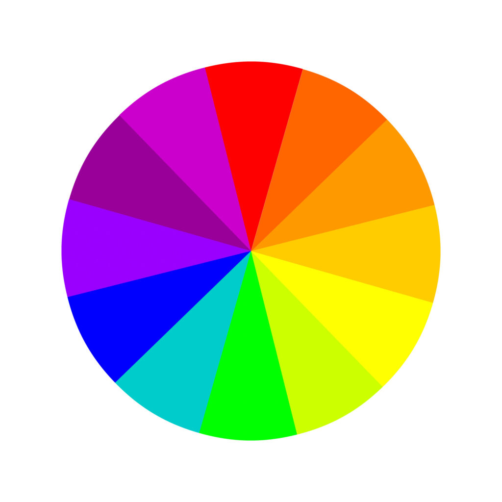
When you think of color theory, the first thing that probably comes to mind is the color wheel.
While that’s a great way to understand color relationships, to truly understand color, you need to also look at individual colors and their dimensions: hue, value, and chroma.
The color wheel is just one way to understand color. In order to create a color scheme in any setting that’s pleasing to the eye, you need to factor in all the traits of the colors you’re using.
Albert H. Munsell created the Munsell color system to describe color in the early 20th century. It remains in use by artists, designers, and anyone who works with color to this day.
Albert Munsell was the first person to distinguish hue, value, and chroma into different, consistent dimensions and to create a color solid system to describe them in the 3-dimensional world.

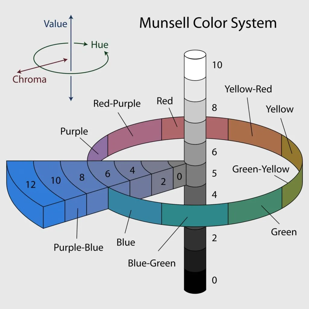
He wanted to create a “rational way to describe color” that would use decimal notation instead of common color names, which he felt were foolish and misleading.
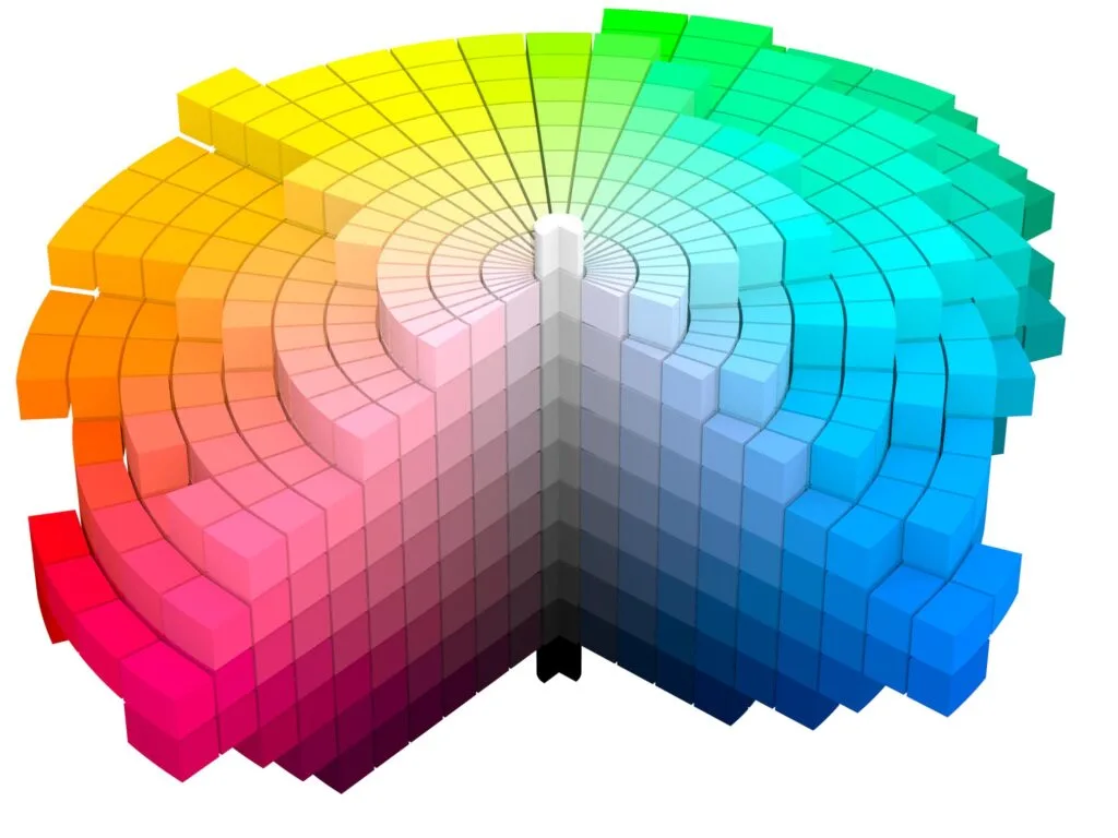
Hue, value, and chroma are part of this system and help differentiate colors and undertones. They’re extremely useful to help create visually appealing color harmonies.
Developing an eye for hue, value, and chroma and learning to identify these traits of any given color will serve you well in any field that uses color.
This will help you quickly understand what makes each color unique. It will also make it much easier to create color harmonies that are pleasing to the eye. When you have this foundation of knowledge, you’ll be able to play with color and use it to your advantage.
Hue

Hue is the word we normally think of as describing a color: red, blue, purple, etc. Hue describes color families, rather than specific shades – blue, not navy or baby blue.
Each hue has a wide range of colors within it thanks to variations of values and chromas. For example, within the hue blue, the different colors include baby blue, navy, ultramarine, etc.
This variation can be achieved by playing with different chromas and values within the color family.
The Munsell color system measures it by degree around horizontal circles, which are divided into five main hues: red, yellow, green, blue, and purple, along with five intermediate hues. These 10 steps of hues are then broken into 10 sub-steps, creating a total of 100 hues for every value.
All Hues Are Colors, But Not All Colors Are Hues
Keep in mind that all hues are colors, but not all colors are hues. Hue isn’t a catch-all term to describe every shade under the sun and it can’t be used exactly interchangeably with the term color.
To understand hue, think of the colors of the rainbow. Each rainbow includes a range of hues. But there are different shades of those hues all around us.
Another good example of this is the color brown. Brown is a color, but you won’t find it anywhere on the color wheel.
That’s because it isn’t a hue; it’s a dull color of a given hue. Depending on the kind of brown, you might actually be looking at a dull purple, red, orange, or green.
The same goes for black, white, and gray. They’re technically not part of the visual spectrum, so they aren’t considered hues either.
Value
When we talk about how light or dark a color is, we’re talking about value. Value is a way to describe the overall lightness or darkness of a color.
The Munsell color system uses a 0-10 value scale. Black, an achromatic color, has a value of 0 and pure white has a value of 10.
The values in between consist of gradually lighter shades of gray with values 2, 4, 6, and 8. Every color can be associated with a specific value between 0 and 10.
This creates the variations between light and dark shades of a hue that we’re used to seeing, like light purple and dark purple.
In short, dark colors have more black in them and are heavy and sophisticated. Light colors have more white and are light and airy.
One way to discern a color’s value is to squint when you look at it. When you squint, your eyelashes filter and block out colored light. That lets you see the gray undertones – the value – of an object.
Chroma
Chroma refers to the strength or saturation of a color. It describes the color intensity, or how pure it is.
Pure colors at maximum chroma, or a high chroma color, have no white or black in them, making them bright colors. It can also be thought of as the strength or dominance of a given color.
Lower chromas fall into the pastel category – think the diffuse, airy colors used around springtime and Easter.
Colors with higher chromas are more saturated. These feel much bolder and more intense.
Munsell’s color chart where chroma is represented in the horizontal scale:

How to Use Hue, Value, and Chroma
After you’ve developed an understanding of hue, value, and chroma and can identify these traits in any given color, you’ll find a whole new world of color possibilities available to you.
Here are a few ways to take advantage of your newfound knowledge.
Use Pure Hues for a Fun, Playful Look
Try using pure hues when you want a peppy look that feels energetic, bold, and in your face.
You can use different values and lower chromas colors to round out the look or stick to the pure hues for maximum impact.
This technique can be extremely effective in web design when you want a landing page to grab the viewer and pull them in.
Just be sure not to let the color scheme get too overwhelming. This is an advanced technique, and with an unpracticed hand, it can easily look harsh or juvenile.
Use Contrasting Values to Create Dimension


Changes in value can create the impression that objects are 3-dimensional. This is useful in art and graphic design.
Our minds perceive lighter colors as being closer and darker colors as being farther away. You can use this to shade objects and create the illusion of 3-dimensional objects in a 2-dimensional medium like a print-out, a piece of artwork, or a company logo.
This is also useful in interior design when you want to create visual layers in a room without straying too far from a specific color palette.
Try painting walls one color and selecting a couch of the same hue, but a different value. This creates a cohesive look without the components blending together.
Avoid Using Hues with Similar (but Differing) Chromas
When in doubt, use hues with chromas that are either exactly identical or a few steps away from each other.
Colors with similar chromas have little contrast and might not create harmonious color combinations. This applies no matter what type of design you’re working with.
Did you enjoy learning about the three dimensions of color: hue, value, and chroma? Then share this article with a friend who might enjoy it too!
Dinna
Tuesday 8th of October 2024
Thank you for the comprehensive articles about colors. It helps me a lot
Annemarie Johnson
Friday 6th of September 2024
This was an excellent visual explanation of colour hues, values and chroma. Thank you for this!