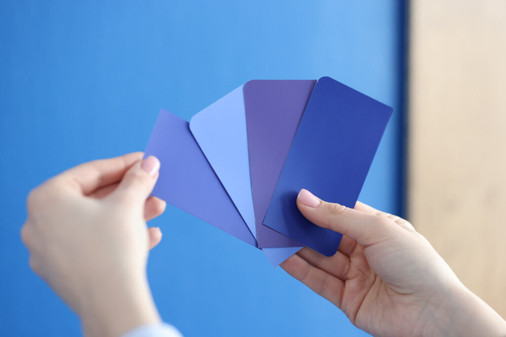
In today’s article, we talk about the difference between shade, tint, and tone.
We tend to use the words shade, tint, and tone more or less interchangeably in casual conversation. But in the art world, each of these terms has a distinct definition.
Knowing what these words mean and how to create different shades and tones of color is crucial when mastering your craft as a designer.
Let’s get a look into them!
Shade, Tint, and Tone in Color Theory
Having a firm grasp of color theory is important to help you create the best possible designs. Think of color theory not only as a way to create visually appealing products but as using color to effectively communicate.
Using shade (darkness), tint (lightness), and tone (richness) is important for harnessing the power of contrast, color harmony, and composition.
When you understand how to use these techniques to access the endless realm of color combinations, you’ll have the whole world of color at your fingertips – whether you’re working in web design, marketing, or interior design.
For example, if you want to emphasize certain parts of your composition, you need to know how to apply and mix colors and adjust saturation.

This will help you get your message across properly, whether you’re advertising a product or creating a cozy space.
Think of it as an artist creating a painting. They could have the best tools available to them, but if they don’t understand color, they won’t be able to create a masterpiece.
The same goes with color theory. Understanding shade, tone, and tint helps you create designs that are pleasing to the eye and draw people in – which is always what you want.
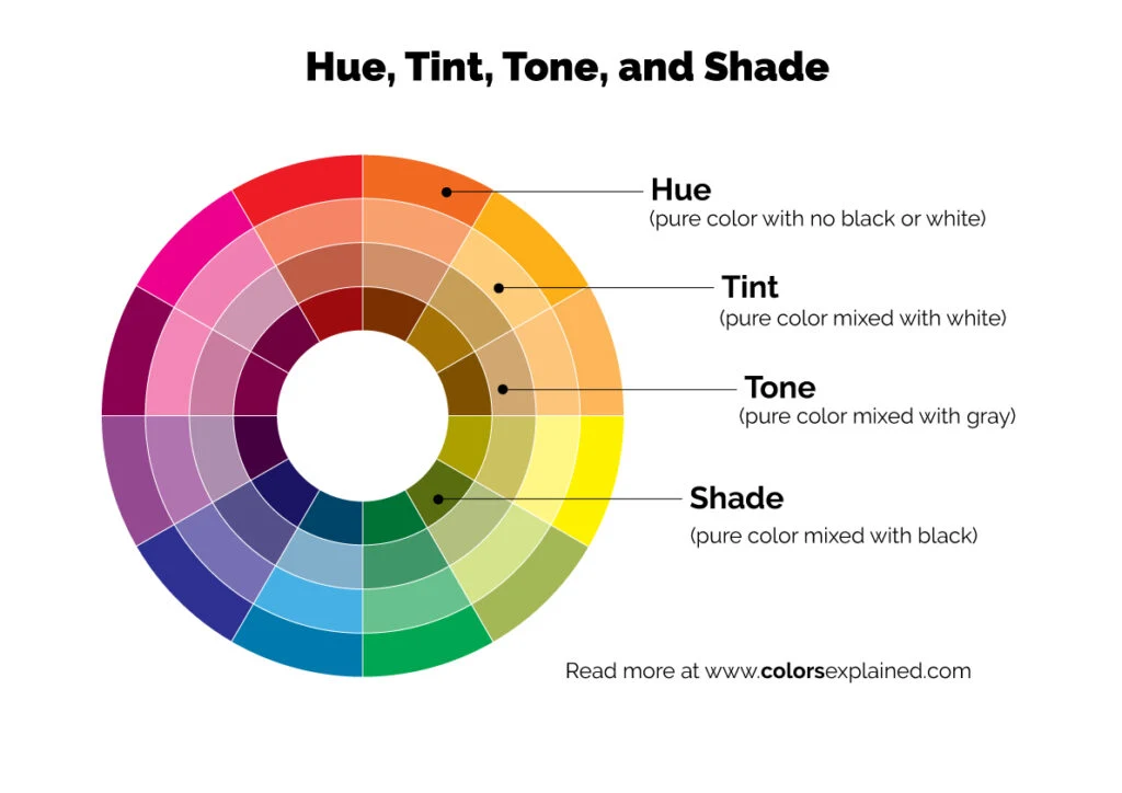
Color Wheel
Designers use the color wheel to build palettes and create color schemes.
The color wheel is divided down the middle between cool and warm colors and is made up of primary, secondary, and tertiary or intermediate colors, which open the door to complex colors.
In the traditional RYB color wheel, the primary colors are red, yellow, and blue. Secondary colors are made by evenly mixing primary colors, creating orange, green, and purple.
Tertiary colors are mixed colors created by a primary with a secondary color. That’s how you get colors like red-orange, blue-green, and red-violet.
Each hue on the color wheel has a number of shades, tints, and tones that you can achieve by playing with color adjustment.
Good to know: Hue is the underlying base color of any color family, such as blue, yellow, orange, red, and green — not ultramarine blue or forest green. All hues are colors, but not all colors are hues. For instance, brown is a color, but you won’t find it anywhere on the color wheel. That’s because it isn’t a hue; it’s a dull iteration of a given hue, such as red and orange.
Shade

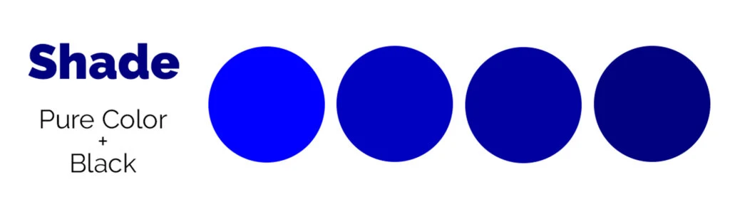
According to color theory, shades are created by adding black pigment to any hue (dominant color family).
Black, together with white, is a neutral color and by adding it to any color, it intensifies and darkens the original hue, creating a darker version of it.
Shades can range from medium to very dark colors, depending on the amount of darker pigment, black, added to the original color.
However, many artists darken colors by adding the original hue’s complementary color. This creates more vibrant results.
Still, if you’re indeed mixing colors by hand (like mixing pigments for an art project or paint for interior design), proceed with caution. It’s easy to create an overpoweringly dark shade.
Nevertheless, they’re a valuable way to add contrast to your palette.
When playing with shades, consider how darker tones make people feel. Darker colors tend to feel more serious, authoritative, and sophisticated.
Think of the classic black suit-and-tie look. This is why most uniforms use dark shades like navy.
Tint

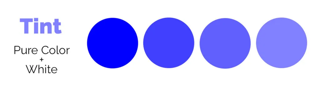
Tints are created by adding white to any hue, according to color theory. This lightens and desaturates the hue, creating a subtler and lighter color than the original hue.
In other words, it creates a lighter version, or paler version if you will, of any hue.
Pastel colors are often associated with tints since they’re softer and lighter. They’re considered quieter colors. In an art project, you would simply add white paint to the original hue.
In the graphic design world, you can adjust the opacity in your software to create a tint.
Lighter tints tend to feel gentle, soft, and peaceful – like the cheery, airy tones of springtime.
They tend to be easy to look at and pleasing to the eye. But in large amounts, they can feel overly feminine or juvenile. Think of the colors people often paint nurseries; pastels are a popular choice.
Tone

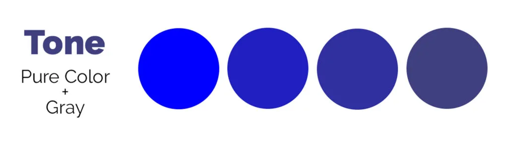
Tones are created by adding gray to any hue. The tone created depends on the amount of black and white used in the gray and the amount of gray added (keep in mind there are a lot of shades of gray).
This can create tones that are lighter or darker than the original hue, depending on the exact color and the type of gray you’re mixing it with.
Most of the colors we see in the real world are tones of a pure color. The colors on the color wheel are much brighter and more saturated than we’re used to seeing in the real world.
However, most people are used to being surrounded by toned-down versions of pure colors that are at least slightly desaturated. Keep this in mind as you create your color palette for a new project.
Muted colors tend to feel quiet, sophisticated, and subdued. Large swaths of muted colors can feel dull, boring, and fail to draw the eye.
More saturated colors (or colors pulled directly from the color wheel) are vivid, energetic, and bold. In large quantities, saturated colors can feel juvenile or overwhelming.
It’s a good idea to incorporate tones and more saturated colors in your palette to introduce contrast and draw the eye where you want it to go.
How to Use Shade, Tint, and Tone
After you master applying shade, tint, and tone to your base hues and experimenting with color mixture, your options are limitless. Here are just a few ways you can use these techniques to your advantage.
Using Contrast to Create Illusions and Geometric Shapes
Start with a base hue, then create a variation of the base hue by adding a bit of contrast. You can use this contrasting color to add geometric shapes into your design (side-bars on websites, feature walls in interior design, etc.).
Also, a design with different tints, shades, and tones of any given color (or different colors) creates a two-dimensional effect.
By using a variation of the base color, you’ll deliver a design that’s easy on the eyes while still easy to read. Just be sure to use enough contrast that the two variations on the base hue are easily distinguishable.
Using Tints and Shades to Draw Attention
Tints and shades have a high degree of color contrast, so putting them next to each other draws the viewer’s eyes to the right place.
Say you’re working on an art project, place a dark object in a light area of your painting — the dark object will stand out. Likewise, creating a light area surrounded by dark colors will draw attention instantly.
This same concept can be applied to any design, from interior to web design.
Mixing Color to Create Combinations
Creating color palettes using different base colors is great. But you can get more variation out of your palette if you incorporate different shades, tones, and tints into the palette as well.
In the same breath, you could create a monochromatic color scheme using the principles of shade, tint, and tone.
This creates visual interest without trying to use too many different colors, which can get overwhelming and confusing.
Using Color to Guide Composition in Decorating
When you’re decorating an entire space, you want to strike a balance between visual interest and overwhelming the eye.
Try using tints or muted tones for large swaths of space (like entire walls) and dramatic shades for focal points or statement pieces.
Wrapping Up on Shades, Tints, and Tones
Understanding the difference between tints, shades, and tones is essential to creating harmonic color combinations.
Not only that, but these elements of color help you get a grasp of color theory and master your design skills.
Did you enjoy learning about shade, tint, and tone? Then share this article with a friend who might enjoy it too!