Bright colors can grab a person’s attention like a bolt of lightning on a stormy day, and there’s a reason for this.
Have you ever wondered about the essence of bright colors and what they mean psychologically?
There are benefits to using vibrant colors in design and applying them effectively in everyday life. A bright color is worth a thousand words; I’m here to tell you how and why.
Bold and vibrant colors have more to them than just their thought-grabbing aesthetic.
If you want a quick fix of what bright colors are, their psychological meaning, their pros and cons, and how to use them, then you’ve come to the right place!

What Are Bright Colors?
The visual loudness of bold colors is all thanks to the intensity it reflects when light passes through them.
Color intensity, also known as saturation, refers to its purity and whether it’s mixed with black or white.
Hue is the origin of color in its purest form. The brightest colors are in absolute hue and are not diluted by black or white, making them a shade, tint, or tone. This pureness gives them their unique nature.
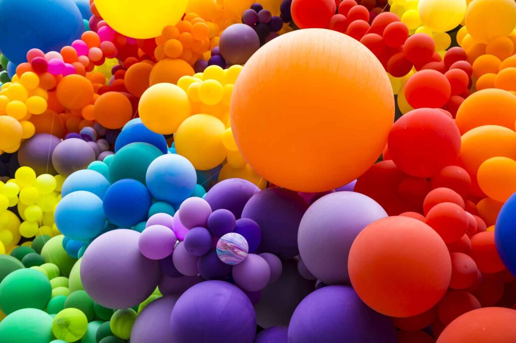
Some colors are naturally brighter than others. For example, when looking at the color wheel, we perceive red, orange, and yellow, known warm colors, to be brighter than green, blue, and purple, a few cool colors.
Still, any color can be bright, regardless of it being a cool or warm hue. Also, neon colors are obviously the brightest of all.
Scientifically, we perceive the brightest colors through wavelengths that refract into our eyes–that’s how we see color. The boldest colors the human brain perceives are yellow, orange, cyan, magenta, lime green, and red.
Interestingly we see color differently when the lights are off and on. The brightest color in everyday life in the dark is green, and in the light, it is yellow, but cyan is the winner on digital screens!


Psychological Meaning Of Bright Colors
Colors arouse certain feelings and, as such, have generated specific associations. For example:
- Dark colors are associated with seriousness, power, and sophistication.
- Light colors are related to stillness, peace, cleanliness, and softness.
- Pastel colors are linked to playful calmness and friendliness.
- Muted colors are related to safety, familiarity, and genuineness.
- Metallic colors are associated with power, luxury, and regality.
Vivid, vibrant colors equal upliftment. Why? Because they mimic the intensity and pleasantness of light, which has been proven to influence mood because it stimulates our brain.
Scientists have yet to conclude on color psychology reasonably, but design and art movements have long since theorized its effects on people.
Many people have partaken in surveys that indicate a unanimous decision that lighter, warmer colors positively affect moods.
People’s emotions when looking at color are entirely subjective since culture, nature, and everyday associations affect this.
Some people experience bright and flashy colors as overwhelming because they are overstimulating, so all opinions should be considered when using dazzling colors in a design concept.

Pros And Cons Of Using Bright Colors
Since color psychology is a thing, using striking colors in art, graphic design, and interior decorating needs an evaluation before you go too color-crazy.
Here are a few things to consider before creating your bright color palette.
The Bright Color Pros
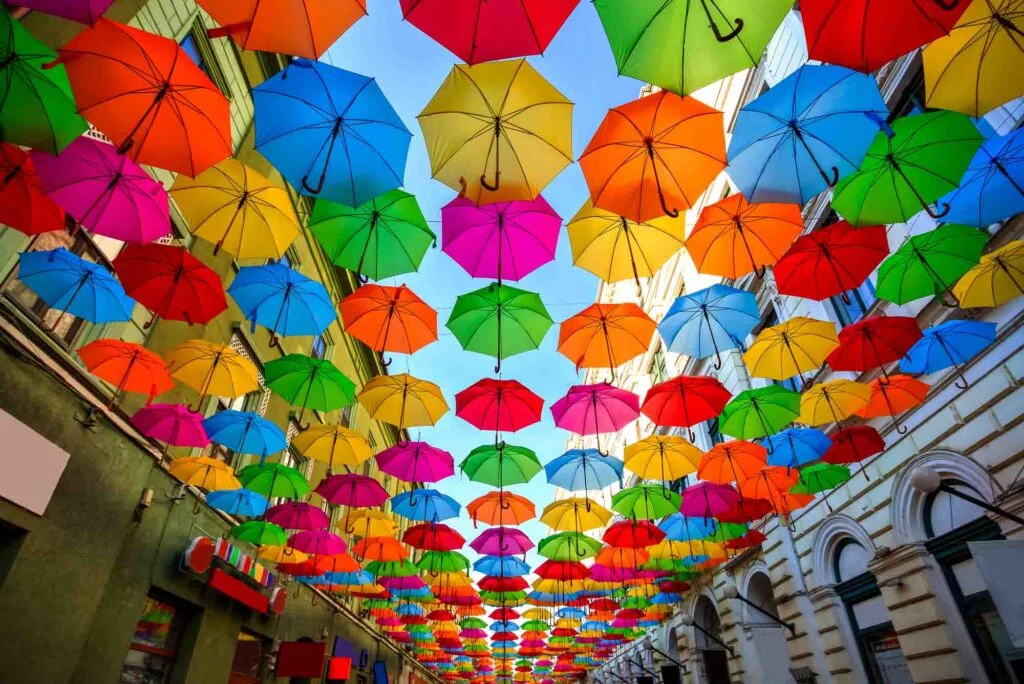
Color can benefit an environment when used in interior decorating or other designs. Punchy colors of pure hue allow creatives to make a statement that stimulates an emotional response.
Since most people associate bright colors with happiness, joy, compassion, and other related feelings, you can use them effectively to conjure up those emotions.
The Bright Color Cons
Since some people have joined the darker side of color favorites, bold colors don’t tickle everyone’s interest.
Striking colors can leave people overwhelmed and avoidant of creative work that incorporates them.
For example, the design could feel too intimidating for the faint-hearted if you use a bright color scheme to paint a room, like neon yellow or hot pink.
Like in the fashion industry, bright colors also go out of style in the blink of an eye.

Tips For Using Bright Colors
“Everything in moderation” is a good rule of thumb. Using accents of bright colors in graphic design or interior decorating can pack a more significant impact than running them as the primary source.
Pairing colors like reds, greens, yellows, and light blues with neutral colors like white, black, and gray creates a harmonious mood.
If you’re designing a site, use bright colors in buttons, links, and call-to-actions to lead readers, well, to take action (definitely avoid it as a background color). Add some neutral shades for some nice balance, and you’re bound to design an aesthetic site.
Just keep color harmony in mind, you know, complementary colors and so on, and you’re good to go.


Bright Color Codes and Examples
Here are a few collections of bright color hex codes to inspire and help you create your next design:
Make it hot
#ff4800
#ff5400
#ff6d00
#ff8500
#ff9100
#ff9e00
#ffaa00
Rainbow colors
#ff0000
#ff8700
#ffd300
#a1ff0a
#0aefff
#147df5
#580aff
It’s summer!
#13d1ff
#19a5ff
#fee719
#fe4f19
#f00c18
Citrusy
#ff9900
#ffc800
#ffe000
#fff700
#b8f500
#95e214
#72ce27
How civilized!
#ff00c1
#9600ff
#4900ff
#00b8ff
#00fff9
Bahamas holiday
#fd5200
#fe621d
#ff9505
#00cfc1
#00ffe7
Give me color
#edff00
#ff00b1
#9a00ff
#02b3f6
#66f200
Have you enjoyed this article about bright shades? Then share it on your social media! Also, feel free to drop the name of your favorite bright color in the comments! I’d love to hear from you!
vraj patel
Thursday 12th of September 2024
blue is my favorite color it is bright color and i feel happy when seeing bright color especially blue .