Neutral colors have timeless appeal in graphic, interior, and fashion design. They’re perfect background colors but can also make a powerful statement.
If you’re interested in graphics and fashion, this article will help you to understand the types of neutral colors, their meanings, when to use neutral shades, and actually see a few neutral palettes.
Ready? Then let’s explore neutral colors and their significance.

What Are Neutral Colors?
Neutral colors are muted shades that lack saturation, meaning they seem colorless.
These colors don’t form part of the color wheel or belong to the primary or secondary color categories.
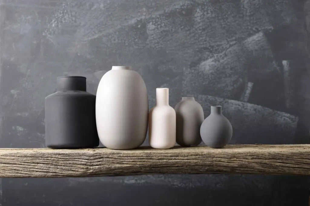
Brown, gray, white, and black are examples of pure neutral colors. However, as we will see in this article, there are a few more neutrals with varying shades.
Different Types Of Neutrals
Like with other types of colors, there are different types of neutral colors. These categories, if you will, are divided into two groups that include brown, gray, white, black, and many shades in between. Let’s take a look at the basic neutral color palette.
Pure Neutrals
Black, white, brown, and gray are known as pure neutrals because they don’t have any color undertones or underlying shades.
Pure neutrals are thoroughly saturated with a single hue. Once you combine a pure neutral with a primary color, you influence its saturation, which ceases to be pure.
Near-neutrals
Near-neutrals appear to be pure neutrals: at first glance, they don’t seem to have any color. However, on closer inspection, near-neutrals have a colored undertone and low saturation that prevent them from being pure neutral colors.
This undertone comes from the mixture of colors that create near-neutrals: a primary color plus a pure neutral.
You can find near-neutrals that are lighter than their original hue. For example, if you combine gray and blue, you can create a pale blue-gray or eggshell with neutral-like tendencies. Similarly, if you mix yellow and brown, you will get tan.
Near-neutrals can also be darker than a pure neutral, for instance, if you combine a primary color with black. A dark near-neutral is similar to shade or tone but with far less color saturation.
Warm Neutrals And Cool Neutrals
The undertone of a near-neutral shade determines whether it is a warm or cool tone.
For instance, if you combine a neutral with yellow, orange, or pink, known as warm colors, you create warm tones of near-neutrals, like beige, tan, and gold.
Cool neutrals come from mixing blue, purple, or green, known as cool colors, with a neutral shade. Examples of cool near-neutrals are ivory, gray, and taupe.
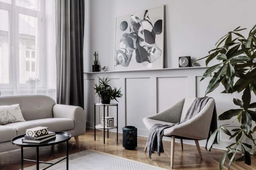
Consider how much natural light is coming through the windows if you’re using neutral wall colors. Cooler undertones are better for rooms with lots of sunlight.
Psychological Meaning Of Neutrals
Colors evoke particular emotions and feelings, creating specific associations in our brains. For example:
- Bright colors link to high energy, fun, and youthfulness.
- Light colors are related to stillness, peace, cleanliness, and softness.
- Pastel colors are linked to playful calmness and friendliness.
- Dark colors are typically associated with stability, competence, power, and sophistication.
- Muted colors are related to safety, familiarity, and genuineness.
- Metallic colors are associated with power, luxury, and regality.
Like all colors, neutral shades send different messages, evoke various emotions, and influence the psychology and behavior of those looking at, wearing, or living with the color. Understanding how color affects people is key to marketing and advertising.
For example, red is a strong color that draws people’s attention and stimulates the body. It calls for action. In contrast, neutral colors will blend in the background, giving you a sensation of restfulness and ease.
Let’s look at the meaning behind the most common neutral shades according to color psychology.
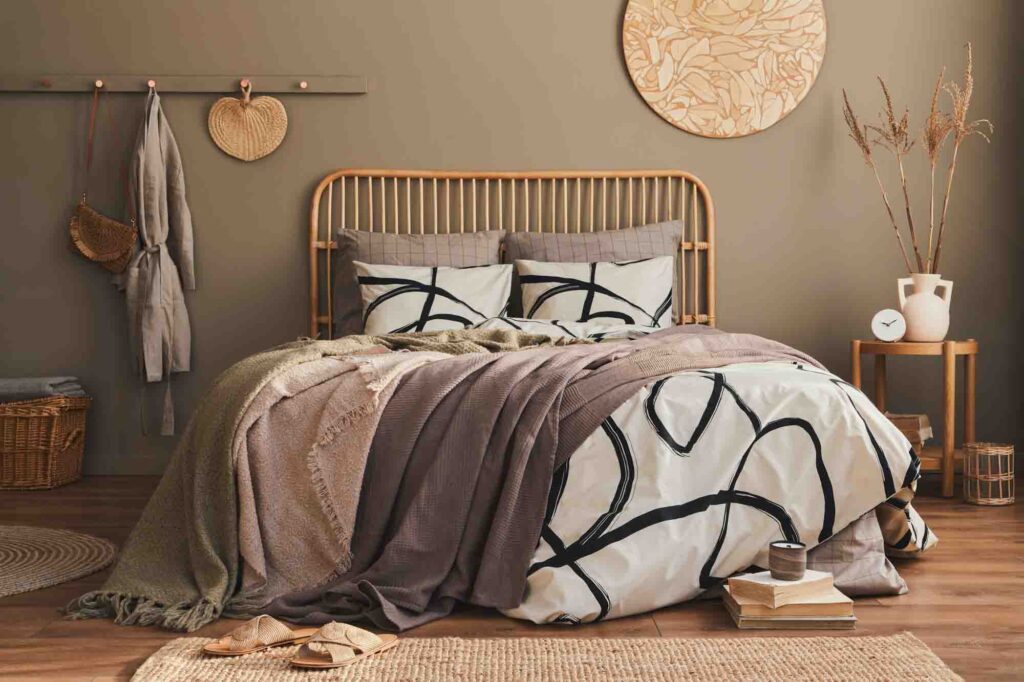
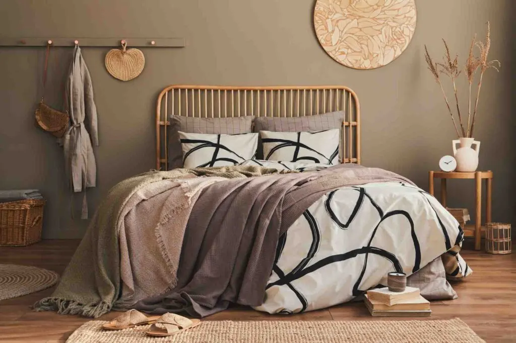
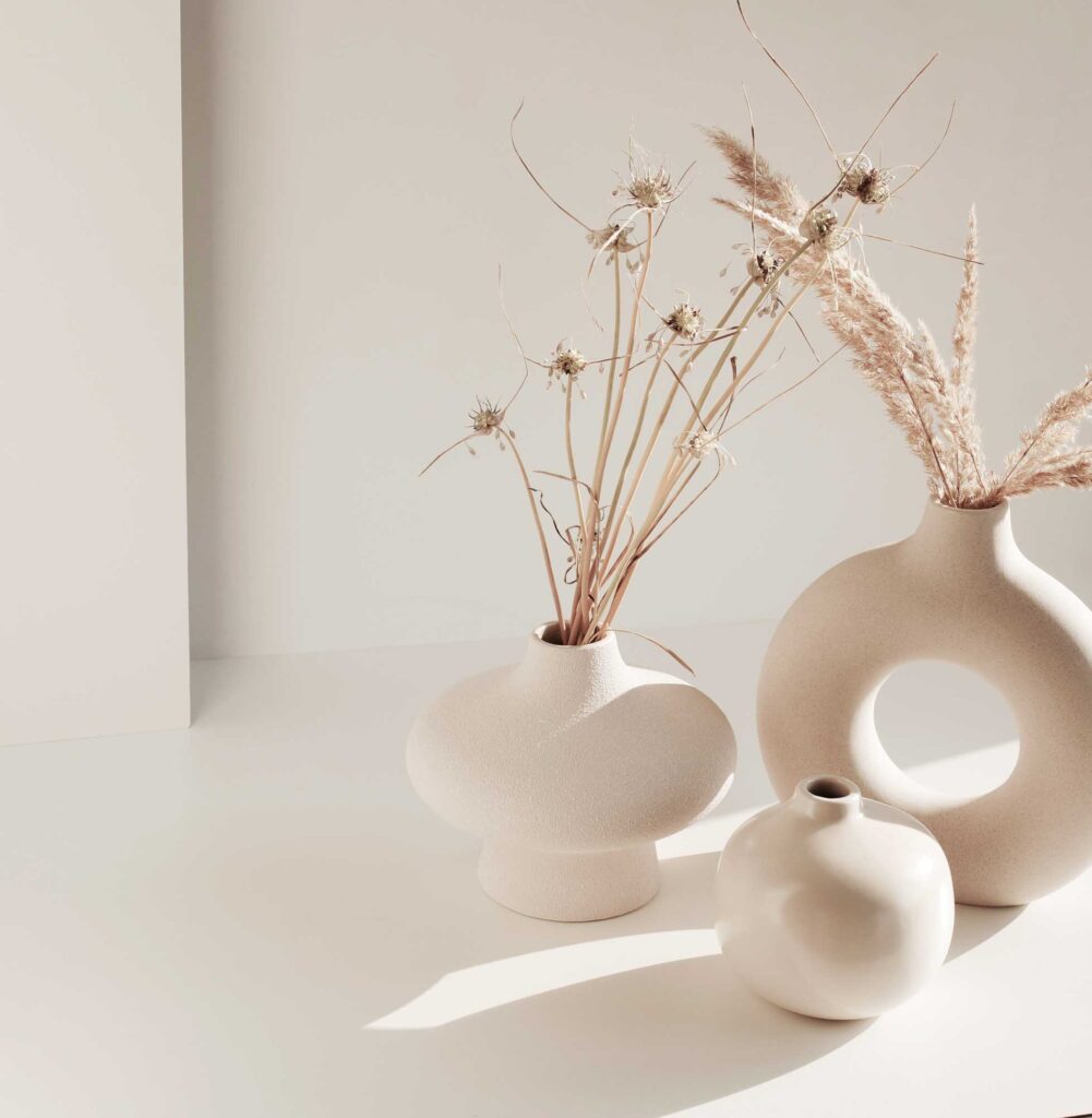
Brown
Because brown is the neutral color most associated with nature, it is seen as wholesome, natural, healing, warming, homey, and comfortable. It also has a variety of meanings.
- Dark browns: These colors create a sense of solidity, responsibility, and dependability. They’re grounding, authentic, and homely.
- Light brown: The lighter browns are calming, simple, and conservative. For example, beige tends to be a background color and is influenced by the colors around it.
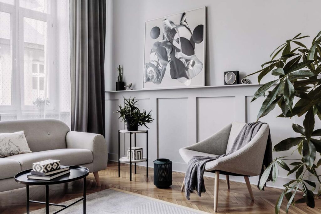
Gray
Gray is a pure neutral color that can be interpreted in multiple ways, ranging from classy to boring and modesty to modernity. It is, therefore, a versatile color to use in design.
There are several near-neutral grays, each carrying its own message.
- Dark gray: Like all darker hues, dark gray is serious, solemn, and traditional. This color can make you feel oppressed if overused.
- Medium gray: Lighter gray neutrals are more mysterious, intriguing, and elegant. These grays can resemble a nun’s habit, calling up wisdom and demureness. However, gray also conveys the restlessness of storm clouds and the potential for rain.
- Metallic gray: Once neutrals pass into silver, chrome, or pewter, gray becomes sophisticated, modern, and sleek, like a corporate skyscraper.
- Pale gray: Grays that tend towards white are timeless, classic, and calming.
White
In Western cultures, white has positive connotations. We associate white with innocence, simplicity, cleanliness, light, holiness, and peace. For example, it is traditional for brides to wear white to indicate purity and new beginnings.
Near-neutral shades of white, also called off-whites, are seen as appealing, conveying a classic, chic image. These shades evoke feelings of tranquillity and relaxation when combined with natural textures. Think, for instance, of beach tones used in a coastal-style interior.
Be aware that colors can have alternative symbolism in different cultures. For example, in Chinese culture, white is associated with passing, so consider how you use colors for varying audiences.
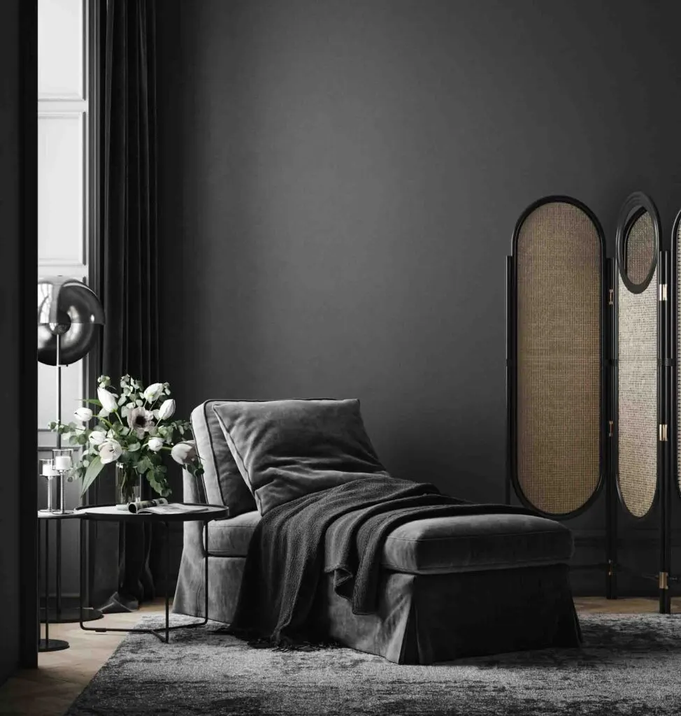
Black
Black is the most powerful and intense of the neutrals. It can also have varying meanings, depending on how the color is used.
Many societies see black as the color of mourning and passing, thus a negative color. It can be forbidding and unfriendly, associated with sadness or depression.
On the other hand, black is an elegant, sophisticated color, conveying timelessness – consider the classic LBD (little black dress). Using black in home decorating creates sophisticated, luxurious interiors.
Combining black and white creates a crisp, professional-feeling design, ideal for corporate branding.
Pros And Cons Of Using Neutrals
There are advantages and disadvantages of using neutrals in design, whether in a brand’s website, a corporate interior, a home, or a wardrobe. Let’s consider when to use neutrals and the challenges of using these colors.
Pros Of Using Neutrals
There are many reasons why designers keep returning to neutrals.
Neutrals Give The Eye A Break
In a design where neutrals are combined with brighter or vibrant colors, neutral shades are visually restful and give the viewer’s eyes a break.
Using too many colors, patterns, and textures can be overwhelming and create a feeling of unease and disorientation. Too much visual stimulation is mentally and visually exhausting, so it’s best to incorporate the calm provided by neutral colors.
Neutral tones lack saturation, so they don’t require attention or focus. Once the eye has rested, it can go on to appreciate the patterns and textures in the design.
Providing a visual and mental break is why many graphic and web designers and interior decorators use neutral colors as a background or base. Neutral paint colors are an excellent way to add color to a room without it being too present, like bold colors do.
Neutrals Enhance Other Colors
Another reason to use neutral colors is to enhance other saturated colors, making them pop and appear more vibrant. Neutrals can give different shades depth and intensity.
Neutral colors aren’t competing for attention, so other colors have the opportunity to stand out. Again, designers love neutrals because they make good backgrounds or base colors.

Neutrals Are Versatile
A massive advantage of using neutral colors is that they are versatile and suit every style.
In terms of interior design, several popular styles use neutrals. Here are some examples:
- Muted tones of off-white are essential in a minimalist interior.
- Rich browns are ideal for a traditional or rustic look.
- Black and white create the modern contrasts of Art Deco and go well with any strong accent color.
- Navy and gray make a masculine, sleek interior.
Neutrals Are Classic
Another reason to use neutral colors is that they are timeless and beyond trends.
Color trends come and go, being fashionable one season and rejected the next. All trends are temporary: the 1970s were all about brown, orange, and yellow, while the 1980s loved neon colors.
If you’ve embraced a trendy color, your design, home, or style will look dated once it’s out of fashion.
Neutral colors don’t go out of fashion. They are always classic, elegant, and appealing.
The advantage of timelessness applies both to a capsule wardrobe and an interior. You will get your money’s worth in repeated wearing or resale value.
Cons Of Using Neutrals
However convenient and classic neutral colors are, they don’t always work.
Neutrals Are Bland And Boring
Unfortunately, neutral colors can create a boring look, especially when they’re not skillfully layered or combined. Neutrals are best combined with a statement color to enliven a design or another neutral that offers visible contrast.
Many people stick to neutrals because they’re safe and inoffensive, not embracing their own tastes and color choices. Again, the result can be bland and uninteresting.
Because neutrals are seen as an easy option, they are overused in design. This glut of neutrals means they have lost their unique appeal, and their elegant charm can wane unless used unconventionally.
Neutral Color Codes and Examples
Here are a few collections of neutral color hex codes to inspire and help you create your next design:
High tea
#999B84
#F4EEED
#EFD9D1
#DDB7AB
#7F636E
Linen
#AD896E
#F0ECEA
#B0A89E
#A28C89
#DAD6D2
Sunrise
#F2E9E4
#C9ADA7
#9A8C98
#4A4E69
#22223B
Good morning
#EDEDE9
#D6CCC2
#F5EBE0
#E3D5CA
#D5BDAF
Back to your roots
#CB997E
#EDDCD2
#FFF1E6
#F0EFEB
#DDBEA9
#A5A58D
#B7B7A4
Sleek
#463F3A
#8A817C
#BCB8B1
#F4F3EE
#E0AFA0
Vacay mode
#3B4964
#D7C3B8
#DBD4C7
#D8D8D0
#EDE9DE
Neutral Shades FAQ
What are neutral colors?
Neutral colors are muted shades that lack saturation. They do not belong to the primary or secondary color categories and are not part of the color wheel.
What are the different types of neutral colors?
There are two main types of neutral colors: pure neutrals and near-neutrals. Pure neutrals include black, white, brown, and gray, while near-neutrals are shades created by combining a primary color with a pure neutral.
What is the difference between pure neutrals and near-neutrals?
Pure neutrals do not have any color undertones and remain saturated with a single hue. On the other hand, near-neutrals have a colored undertone and lower saturation due to the mixture of a primary color with a pure neutral.
How are warm and cool neutrals determined?
The undertone of a near-neutral shade determines whether it is a warm or cool neutral. Mixing a neutral with warm colors like yellow, orange, or pink creates warm near-neutrals while combining it with cool colors like blue, purple, or green results in cool near-neutrals.
What is the psychological meaning of neutral colors?
Neutral colors are often related to feelings of safety, familiarity, and genuineness. Each neutral color, such as brown, gray, white, and black, carries its own psychological significance.
What are the pros of using neutral colors in design?
Using neutral colors provides visual rest and allows other colors to stand out. Neutrals are versatile, enhance different colors, and can suit various design styles. They are also timeless and don’t go out of fashion easily.
What are the cons of using neutral colors in design?
Neutral colors can create a bland look if not skillfully layered or combined. Overusing neutrals can diminish their appeal, and some people may find them safe and uninteresting.
Have you enjoyed this article about neutral shades? Then share it on social media!
Drop the name of your favorite neutral color in the comments! I’d love to hear from you!