Pastel colors are some of the most used and loved tints on the color spectrum; their soft appearance is lovely, and is used in decoration, art, and design the world over; why is this?
This article about pastel shades will take a comprehensive look at what pastel colors are, their meaning, and how you can create your own pastel palette.
I will also provide the best recommendations for using pastel colors for optimal effect. Ready? Let’s go!

What Are Pastel Colors?
Pastel colors are colors that can be both bright and pale simultaneously. They are typical colors with added white, which pales the original color into a lighter, softer tint.
Basically, pastel colors have a lower saturation and higher value.
High-value colors are lighter, while low-saturation colors are more muted and less intense; this is why pastels are delicate, soft, and restrained.
Some colors are naturally brighter than others. For example, when looking at the color wheel, we perceive red, orange, and yellow, known warm colors, to be brighter than green, blue, and purple, a few cool colors.
Still, you can turn any color into their pastel version, whether cool or warm.

Psychological Meaning Of Pastel Colors
According to color psychology, colors arouse certain feelings and emotional responses and, as such, have specific associations. For example:
- Bright colors link to high energy, fun, and youthfulness.
- Dark colors are associated with seriousness, power, and sophistication.
- Light colors are related to stillness, peace, cleanliness, and softness.
- Muted colors are related to safety, familiarity, and genuineness.
- Metallic colors are associated with power, luxury, and regality.
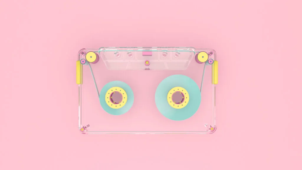
Pastel colors are commonly used to convey a feeling of calmness, relaxation, and peacefulness. Pastels are subtle, soft colors that are not overwhelmingly loud or obnoxious.
Pastel blues, like baby blue, can create a calm atmosphere that soothes the mind and will also help improve concentration.
Green pastel colors, such as light mint, are naturally calming; they provide balance and harmony. Pastel greens are often used in hospitals and doctor’s rooms to assist patients in reducing anxiety.
Yellow pastels can be cheerful without being exuberant and have childlike energy. Yellow pastel colors are common in children’s rooms and stores as they have a joyful aura and lift people’s moods.
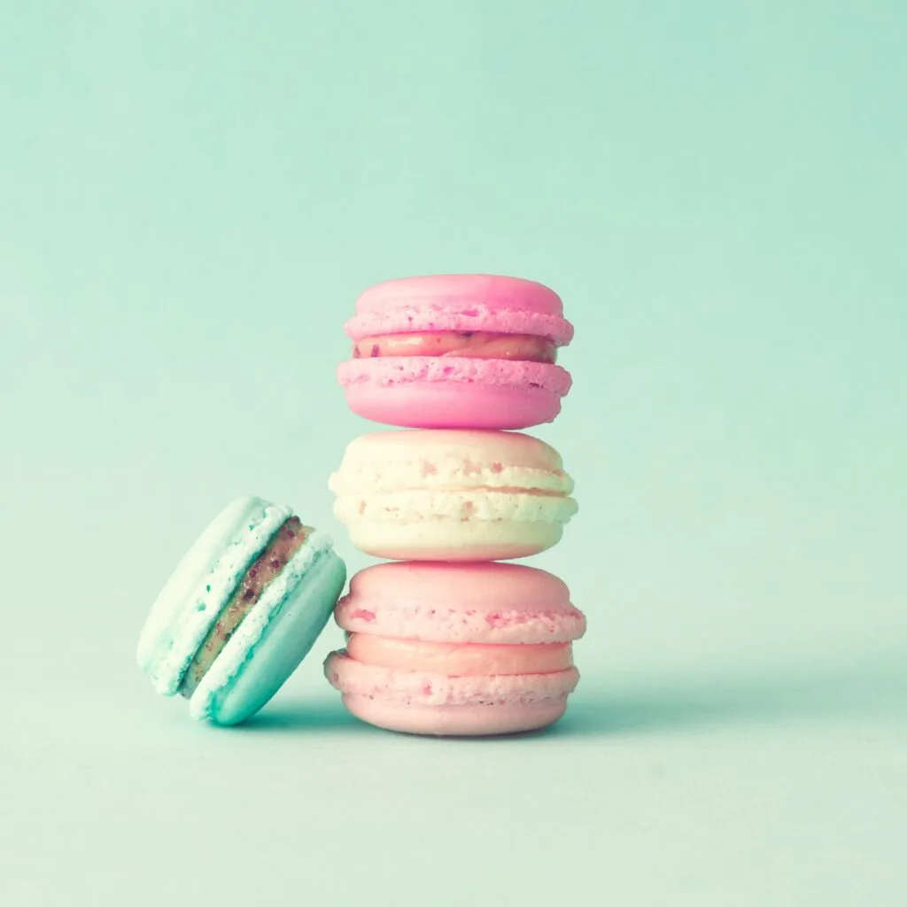
Pastel pinks have taken on a feminine meaning in the last century, with pale pinks (and pastel purples) associated with little girls; they are also used to demonstrate romance, affection, youthfulness, and hope.
Pastels with a red base can be more stimulating and help create a warm and welcoming atmosphere. More saturated pastels may, however, be less welcoming and provide a feeling of urgency.

Pros and Cons of Using Pastel Colors
As with anything, pastel colors need to be used carefully; I have put together some pros and cons.
Pros
Although pastel tones are light and pale colors, they can just as easily provide a vibrant feel due to their brightness.
Pastels are delicate colors that are perfect for background color as they are not overwhelming, being soft and more discreet than pure pigments.
Pastel shades are playful and fun, allowing one to add color to a palette without being kitsch or tasteless.
Pastel colors can add sophistication to an occasion, although this will depend on the shades used.
The softness of pastel colors prevents eye fatigue, especially in website design.
Cons
Too many pastel colors or a complete pastel color palette can give off an immature and babyish feel.
Just as too much of a saturated color may be overwhelming, so can too much of a pastel color also be.
In addition, specific pastel colors won’t stand out like bright saturated colors; darker pastel blues and greens may seem dull or depressing when used in excess.

Tips For Using Pastel Colors
Colors can help convey messages in art and design projects.
Pastel shades are no different and are often used in art, décor, and web design; here are some top recommendations for creating a pastel color palette.
It’s always a good idea to match your pastel color to what you are aiming for. A pastel color scheme made of complementary colors creates a lot of contrast to draw attention.
You can combine your pastel color with a neutral color, which helps create balance, especially in graphic design.
Use only a few pastel colors in your visual content; choose a few colors, perhaps use one as a background or accent color and the others to create a contrast.
Using one saturated, bold color together with pastel colors is a good idea to create a more emphatic impact.
Pastel Color Codes and Examples
Here are a few collections of pastel color hex codes to inspire and help you create your next design:
Rainbow colors
#ffadad
#ffd6a5
#fdffb6
#caffbf
#9bf6ff
#a0c4ff
#bdb2ff
Sweet colors
Light pinks, pastel shades of purple, and light blues, like baby blue create a sweet, innocent look.
#Cdb4db
#Ffc8dd
#ffafcc
#bde0fe
#a2d2ff
Citrusy
#fec5bb
#fcd5ce
#f8edeb
#e8e8e4
#d8e2dc
#ffd7ba
#fec89a
Summer vacay
This palette with somewhat vibrant colors is perfect for lively and summery designs.
#84dcc6
#a5ffd6
#ffa69e
#ff686b
Barbie world
Here are some beautiful soft pinks. For more shades of pink, check out our article.
#ffe5ec
#ffc2d1
#ffb3c6
#ff8fab
#fb6f92
Calm day
These soothing colors and muted tones are excellent choices for eco-friendly products and packaging design, for example.
#ccd5ae
#e9edc9
#fefae0
#faedcd
#d4a373
Neutral me
This pastel palette is perfect for baby products or even a baby shower.
#d0b8ac
#f3d8c7
#efe5dc
#fbfefb
#eeddd3
Have you enjoyed this article about pastel shades? Then share it on your social media! Also, feel free to drop the name of your favorite pastel color in the comments! I’d love to hear from you!