Muted colors are calm tones that you can use effectively to create balance in many situations. Different types of colors have many effects on us, and today I’ll talk about the muted ones.
Color can be a lot of fun, and it can have a significant impact on mood and desire. I will investigate what you need to know about muted colors, what they are, and what they mean.
Also, I will go through the dos and don’ts of muted colors and provide the best tips for using muted colors in your designs. Ready? Let’s go!

What Are Muted Colors?
Muted colors are generally any color with black, white, brown, or gray added to them, making them appear duller and less vibrant than before. Muted colors have less chroma and are not as saturated as vibrant colors.
Muted colors are often called desaturated or natural colors and can also comprise more earthy colors of browns, greens, blues, and grays.
Any color on the spectrum can be muted by adding a dulling color. You can make muted yellow with a dash of black or a murky brown by adding a brown color.
They are considered cool colors as opposed to bright, warm colors.
Hues can also turn into a muted version of themselves if their complementary color (from color theory) is added. For instance, you add blue to orange or red to green; the resultant color is dull and muted in both cases.
Often pale shades are considered muted shades, but muted colors can also be darker shades of saturated colors. In essence, muted colors are not bright or vivid due to an addition of a dulling agent.
In graphic design, they are called tones because, many times, they are made by adding gray. (Click here to read about shades, tints, and tones.)


Psychological Meaning Of Muted Colors
Colors evoke particular feelings and, as such, have forged specific associations in our brains. For example:
- Bright colors link to high energy, fun, and youthfulness.
- Light colors are related to stillness, peace, cleanliness, and softness.
- Pastel colors are linked to playful calmness and friendliness.
- Dark colors are typically associated with stability, competence, power, and sophistication.
- Metallic colors are associated with power, luxury, and regality.
Some think muted colors are lifeless and even boring. In truth, muted colors are often used to create spaces of calm and peace.
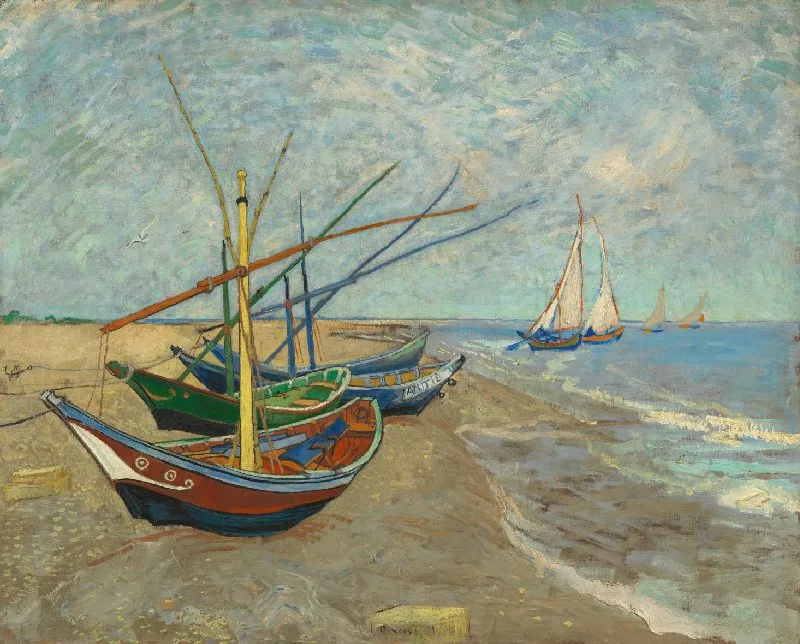
For example, consider Vincent Van Gogh’s Fishing Boats on the Beach at Les Saintes-Maries-de-la-Mer. This painting shows a beautiful use of deep and muted colors perfectly combined to draw one’s attention to the boats while giving an overall feeling of calmness.
As many neutral colors fall within the range of muted colors, a muted color palette may help one feel safer in terms of simplicity and nature; muted colors are used in hospitals and lounges to provide a feeling of safety and nurturing.
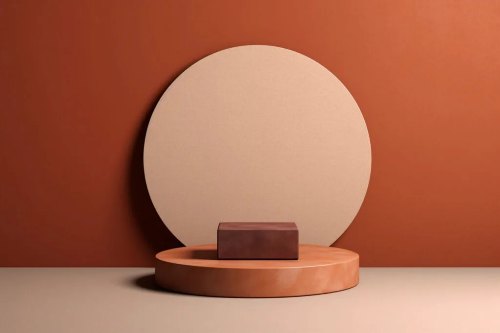
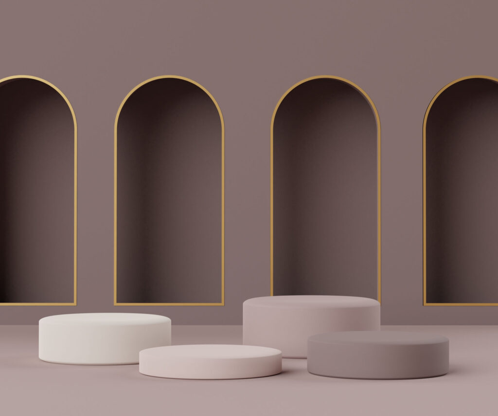
Muted color schemes also give a feeling of age, knowledge, and wisdom. Maroons, grays, and off-blues have an official, mature feel. These muted tones are also widely used to convey elegance.

Pros And Cons Of Using Muted Colors
As with most things color based, there are pros and cons to using muted colors and tones. Let us take a look at these.
Pros
Muted colors provide a more natural feel and a relaxing and peaceful atmosphere to a room. Muted palettes provide subtlety and grounding.
Muted colors are good for living spaces that are used for relaxation, like bedrooms and lounges. As they are unassuming and bland, muted tones help to provide a stimulation-free environment. Also, rooms with good natural light will benefit from an airy look.
Muted tones have been found to give the public a feeling of trust and calm when used in doctors’ rooms and schools. In contrast, many pops of color can feel overwhelming.
Muted tones also provide a feeling of sincerity, so they are useful when creating branding that wants to imply maturity and intelligence. You can use them in your design’s primary color and the brighter, intense color for the colorful accents.
Using a desaturated hue as the base color gives you control over the focal point in your design, so you can use accent colors to draw people’s attention to where you want them to look.
Cons
Muted colors can be dull. A room entirely made up of a muted palette can feel washed out and lifeless.
Because they are so bland, muted colors can also give off an anti-septic feeling.
Muted colors are exactly that; muted, and they are unobtrusive, so they won’t catch the eye and are unlikely to create much impact as they can merge into each other, so logos comprising exclusively muted colors may end up having little to no effect.

Tips For Using Muted Colors
A desaturated color palette is useful in design, especially as a background color. The trick is how to use muted colors to full effect. You should combine muted colors with two complementary brighter colors for optimal aesthetics.
This contrast of vivid and muted will provide that bit of life to a room without making it too busy, retaining the aura of calm and peacefulness the muted tones infer.
In combination with vibrant tones, subtle colors can also be very effective in branding and marketing, providing the required contrast to make a logo ‘pop.’ While still retaining the elegance the muted color provides.
Lastly, in artworks, muted colors are integral to providing the required shading and mood to an image and will very often make up large areas of backgrounds and shaded areas. When used with other color tones, these subtle shades can make all the difference to an artwork.
Muted Color Codes and Examples
Here are a few collections of muted color hex codes to inspire and help you create your next design:
Sunrise
#ffcdb2
#ffb4a2
#e5989b
#b5838d
#6d6875
Let’s go back to spring
#667761
#545e56
#917c78
#b79492
#eae1df
Earthy me
#797d62
#9b9b7a
#d9ae94
#f1dca7
#ffcb69
#d08c60
#997b66
Blue hour
#566fa3
#637eb6
#8087bd
#8dabce
#9daadb
Sweet, please
#f2c5c4
#b88e8d
#a36665
#823c48
Honeycomb
#F2DF80
#E6BD77
#B8875C
#523D37
#0D0D0D
Moody
#4A2C46
#825A75
#C1A5A9
#9FAD95
#424F44
Have you enjoyed this article about muted shades? Then share it on social media!
Drop the name of your favorite muted color in the comments! I’d love to hear from you!