Every day we open our eyes, and most of us see the incredible palette of colors that make up our lives, but have you ever wondered: what is color?
How do we see color, what is it made of, what is the definition of color, and how does it influence us?
Color is a truly fascinating subject and has been the focus of interest for philosophers, scientists, and artists for millennia. Trust me when I say there is more to colors than meets the eye.
In today’s article, I will take you through what color is and what it has to do with physics, philosophy, art, and even psychology.

What Is Color?
So, what is color? Simply put, color is light and the eye’s perception of visible light—nothing more, nothing less.
Color is electromagnetic radiation of a certain range of wavelengths visible to the human eye. We call this the “visible spectrum of light.” Not very creative, I know.
Still, we see reflection, absorption, emission spectra, and light interference on objects. Basically, light (artificial or natural) reflects off an object, enters our eyes, is recognized, and forwarded to the brain by our photoreceptor cells.
The photoreceptor cells relay will be based on the lengths of the light waves bouncing off the objects and the angles at which they bounce off what we view.
Different objects will absorb some light waves and reflect others. The reflected light waves of an object’s hue, lightness, and saturation are color.
The colors we see will depend on the light; more light will provide clearer, brighter colors, whereas we can barely perceive color in dim light or darkness.
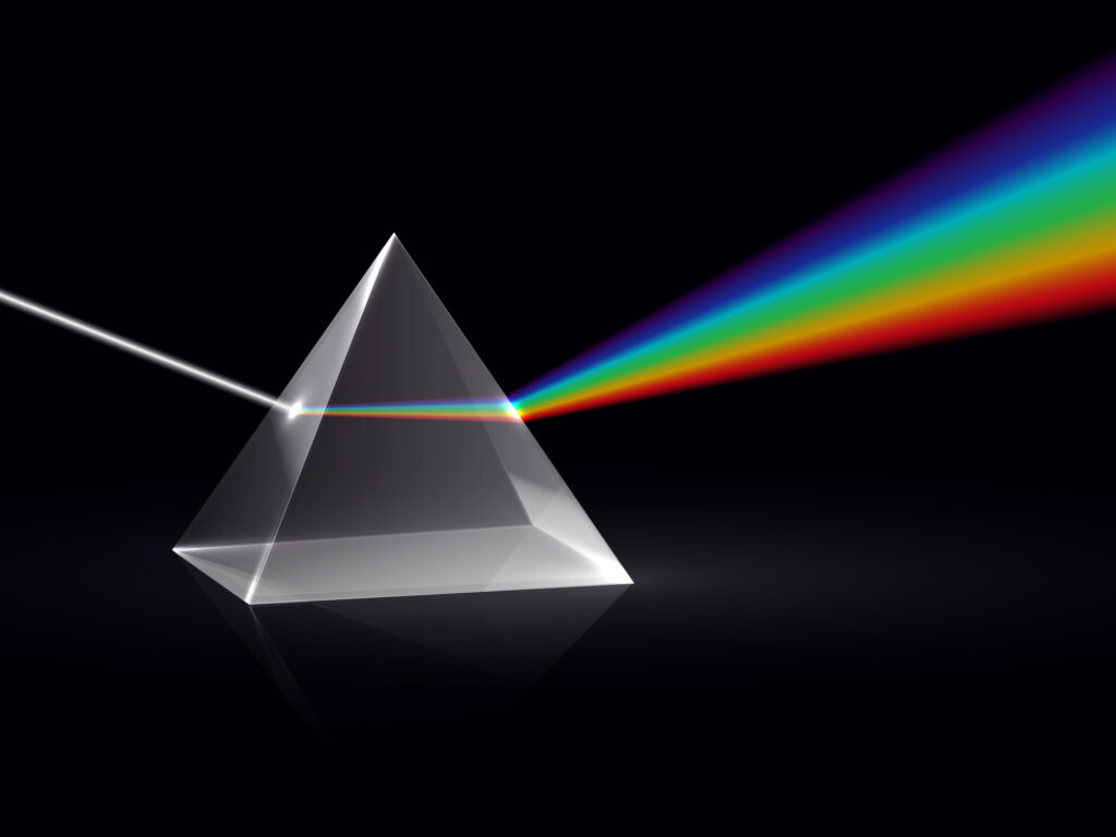
Also, white light comprises the entire visible spectrum, which becomes evident when white light is passed through a prism (Sir Isaac Newton’s experiment, anyone?) or water droplet. The dispersion of light forms the visible spectrum, which makes up the rainbow—these are the spectral colors.

But Wait, How Exactly Does Color Happen?
Okay, so now you know what color is. Now let’s take a look at how color happens. How do we see grass as green and wood as brown? How do we see a blue sky during a clear day and a red sky during sunset?
This happening can be attributed to many factors, but at face value, color is down to science and physics, which depends on how light travels.
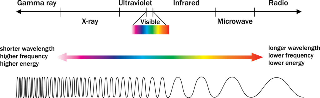
Light is a form of electromagnetic radiation. In the electromagnetic spectrum of light, there can be shorter wavelengths with higher frequency and energy, like harmful gamma rays, but also longer wavelengths with lower frequency and energy, like radio.
Well, you can’t see either gamma rays or radio frequency, but the only visible part of this spectrum is what we know as color—the visible spectrum of light.
The visible light humans can see runs between 380 nm to 700 nm (nanometer)—this range is observed as color.
| The Visible Light Spectrum | |
| Color | Wavelength |
| Red | ~ 625 – 700 nm |
| Orange | ~ 590 – 625 nm |
| Yellow | ~ 565 – 590 nm |
| Green | ~ 520 – 565 nm |
| Blue | ~ 500 – 520 nm |
| Indigo | ~ 435 – 500 nm |
| Violet | ~ 380 – 435 nm |
Visible light travels in waves, with different colors being different wavelengths. Blue has far shorter wavelengths than red.
Light waves can be bent, reflected, absorbed as heat, refracted and dispersed, or scattered, all of which will affect the perceived color of an object.
That’s why the sky is blue, but it can also be red, pink, and so on—the visible light travels differently throughout the day as the Earth spins around its axis and light enters the atmosphere from different angles.
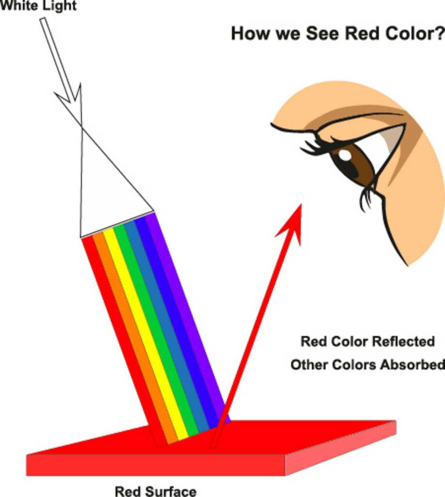
For color to happen, an object will absorb certain light waves as heat and reflect other light waves as what is perceived as color, but this depends on the light source and the angle at which the light hits and reflects off the object.
When we look at the grass, some light waves are absorbed by the grass, and some light waves are reflected in our eyes. What makes grass appear green is the green light wavelengths reflected off it while it absorbs all the other light wavelengths, also known as colors.
In essence, an object’s perceived color is determined by which wavelengths the object reflects and the angle at which they are reflected. That’s why two persons seeing the same thing under the same circumstances may not see the same as color perception varies.

The Physiological Side Of Color
Cool. You know what color is and how this wonderful phenomenon is possible. Now let’s talk a bit about how our bodies make it possible to translate these wavelengths into a colorful world.
Physiology has a large role to play in how we see color. After all, our eyes are the organs that provide information on visible light, which is then relayed to the brain to decipher what we see as objects and colors.
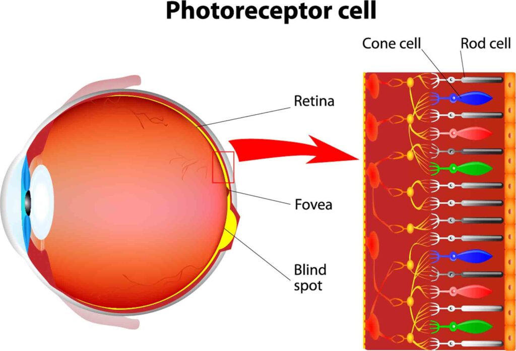
The human eye can perceive color thanks to the photoreceptor cells in the eye. The cells are the rods and cones that are found in the retina. These cells are responsible for identifying light, with the cone cells working better with brighter light and the rod cells functioning better with lower light.
Unlike many animals, humans are mostly trichromatic, which means our eyes have three types of cones to detect the wavelengths of the visible light spectrum.
Just for fun: most mammals, such as cats and dogs, are dichromatic (only two cones). However, most birds, amphibians, and reptiles are tetrachromatic (four types of cones).
Anyway, these three types of cones humans have can detect short, medium, and long wavelengths. The sensory values of the cone cells are also known as tri-stimulus values.
When the cone and rod cells are stimulated, they provide information to neurons relayed via the ventral and dorsal streams to the visual cortex of the brain.
When we view an object, such as a yellow rubber duck, the rubber duck reflects the yellow wavelength that bounces off it. Our three cones combine all information being seen and send messages to the visual cortex in the brain for deciphering.
Color is not straightforward, though, and there is a subjective component even within the physiological aspects of vision.

The Perception Of Color
How does one person’s perception of color differ from another’s, and what does this mean in terms of what is color?
Color perception refers to how a color subjectively appears or “looks” to the beholder.
Not all eyes and brains are the same, so we may perceive color differently. More factors may impact how we see color; let’s look at them.
The background on which an object is viewed may impact the color we see on the object. Some colors used in specific sequences and with different backgrounds can seem entirely different; this is often used to create optical illusions.
The light in which an object is viewed is considered as important as the color of that object, which can appear to be different in a bright room versus when viewed in a room with low lighting.
Even altitude may make a difference in how the color of an object is perceived.[1] People visiting areas in higher altitudes experience reduced oxygen in their bloodstream (hypoxia), affecting how the eye perceives individual colors.
Age is also an important factor for color perception; the older we get, so do our eyes. Older eyes slowly lose their ability to see vivid colors.
Medication has been linked to altered color perception. Certain medications can cause us to see colors differently, giving objects a slight tint or difficulty telling the difference between colors.
Memory is another factor. The human brain can get used to seeing certain objects in a specific color, and our brains will insist that an object has the remembered color even if that is incorrect.
As we have mentioned, color is subjective; even feelings can change how we perceive color.
In fact, low levels of dopamine, like when you’re feeling down or a bit depressed, may impact how well you can identify blue and yellow colors.
On top of all that, color vision deficiency is obviously a reason for individuals to perceive colors differently than others. Biological men are more likely to be color blind than women due to DNA mutations.
Interestingly, the most common form is red-green color blindness, called protanopia, followed by difficulty distinguishing between blue and yellow, called tritanopia, and finally, total color blindness, called achromatopia.[2]

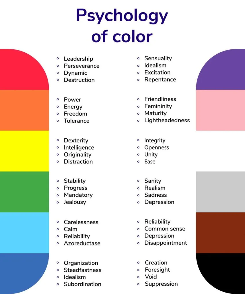
The Psychology Of Color
When I said there is more to color than meets the eye, I wasn’t joking.
Color meanings are subjective and can be quite powerful in conveying messages and instilling emotions. About 62%-90% of your reactions are based on color.
Colors can mean different things to different people; on top of our instinctual response to them, they can have cultural and emotional significance—that’s why they should be used carefully.
That said, colors are useful in getting your message across or transforming a room, and humans have worked out how to use color to our best advantage.
Each color on the spectrum has an emotional component, and designers, artists, marketers, and even you can tap into this to make people feel what they want others to feel. Let’s take a look at how.
While there are the main spectral colors, you can find many colors between the two furthermost limits of the visible color spectrum. Amongst these types of colors are bright, dark, muted, pastel, metallic colors, and many more.
Bright colors are vibrant, energetic, and passionate. These saturated colors can enliven a place but also be overwhelming and aggressive depending on how they are used.
Dark colors are serious and have an air of sophistication, but they can also feel authoritative.
Muted colors are duller, calm, and can be serene, sincere, and discreet; however, this can also be boring and depressing.
Pastel colors are soft and peaceful but playful and fun. They can brighten a room, but they can also be overwhelming and, in excess, dull.
Metallic colors remind us of precious metals and therefore are used to convey luxury, sophistication, and superiority—but you won’t find these on the color wheel.
Generally speaking, each spectral color has an emotional meaning that is further enhanced or detracted from when the color loses saturation.
Red is most commonly linked to feelings of power, energy, and aggression. Many sports teams have red in their team colors. It’s an active color and gives off energetic connotations that can be both good and bad.
Orange is a warm, positive color; it’s strong but playful and can often be used for children’s items, especially because it is considered a gender-neutral color.
Yellow is bright and sassy, a joyful, fun color that exudes energy and enthusiasm.
Green is a natural color; it provides a peaceful aura that is natural and calming; green has a serene feel.
Blue is calming and peaceful but has an underlying power. It has connotations of authority and dependability.
Indigo is mysterious and wise. This color is related to intuition, higher spiritual knowledge, and narrow-mindedness.
Violet is a royal color, often associated with importance, nobility, and power; it can also be calming, peaceful, and even passionate, depending on its hue and shade.

Using Color in Design
Okay, so we talked about what color is, how the phenomenon of color happens, how our bodies process it, how we perceive them, and the psychology behind them. But how are the same colors reproduced in different media, like screens and magazines?
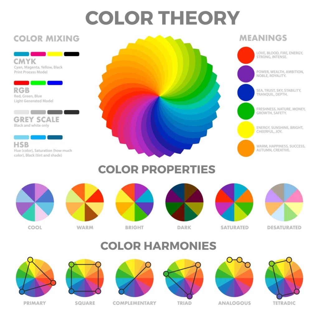
The answer to that question is color models. Different color models are applied to various uses of color, such as print, digital screens, and paints.
In this next section, we will briefly discuss the different color models to help you understand color.
Well, when using color, the words primary, secondary, and tertiary colors can get thrown about, but what are they?
In color theory, primary colors tend to be a group of three main colors from which, when two primary colors are combined, will create secondary colors.
The mixture of two secondary colors or a primary and secondary colors creates tertiary colors, depending on the model you’re looking at.
In the RGB color model (for screens), the primary colors are red, green, and blue, while in the RYB color model (for art and paint), the primary colors are red, yellow, and blue. There is a common misconception that combining any of the three colors can create any color on the visible spectrum, though.
Primary and secondary colors play a role in the two main color models for the use of color.
One model is known as the additive color model (RGB), and the other is the subtractive color model (RYB); we will see how each color model is applied below.


The Additive Color Model
This model, also known as RBG color, uses the physics version of primary colors red, green, and blue.
This model is most commonly used in computer displays, and where all three colors overlap, white is the resultant color. The colors in the additive model are generally brighter and more vibrant as they work with transmitted light.
It starts with a black background (the display screen of any digital device like a TV, phone, or tablet), then mixes light to show color on the screen (adding color = additive).
Using the additive color model, the maximum value for each primary color is 255; if all three have this value, the result will be white. Conversely, the minimum value is 0; if each color value is 0, the result would be black.
The additive color model uses red, green, and blue to create magenta, cyan, and yellow.


The Subtractive Color Model
In this subtractive color model, white is the blank slate. Colors are created by mixing inks (CMYK) in printers or paints (RYB) in art projects and applying them to the paper surface under white light. This pigment blocks specific color wavelengths, therefore subtracting color.
In these two models, the primary colors are cyan, magenta, and yellow, and red, yellow, and blue, respectively. In both cases, when all three overlap, they create black.
Well, at least, in theory. If you try mixing red, yellow, and blue paints, the result will probably be a shade of brown.
As you might have imagined, the subtractive color model has less ability to create as large a percentage of the visible spectrum as the RBG additive model.
Regardless of the media used, applying the principles of the theory of colors ensures a design is appealing to the eyes. Things like color temperature (cool colors/warm colors) and harmony (complementary or analogous color schemes, and so on) are crucial when designing with color.
FAQs About What Is Color
What is color?
Color is light and the eye’s perception of visible light. It is electromagnetic radiation of a certain range of wavelengths visible to the human eye.
How do we see color?
When light (artificial or natural) reflects off an object, it enters our eyes and is recognized by our photoreceptor cells.
These cells relay information to the brain based on the lengths of the light waves and the angles at which they bounce off the objects we view.
What determines the colors we see?
Different objects absorb some light waves and reflect others. The reflected light waves of an object’s hue, lightness, and saturation create the colors we perceive. The amount and quality of light also influence the colors we see.
Why do we see different colors in different lighting conditions?
The way light travels and interacts with objects can vary in different lighting conditions.
For example, the sky can appear blue during the day due to light scattering, but it can also appear red or pink during sunrise or sunset due to the different angles at which light enters the atmosphere.
How does our physiology contribute to color perception?
Our eyes have photoreceptor cells called rods and cones, which detect light and send signals to the brain.
Humans are mostly trichromatic, meaning we have three types of cones that detect different wavelengths of light. The combination of information from these cones allows us to perceive colors.
Why do people perceive colors differently?
The visual perception of color can vary due to several factors. The background on which an object is viewed, lighting conditions, altitude, age, medication, and even personal experiences and emotions can all influence how we perceive colors.
What is the psychology behind color?
Colors have emotional and cultural significance. Different colors can evoke specific emotions and convey messages.
Bright colors can be vibrant and energetic, while dark colors feel serious and authoritative. Color choices can be used strategically in various fields, such as design, art, and marketing.
How are colors reproduced in different media?
Different color models are used for various media.
The RGB color model is commonly used for screens, where red, green, and blue are the primary colors. The additive color model is applied in this case.
The subtractive color model, such as CMYK for printing or RYB for art, is used with inks or paints and works by subtracting certain wavelengths of color.
What is the difference between the additive and subtractive color models?
The additive color model (RGB) creates colors by adding red, green, and blue light. When all three colors overlap, white is produced.
In the subtractive color model (CMYK or RYB), colors are created by subtracting specific wavelengths of light by using pigments or inks. When all three primary colors overlap, they make black or brown.
Why is understanding color important?
Color plays a significant role in our daily lives. It influences our emotions, perceptions, and decision-making processes.
Understanding color helps us appreciate its scientific and psychological aspects and enables us to use it effectively in various fields and contexts.
Final Words on What Color Is
Color is science, physics, and emotions.
Color is everything, and it basically leads us to choose the things we buy, influences how we feel, and conveys subconscious messages every day.
Learning what color is helps us understand this fascinating part of science and, of course, the world we live in.
I sincerely hope you enjoyed this article about what color is and feel inspired by it. Be sure to share it on your social media!
Andrés ShadeGuru
Monday 30th of September 2024
Artículo muy bien estructurado, se aprecia el esfuerzo.