Looking for beautiful Christmas color palettes for your design or home decor? We got your back. Here are our favorite holiday palettes for all tastes.
Eating enough for the whole year, being together with family, and decorating with holly berries, thus red and green — all of these traditions trace their roots back to Celtic people who celebrated the winter solstice.
These traditions have been embodied in our modern Christmas practices, and while we all love them, changes are always welcome.
Because of that, we put together this article with our all-time favorite Christmas theme colors, from traditional to out-of-the-box.
To understand the significance of these festive schemes, you can read up on the meaning of the Christmas colors – it’s an interesting read!
28 Beautiful Christmas Color Palettes
Here are 28 of our favorite color palettes for Christmas.
1. Red, Green, and Gold

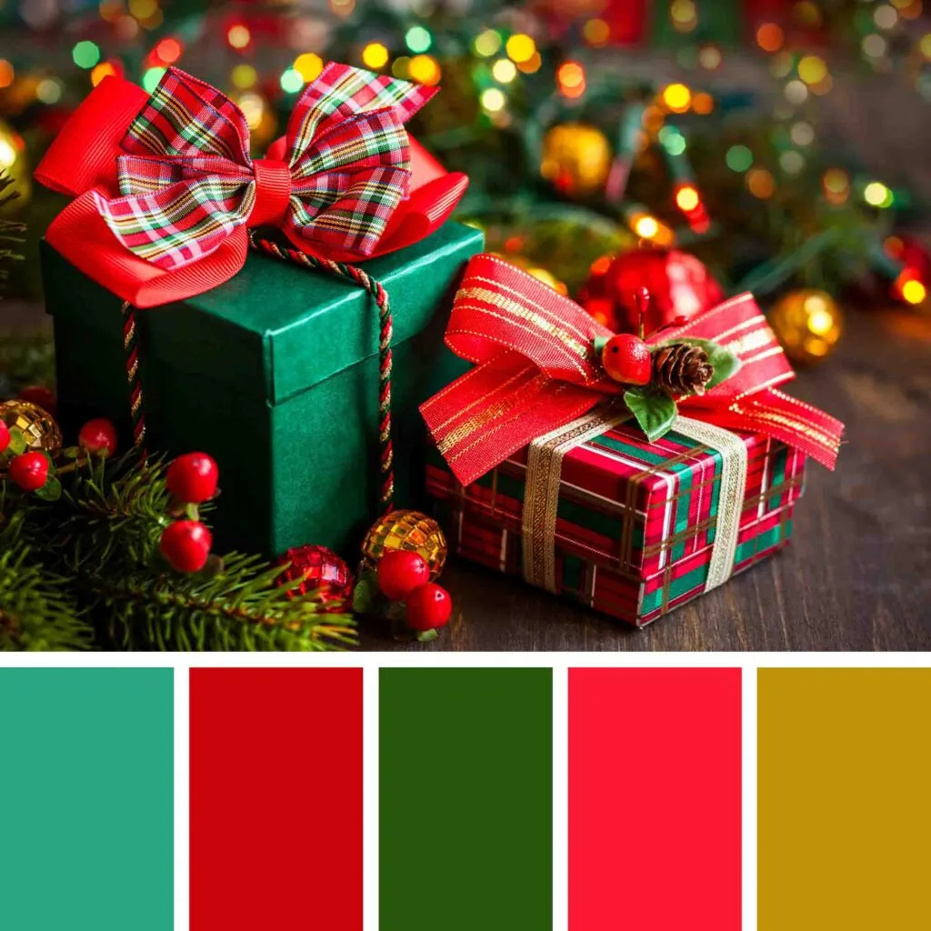
Red and green create not only beautiful color combinations but also remind us of the beauty of the holiday season. The dark gold adds an elegant touch to the color scheme, which is a safe accent next to these bright colors.
This is a classic color scheme if you want to stick to a traditional Christmas color palette.
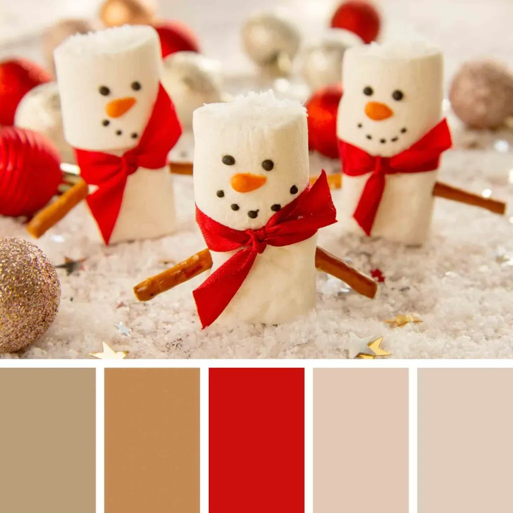
2. White and Red Shades

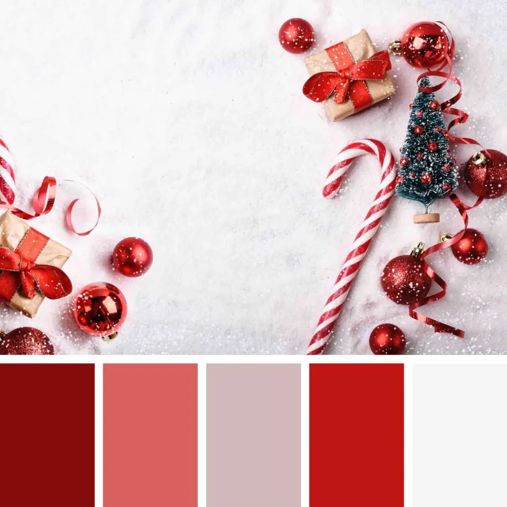
It’s often safe to use a Christmas theme in different shades of red since this is the most important color of the festive season. Still, when you use white and lighter tints of red, you add lightness to this beautiful design.
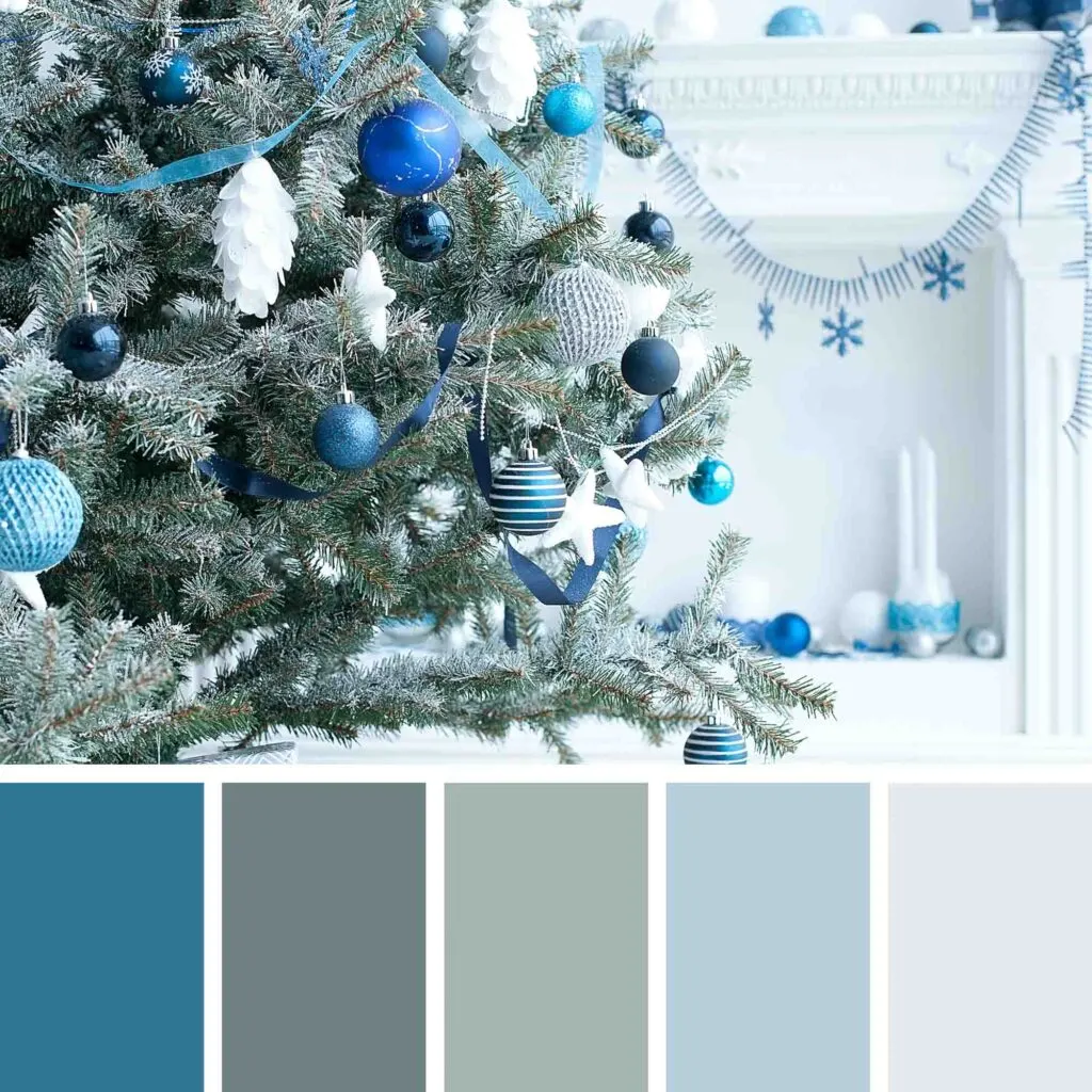
3. Blue and Earthy Tones
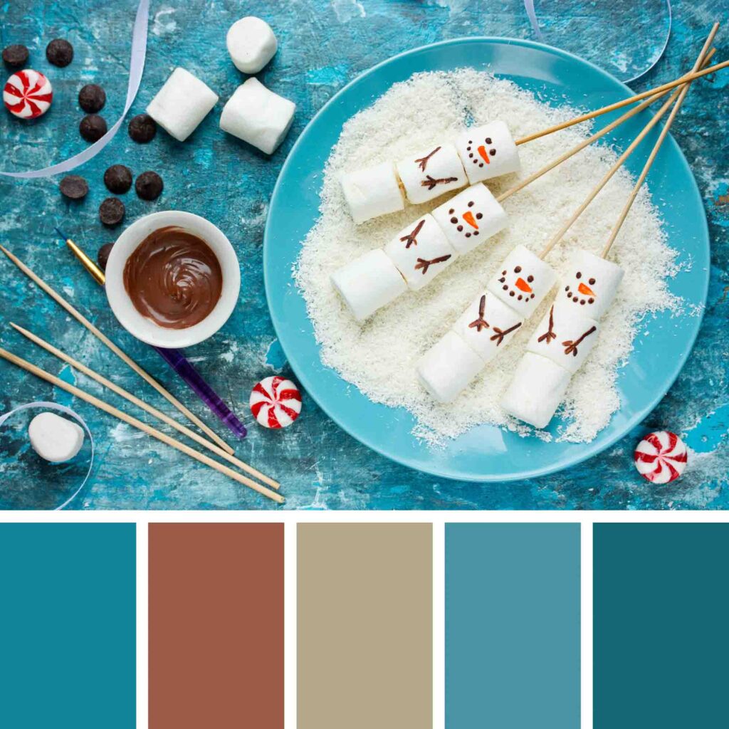
Blue is a relaxing color that, together with earthy tones, creates a calming Christmas palette. Besides, it also evokes the coolness of the season.
It’s an excellent color combination for those who want to stir clear from the over-used red and green.
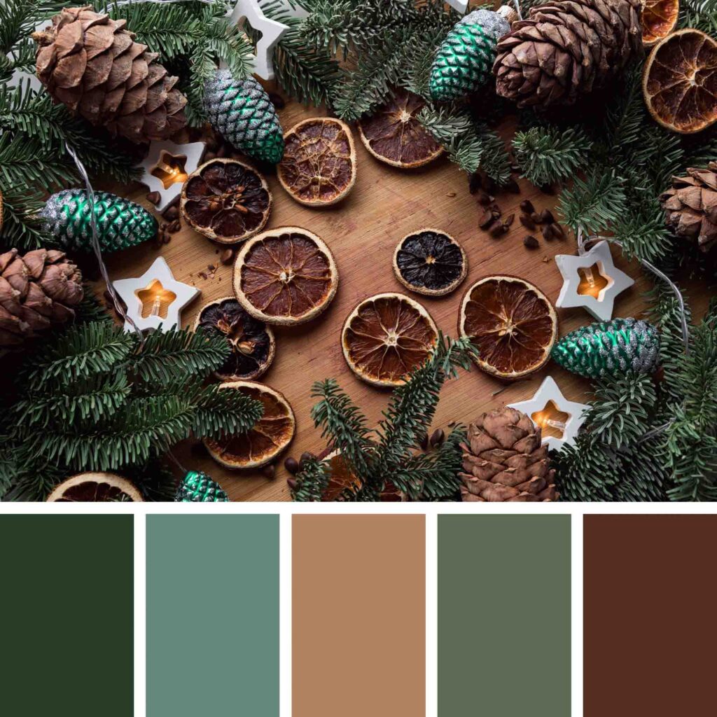
4. Browns and Dark Green
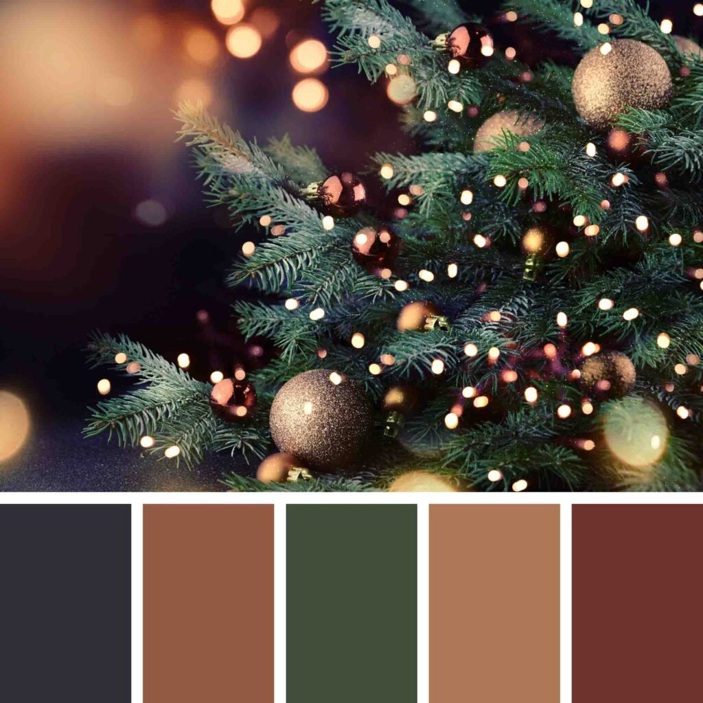

This Christmas color scheme is particularly grounding and evokes not only a welcoming feeling but also images of nature to the viewer.
Brown and green together remind us of forests and the outdoors, creating an elegant decor or design because of the overall dark colors.
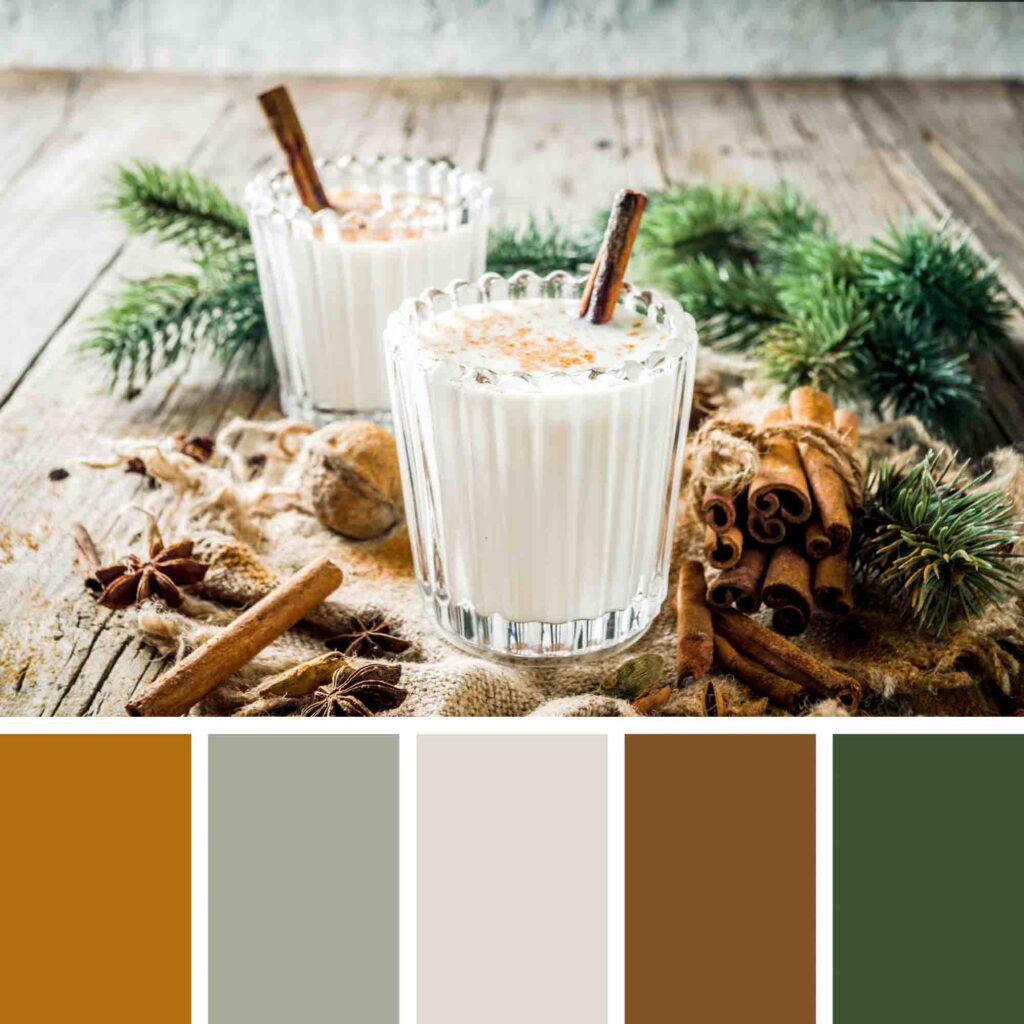
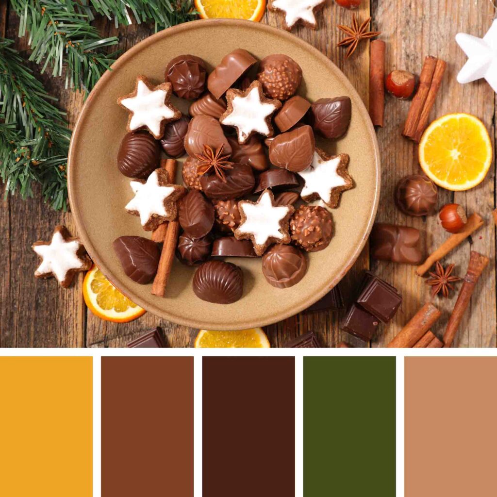
5. Red, Green, Orange, and Brown
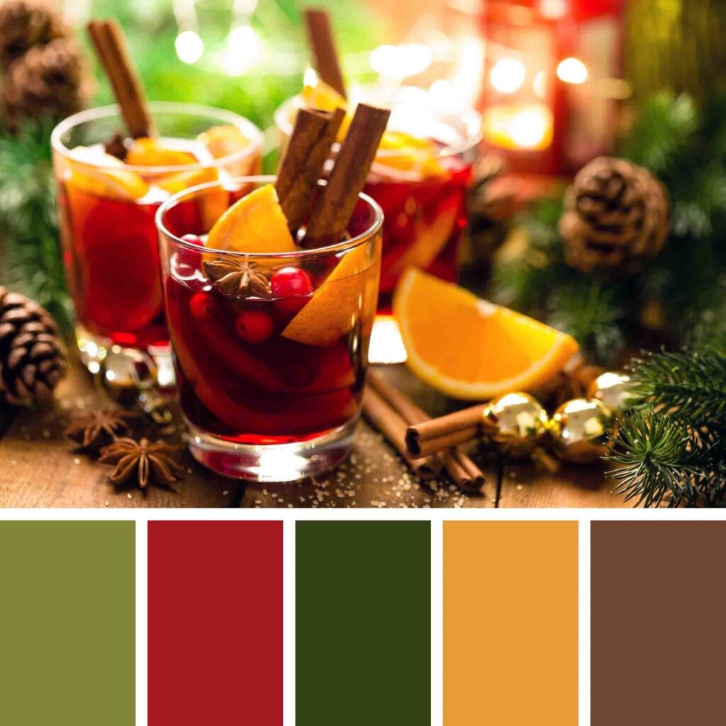

It’s an explosion of colors, but a beautiful one. A colorful but far from garish color palette for Christmas. The red and green evoke Christmassy feelings, while the orange fills us with joy. It adds a lively feeling to the overall look.
Lastly, brown has a grounding and welcoming function. In a way, it is an excellent fall color palette, too.
6. Muted and Light Reds, Dark Green, and Light Blue
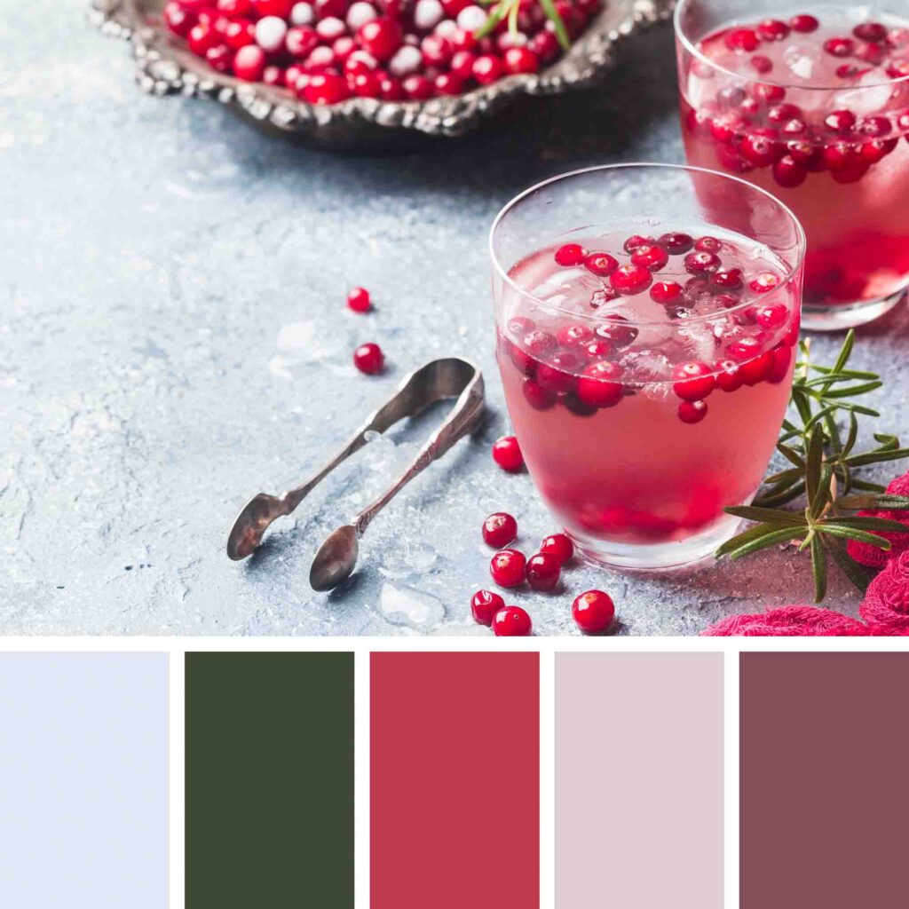
Tired of the classic color palettes? So, this color combination idea is for you.
It has both traditional colors with a little spin: the reds are light, muted, or pinkish, the green is very dark, and the light blue balances the scheme out.
Because the reds are leaning toward pink, it also evokes thoughts of sweets and candies.
7. Earthy Colors and Green

We have seen a “brown and green” color palette above, but this one feels far lighter because of the gray and cream.
In this case, the browns are much deeper and intense, which, together with the dark green, create a rustic vibe — perfect for Christmastime!
If using this Christmas color palette in your home decor, you could use elements of nature to reproduce the browns. Even better if you can use recycled materials.
8. Earthy Tones and Red

The browns and creams are soothing and evoke warm feelings. The use of different shades is essential here so your design or home decor won’t look dull.
Red is a bright accent color that calls to mind the holiday spirit and makes the result look even warmer.
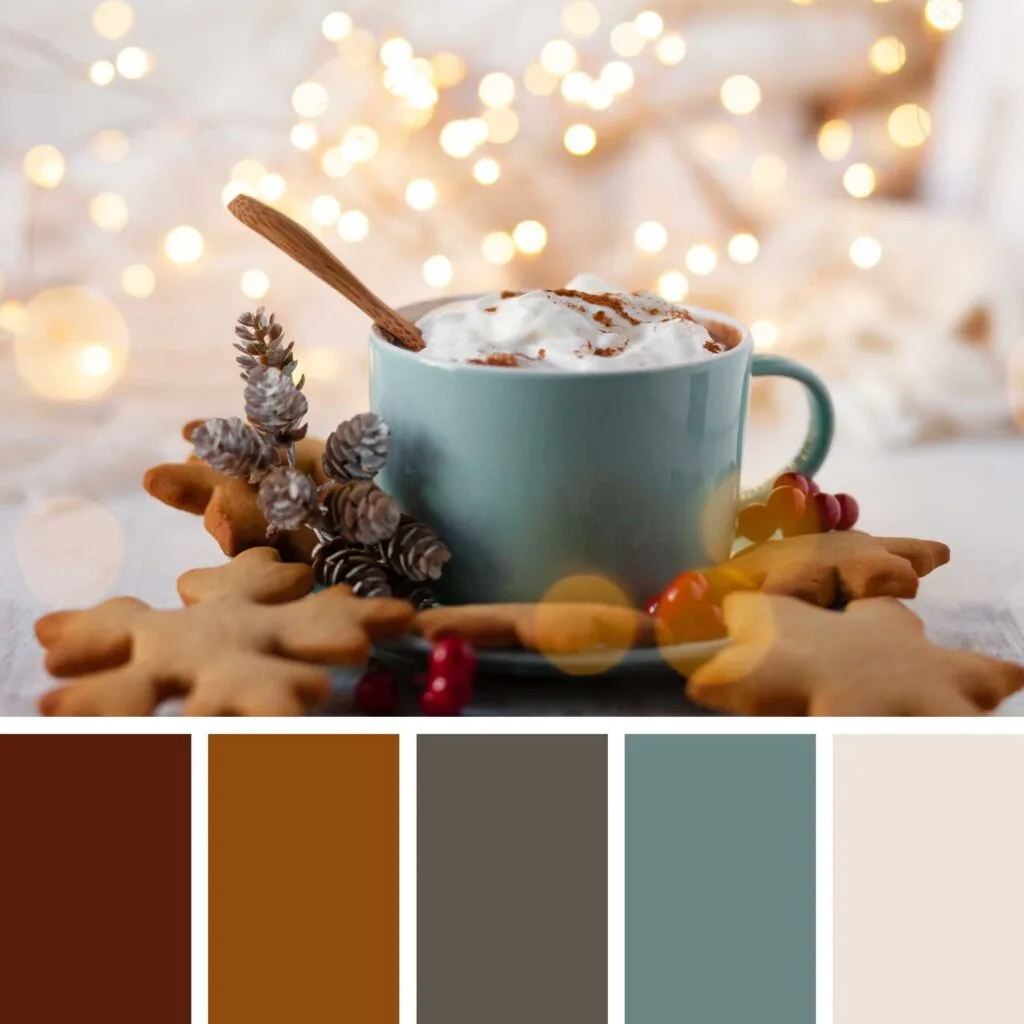
9. Shades of Orange and Green

The brown, which is a dark-muted orange, beige, a light-muted orange, and the light gold, a soft orange, together add depth to this Christmas color palette.
In reality, it’s an earthy tone and green color scheme, but it’s important to note that we’re using different shades of orange to create it, which is a lively and welcoming color when softened.
These colors and green evoke nature and an overall rustic vibe, but the gold adds a hint of elegance to it.
All in all, this Christmas palette is perfect for those who want to have a natural-looking decoration or design without giving up a sophisticated look.
10. Warm Browns and Cool Blue

This festive color palette has an incredible combination of warm and cool colors.
The browns, which are usually warm colors, create a sense of warmth, comfort, and security. On the other hand, blue, which is usually a cool color, gives us a feeling of calmness and balances out the warmth of the other colors.
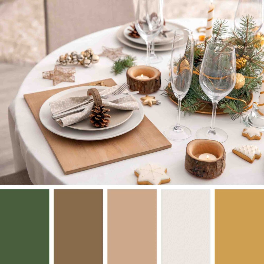
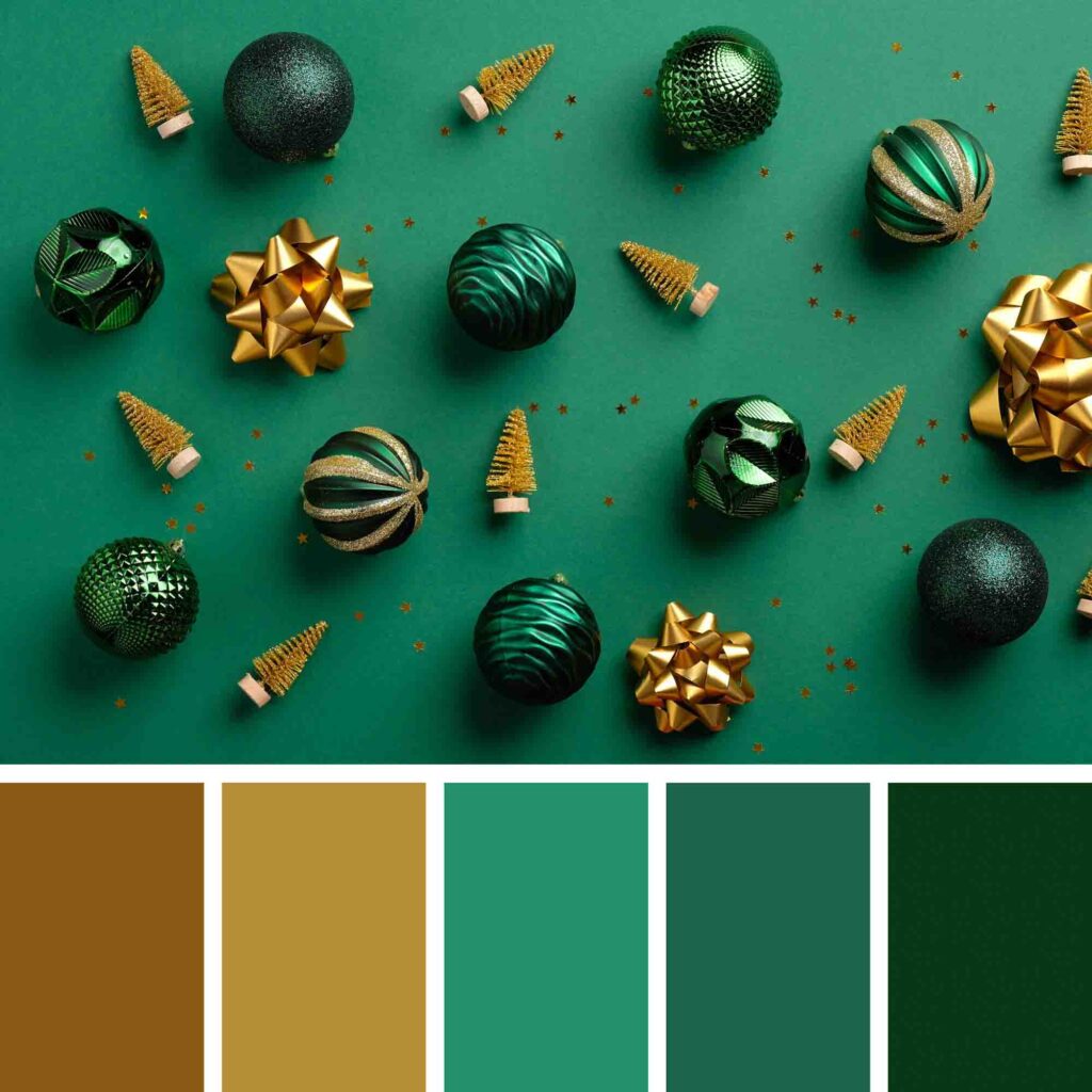
11. Gold, Browns, and Green

As the image suggests, this color combination stimulates the appetite, making it a fantastic color to have around the dinner table.
Not only that but the gold and green together create a fresh and lively combination.
12. Browns, Red, and Greens
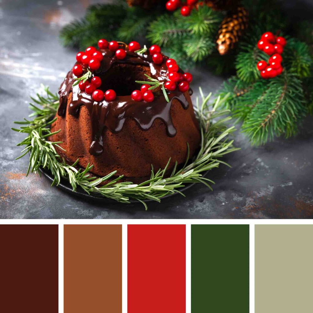

In this highly traditional Christmas palette, only sage is considered a cool color. All the others, including the deep green, are warm. Warm colors together, especially when in deep tones, results in a palette with dramatic colors.
This elegant color combo creates a rich scheme with all the familiar colors of the holidays.
13. Red and Silver

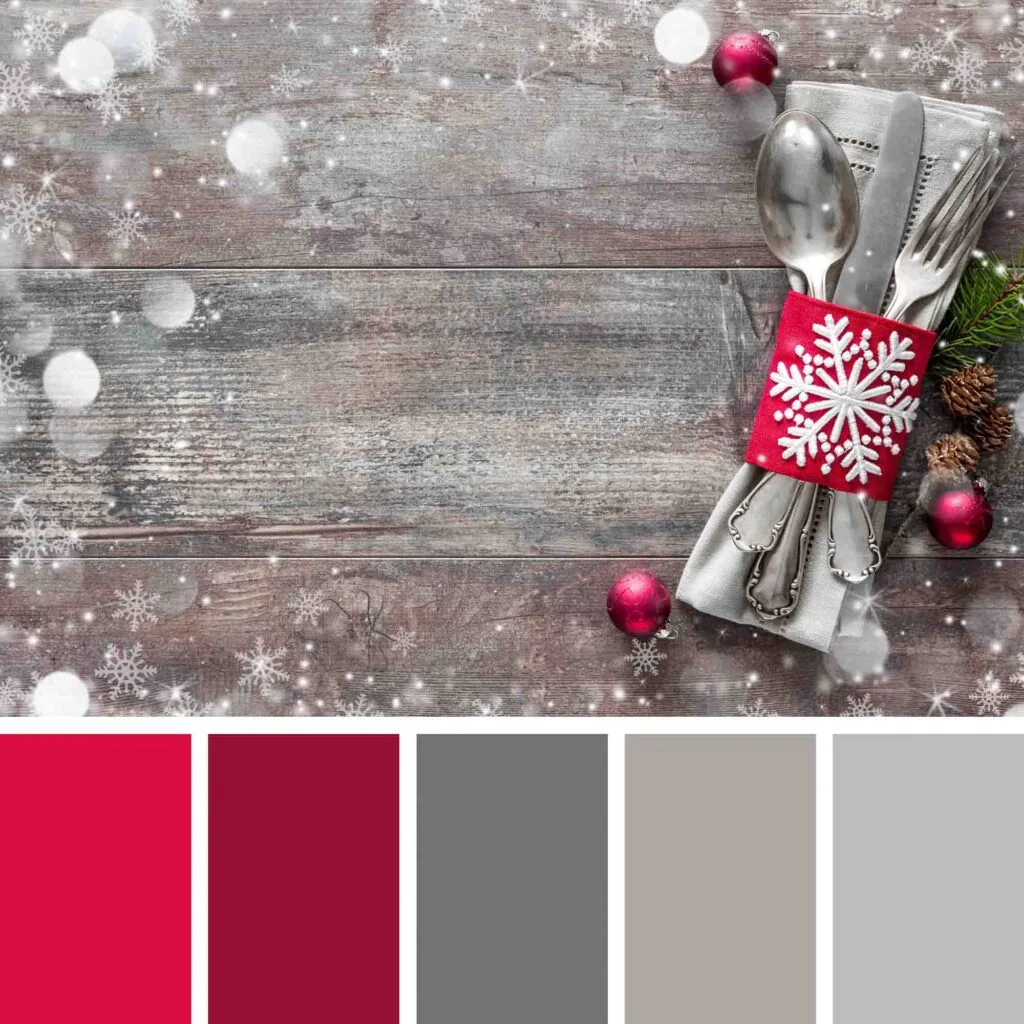
Silver and red together create a sophisticated color scheme. Those gray shades, especially when used in metallic decorations like silver ornaments, evoke a festive look while they keep the environment neutral.
This red, which leans toward pink, is also a cool color, but when used next to silver, it becomes warm, very warm.
This adds a number of positive emotions to home decor and designs: joy, vibrancy, elegance, sophistication, and intensity.
14. Blue and Gold

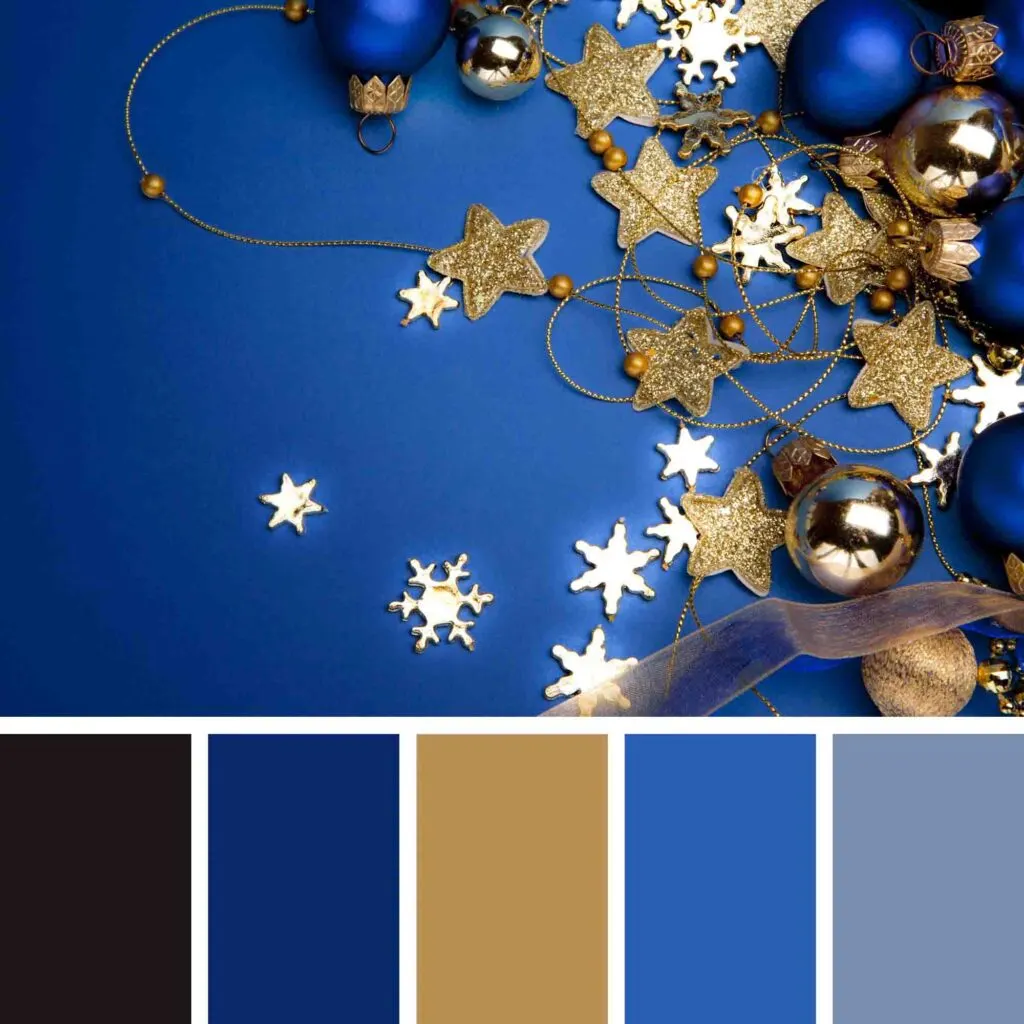
One of our top favorite holiday color palettes, this blue and gold combination is incredibly elegant.
The royal blue creates the feeling of security and evokes images of a beautiful starry night. Not only that, but blue, once a very expensive dye, was the color for the royalty only.
Further out, blue symbolizes the Holy Night spirit in the bible.
Add gold to that, and you have a sophisticated festive palette to celebrate this beautiful time of the year.
15. Blues and Grays

This holiday palette uses classic winter colors to create a classy, relaxing, and soothing feel.
If you have been looking for a non-stimulating scheme with cold winter colors, you will achieve that look with this gray and blue winter color palette. It uses particularly cool shades of blue.
16. Black, White, and Gray

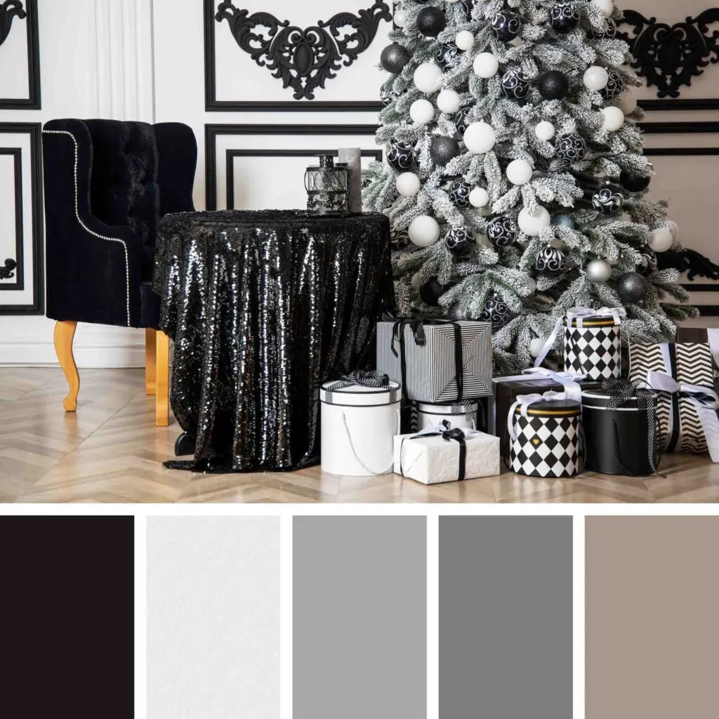
Using non-traditional Christmas colors, this palette is certain to make a bold statement in your home decor or crafts.
Black is an elegant, mysterious, and sophisticated color that, when used in the right amounts, “dresses up” any room.
Besides, by keeping the color palette monochromatic, you create a modern atmosphere. Black and white (and gray, too) have enough contrast to make it an eye-catching color scheme.
17. Neutrals
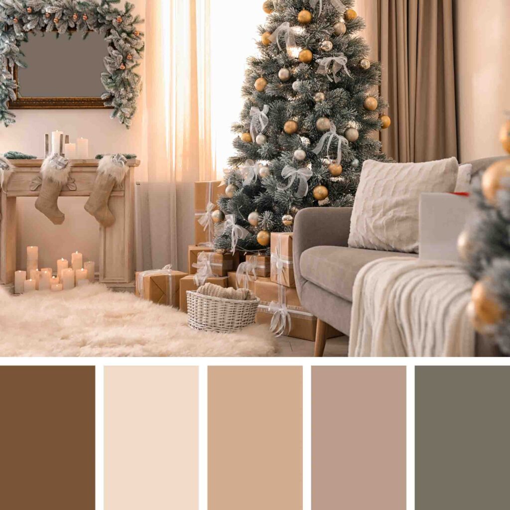
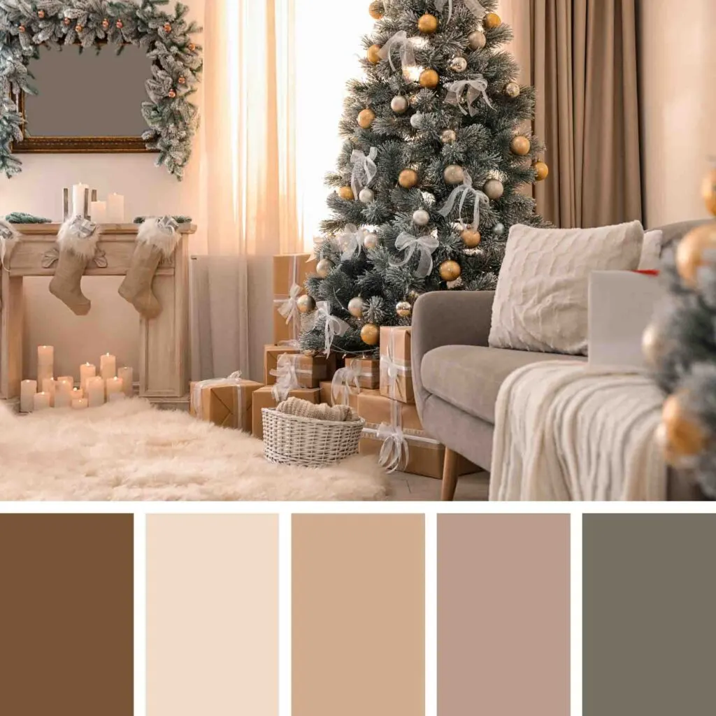
Pick earth colors (brown, beige, and muted green) for a soothing, comforting, and warm effect.
These are excellent color choices for those looking for a chic design without many colors or those who are afraid of combining many different hues — it can be overwhelming, we know that.
You can’t go wrong with this festive color combination, which in turn, delivers a sophisticated vibe.
18. Pink, Green, and Gold
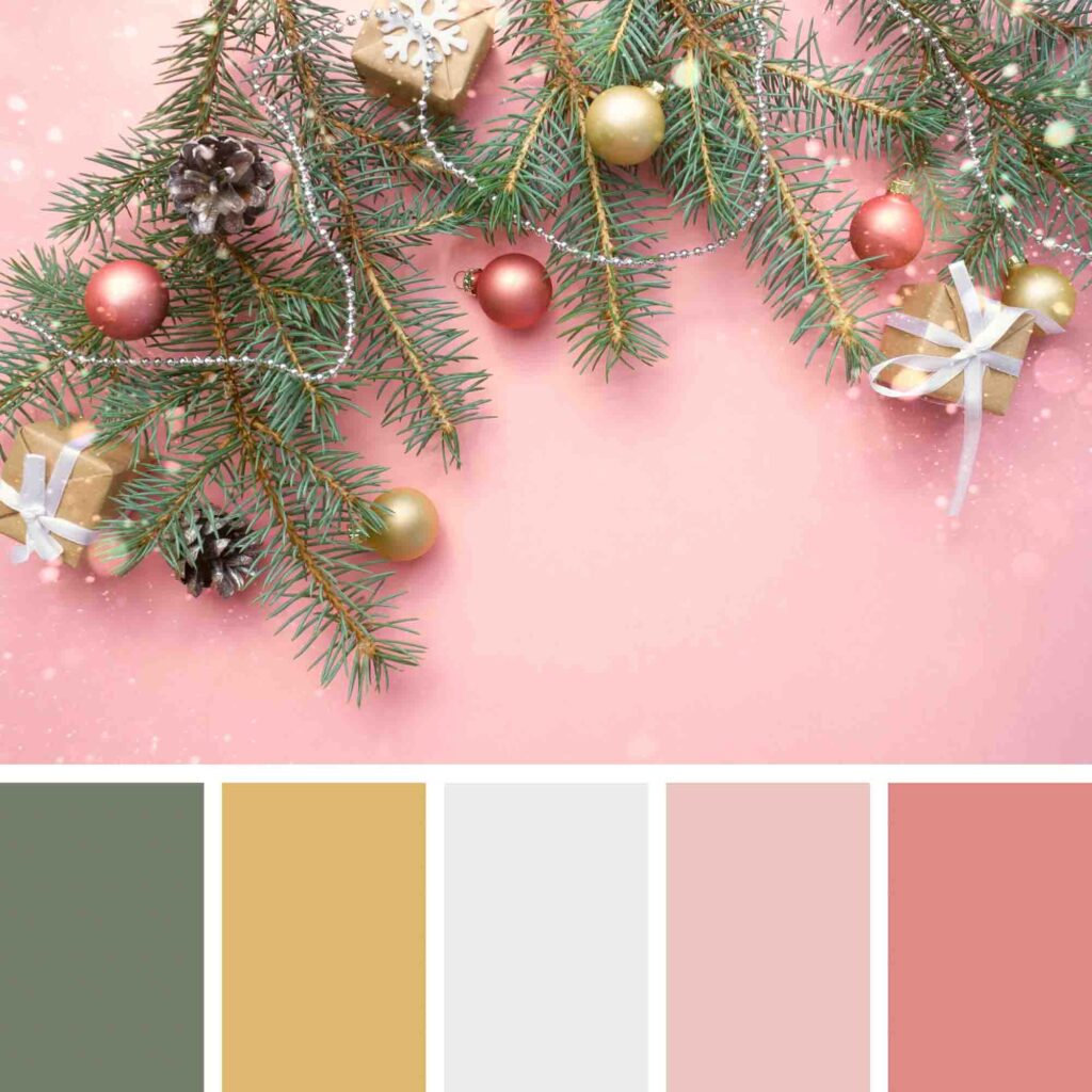
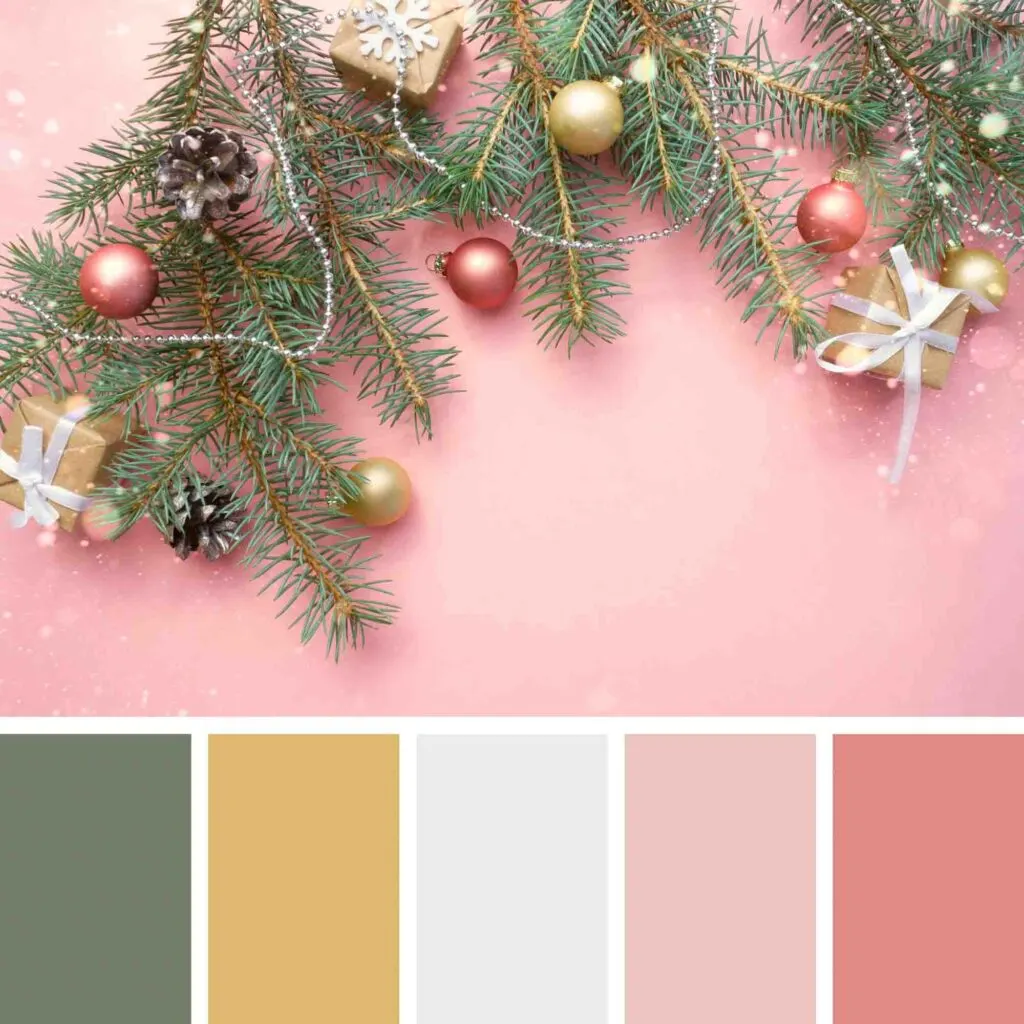
Pink is undeniably a happy color. Green is soothing. Gold is both classy, but it has roots in yellow, the so-called color of happiness. Put these three together, and you have a jolly color combination!
Also, we see this combination a lot in nature, so it’s comforting and pampering in interior design.
To avoid a garish look, go for muted or pastel colors as they are soothing.
19. Purple and Blue
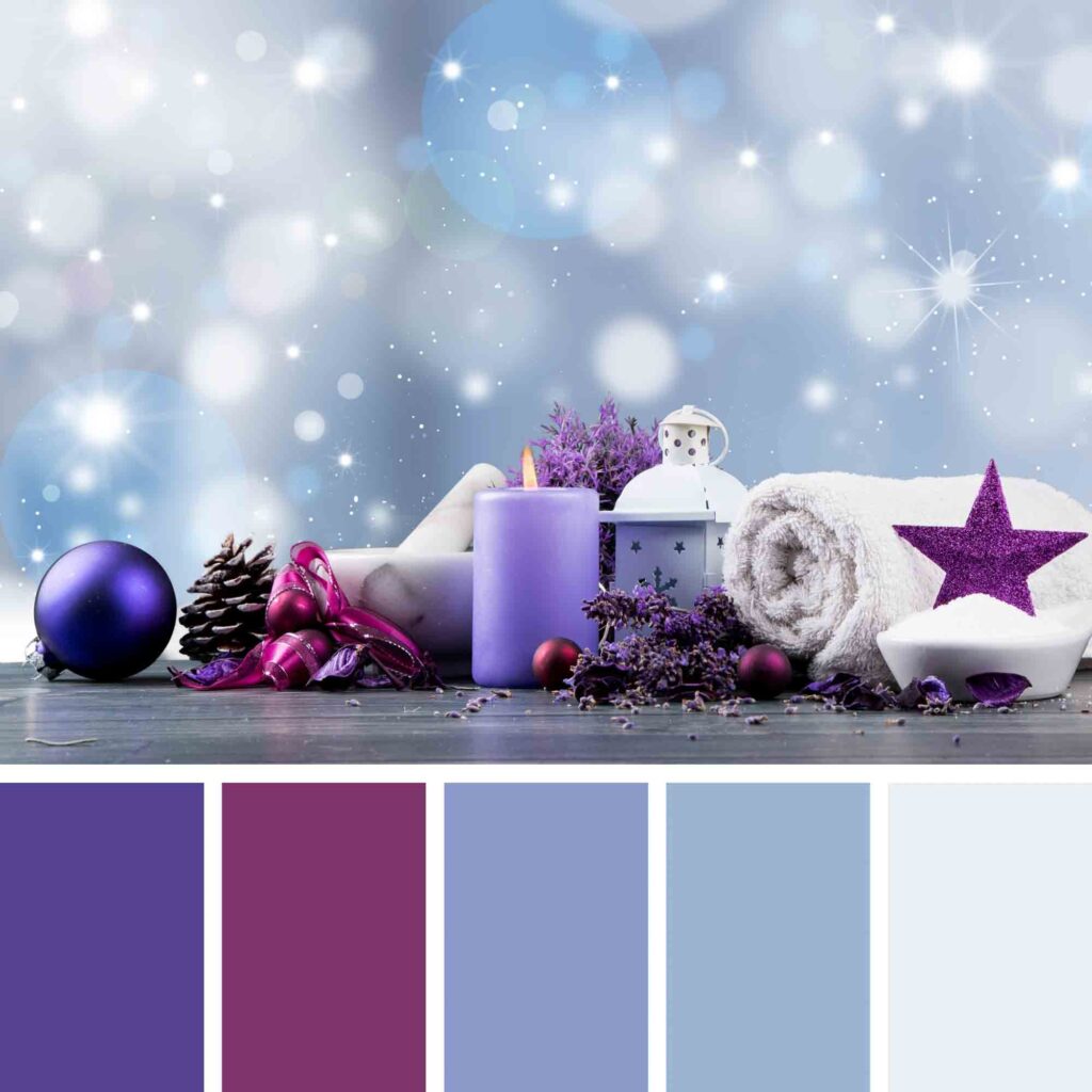
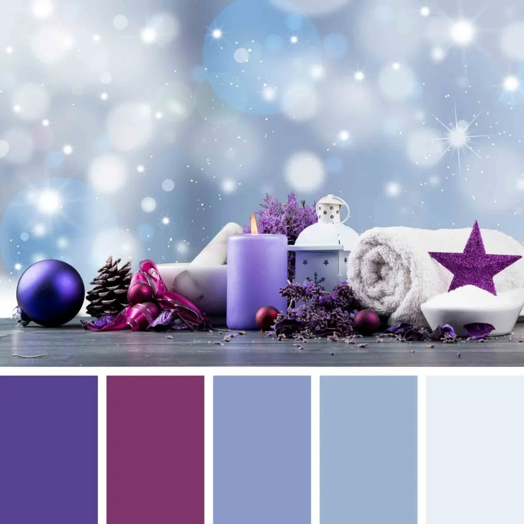
Purple might not be your go-to holiday decoration color, but it has great significance for this holiday.
When the purple dye was first made, it was so expensive that only royalty could afford to wear purple garments. Blue was also very costly.
Purple and blue are mentioned multiple times in the bible suggesting penitence, mourning, and Mary.
Design-wise, these bold colors make a statement in any project. Just be sure to use the darker shades wisely to avoid a look that’s too busy.
Both shades of purple and blue are calming colors that create an analogous color palette, meaning one of the most eye-soothing color combinations.
20. Greens and Warm Browns
This natural and rustic color palette is perfect for those trying to achieve an evergreen winter but somehow warm ambiance.
The browns used here are warm, meaning they are leaning toward yellow, an uplifting and warm color.
Brown is grounding and welcoming, but it also embraces its humbleness.
The main color of the scheme, green, is soothing, calming, and cooling. It’s one of our favorite color schemes for a cozy home.
21. Green and Gold
Standing next to each other on the color wheel, green and gold make an elegant color theme that evokes the holiday spirit with class.
This luxurious color palette has the perfect balance of cool and warm colors and simplicity with style.
Want to make it even more sophisticated? Use metallic ornaments.
22. Shades of Red
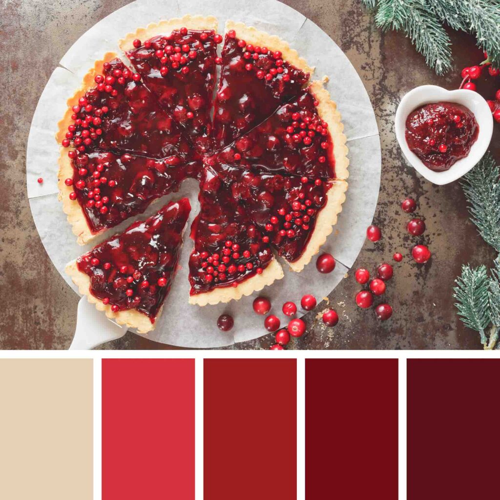

Bold colors and the festive season go hand in hand. These shades of red evoke warmth, excitement, and stimulation of the senses.
This strong-willed color symbolizes importance, and because it is an emotionally intense color, it should be used wisely.
You can use the darker shades more often and use the bright ones for accents. Also, beige and neutrals will be your best friends to avoid creating an overwhelming design.
23. White and Pink
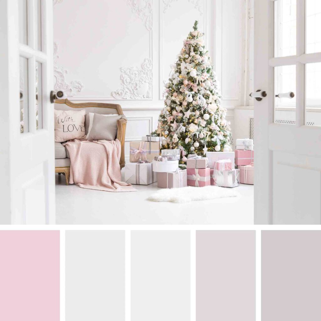

Delicate and romantic, this sweet color scheme is perfect for romantic souls, lively people, and out-of-the-box thinkers who are not afraid to make a unique Christmas of their own.
White and light pink together create a calming and comforting sense that scares away the winter blues.
24. Browns

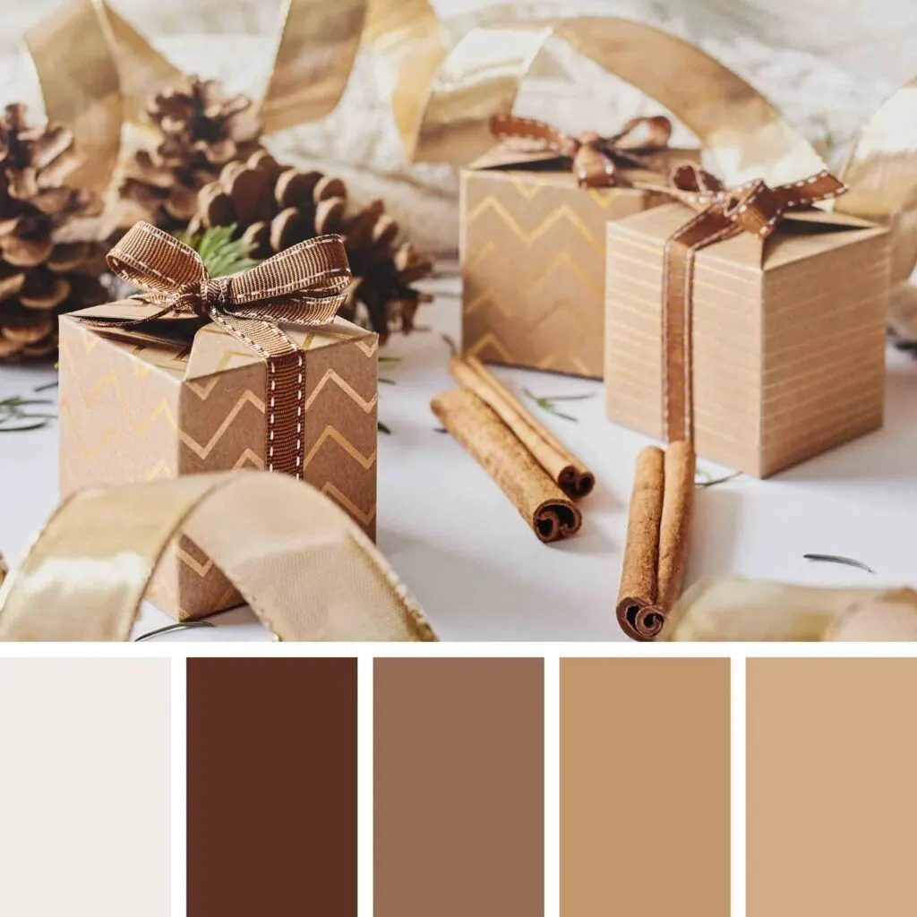
This monochromatic holiday color scheme creates a cohesive design that is eye-soothing and far from underwhelming.
The different shades of brown create depth and evoke a homey ambiance – perfect for those who want to make their home a welcoming place.
25. Green and Blue
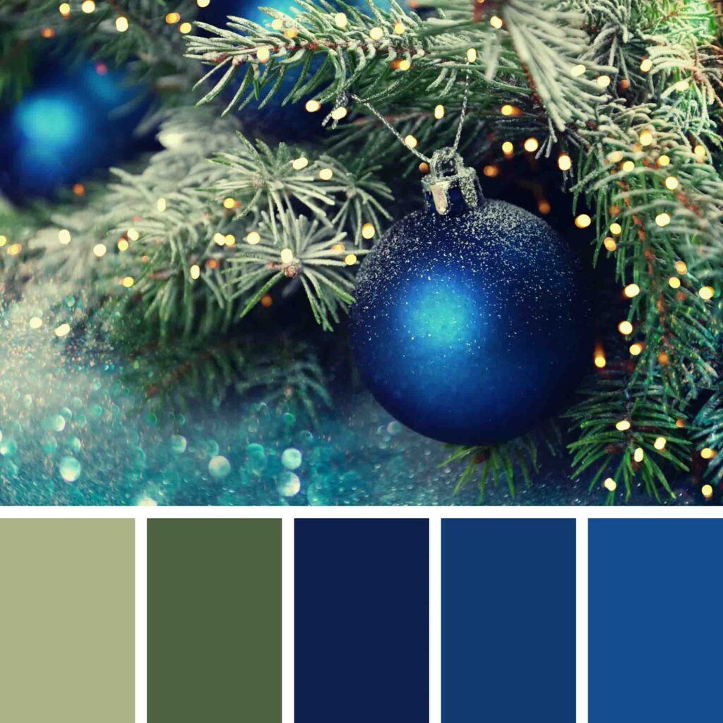

Incredibly gentle and pacifying, a green and blue palette creates a unique design with analogous colors.
This combination calls to mind a serene forest on a starry night. Feel free to use warm white lights in your Christmas tree to make the landscape complete.
26. Gold and Silver
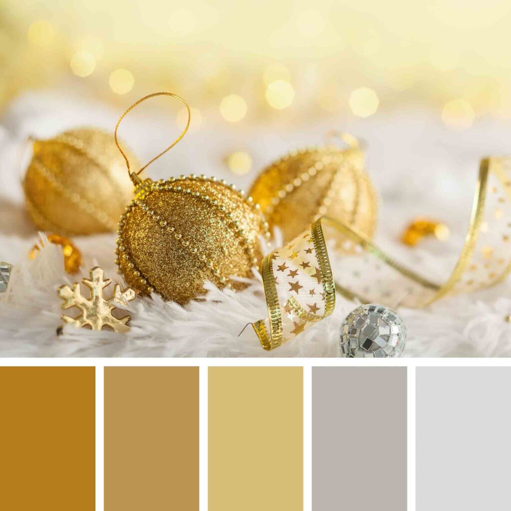

The combination of gold and silver creates a feeling of abundance, luxury, and cheerfulness.
They brighten up any room while keeping their neutrality. This aspect makes it easier to combine patterns and textures around the space.
27. Bright Green and Red Accents
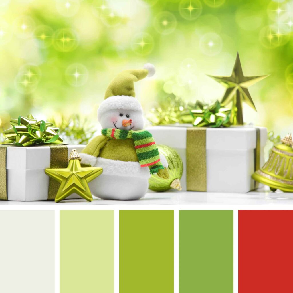

A relaxing and youthful color, light green is an especially calm shade that represents renewal, luck, health, and optimism.
Particularly the yellowish greens evoke a sense of earthiness, sourness, and joviality. These can be seen as negative traits but also as positive since it makes a table decor feels fresh.
The red accents awaken the holiday spirit, making it an excellent Christmas color palette with a twist.
28. Dark Greens and Reds

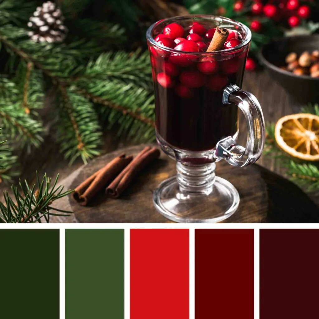
If bright colors of Santa Claus‘ robe are not your thing but you want to go classic, pick darker shades of red and green for your design.
These bold colors together create a dramatic look that feels dignified, expensive, and sophisticated.
Final Thoughts on Holiday Color Palettes
We hope we have given you enough color inspiration to create a captivating color palette for this magical time of the year.
Remember that you can use these color schemes in any project, from web design to home decor. Don’t be afraid to play with colors. The more you work with them, the more you learn how to use them.
Did you enjoy these Christmas color palettes? Then share this article with your friends!
Christina Xavier
Wednesday 20th of September 2023
Oh wow their all so beautiful it's so hard to choose.
Hailey Olson
Monday 19th of December 2022
Good thinking with those colors