To understand how our eyes process the colors in a painting or web design, you need to understand the subtractive color model and how the subtractive color wheel works.
From your favorite shirt to the bursts of colors in your favorite painting, subtractive color is all around us.
In this post, we’ll explain what subtractive color is, when you encounter them, and how subtractive color mixing works.


What Are Subtractive Colors?
In color theory, subtractive color is the way our eyes naturally recognize and process color. This can involve mixing pigments or inks.
If you put a colored pigment or ink on a piece of blank paper or canvas under white light, that white pigment blocks and absorbs certain light wavelengths, meaning your eyes receive no reflection of that particular color from the paper.
If you put a dab of red paint on a white canvas, that paint absorbs all wavelengths of light (white light) from the visible spectrum of colors except for the red ones, leaving your eyes to interpret the result as the color red.
Our eyes and brain translate the light which bounces off objects into the perception of color.
There are two subtractive color models: RYB (used in traditional art and paint) and CMYK (used for color printing).
Any pigment you see in either of these settings has its hue because light either bounces off or is absorbed by an object due to its pigmentation.
Note: RGB uses the additive color model, which is used in digital media.

How Are Subtractive Colors Used?
Subtractive colors are used in the tangible world. Just about any color you see that’s not on a screen is the result of subtractive color. Additive color refers to how we see color in light itself. In other words, how we see color on screens.
More specifically, the RYB color model applies to any mixture of pigment – from the dyes used to color your clothes to the paint on the walls in your house.
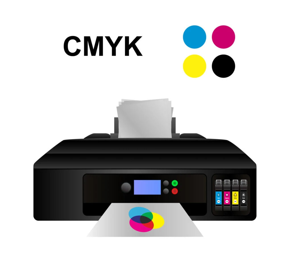
The CMYK color model applies to digital printing. Anytime you see a new page emerge from your printer covered in fresh ink, that’s the CMYK color model at work.
Subtractive Primary Colors
Since there are two different models of subtractive color, that means there are two sets of subtractive primary colors.
In art, the primary colors are red, yellow, and blue. Secondary colors are created by combining primary colors in equal amounts. The secondary colors are orange, green, and purple.
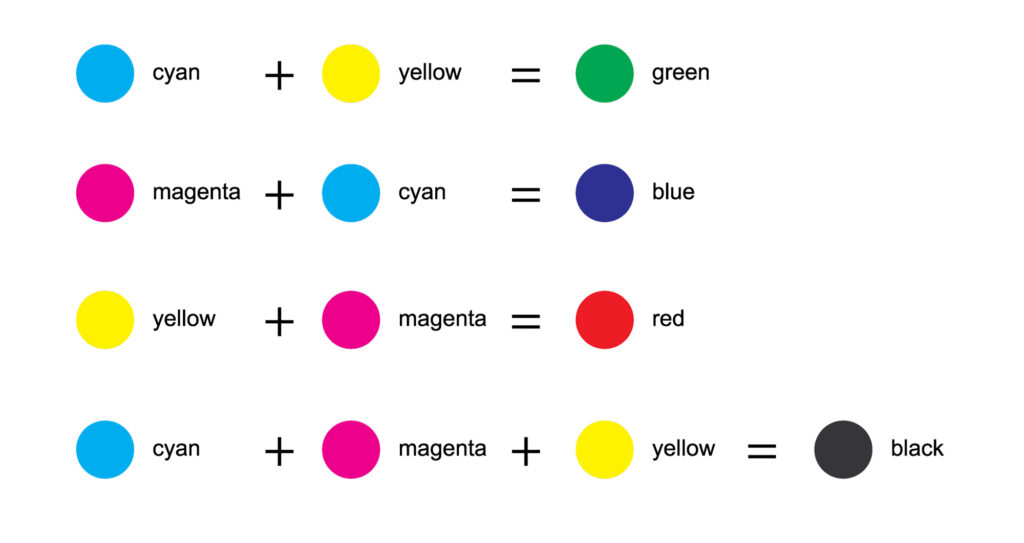
In digital printing, the primary colors are cyan, magenta, and yellow. The secondary colors are red, green, and blue. Combinations of different amounts of the three primary colors can produce a wide range of colors with good saturation.
Digital printing also essentially treats black as a primary color (the “K” in “CMYK” stands for “key,” which means black).
Further out, cyan is the complementary color of red, meaning cyan serves as a filter that absorbs red.
This basically means that the amount of cyan on a white piece of paper regulates how much red in white light will be reflected back from the paper. Ideally, the cyan is completely transparent to green and blue light and has no effect on those parts of the spectrum.

Applicability
Having a solid understanding of both types of subtractive colors will get you far in the world of color. That’s because they’re used for such a wide range of projects.
You’ll use subtractive colors almost exclusively if you’re an artist or designer that works with traditional media like paint, pastel, crayon, ink, or pencil. You’ll also use them in printing, silk-screening, and industrial paint projects.
Understanding what subtractive colors are is just the first step. From here, you can learn all about the RYB and CMYK color models, which will open a whole new world of color for you!
Cleveland Wilks @
Sunday 10th of July 2022
You are too reddish. I want to see my blond blue eyes girl look like what they supposed to be. Greens looks jungle green, blue 💙 sky looks like what it supposed to be white cloud looks as the teachers chark I can't stand tan for white. Fix the colors please!.